Embbrosia
Sector: Printing and Embroidery
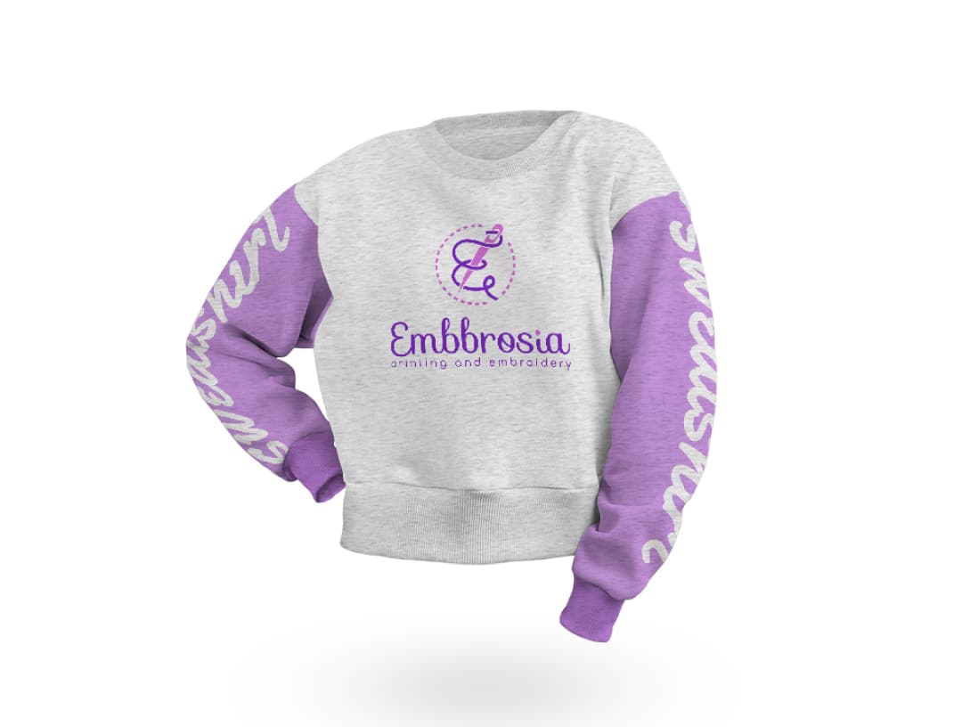
Embbrosia is a brand that combines quality and craftsmanship in printing and embroidery. The logo's "E" represents the brand name, while the thread and needle elements highlight its dedication to embroidery. The curved lines mimic a needle in motion, symbolizing intricate craftsmanship. These thoughtful design choices make Embbrosia memorable, visually capturing its expertise and values.
Letter E
Thread
Needle
Embroidery

Sarah Thompson
Amazing work! The logo came out exactly how I envisioned it. Professional and super fast. Highly recommended!
Capital
Sector: Attorney | Law
Capital is a brand that cleverly blends legal symbols with its name to show trust and justice. The "A" in the logo is designed to look like scales, symbolizing balance and fairness. This smart use of the letter not only reflects the firm's name but also its commitment to justice. Capital’s logo is a clear symbol of its dedication to legal expertise and integrity.

Letter A
Balance

Javier Morales
The design captured the spirit of our brand perfectly. We got exactly what we wanted. We might consider working together again. Thank you!
Acoustic
Sector: Music
Acoustic is a brand that creatively blends musical elements with its name to represent the world of sound. The logo incorporates a microphone into the "I" and a guitar shape along the bottom, symbolizing voice and instrumental harmony. This imaginative design not only visually represents music but also conveys Acoustic's dedication to authentic sound. The clever use of these symbols makes the logo memorable and perfectly aligned with the brand’s essence in the music industry.

Microphone
Guitar
Emily Chen
I absolutely love the storytelling aspect of the logo! The attention to small details really reflects our brand's story. It exceeded my expectations.
Motto
Sector: Pan-Cooked Liver
Motto is a brand that uses creative design to highlight its focus on pan-cooked liver. The logo cleverly incorporates a stylized pan in the letter "O," symbolizing the cooking process at the heart of their business. This imaginative touch not only makes the logo visually engaging but also reinforces the brand's culinary expertise. The unique use of the "O" as a pan gives the logo character, making Motto memorable in the food industry.

Letter O
Pan-cooked

Daniel Fischer
We couldn't be happier with the result. The logo truly captures our brand’s values and reflects the essence of what we stand for. They took the time to understand our business, and it shows in every detail. Working with them was a pleasure from start to finish, and I’d gladly recommend their services to anyone looking for a unique, meaningful logo that stands out.
Spray
Sector: Painting Art
Spray is a brand that combines creativity and subtle symbolism to represent the world of painting and scent. The logo integrates the shape of a spray bottle into the letter "P," symbolizing the act of spraying paint or perfume. This clever design adds depth to the brand identity, linking it directly to the act of artistic expression and fragrance. The unique use of the "P" creates a memorable and visually engaging logo that reflects Spray's focus on creativity and style in the painting art industry.

Letter P
Perfume
Olivia Patel
It was a fantastic experience. The designer was open to feedback and made every change we asked for. The final result is exactly what we wanted.
Digital Menu
Sector: Hospitality Technology
Digital Menu is a brand that combines innovative design with elements from the hospitality industry to create a distinctive identity. The logo features a waiter figure integrated with a glass icon, symbolizing service and refreshment. Additionally, the pixelated corner suggests digital transformation, aligning with the brand’s focus on modern technology in hospitality. This thoughtful design not only represents the brand’s name but also highlights its commitment to enhancing the dining experience through digital solutions.

Waiter
Glass
Digital
John Smith
The final product exceeded my expectations. This is not just a logo, but a visual story that tells our brand’s essence. The attention to detail is truly impressive.
Arnis Pharma
Sector: Pharmaceuticals
Arnis Pharma is a brand that thoughtfully combines health and family symbolism in its logo to reflect its commitment to wellness. The design features a mother and baby icon within the shape of the letter "A," symbolizing care and protection. The heart detail within the baby figure emphasizes the brand’s focus on nurturing health. This creative use of shapes not only represents Arnis Pharma’s dedication to family and health but also makes the logo memorable and meaningful in the pharmaceutical industry.

Mom
Baby
Healty
Letter A

Hana Yamada
The design is beautiful, and working with them was very easy. We needed a few revisions, but they handled them smoothly. Highly recommended!
Cool Home Furniture
Sector: Furniture
Cool Home Furniture is a brand that combines comfort and elegance in its logo to reflect its dedication to stylish home furnishings. The design integrates the letters "C" and "H" into an armchair shape, crowned at the top to symbolize luxury and sophistication. This creative blend of elements highlights the brand’s commitment to quality and comfort in furniture. The logo’s thoughtful design not only reinforces the brand name but also makes Cool Home Furniture memorable in the home décor industry.

Letter C
Letter H
Crown
Armchair
Luis Garcia
The logo design was exactly what our team wanted. They were very patient and attentive to detail. Thank you for the dedication.
Dky Pipe & Fittings
Sector: Pipe and Fittings
Dky Pipe & Fittings is a brand that uses clever design to visually represent its focus on pipework solutions. The logo incorporates the letter "D" with a pipe fitting element, symbolizing the brand’s dedication to quality in the pipe and fittings industry. This creative use of the "D" not only strengthens brand recognition but also conveys expertise and reliability. Dky’s logo captures its role in delivering durable and efficient pipe solutions.

Letter D
Pipe

Sophia Williams
We loved the logo. It’s both elegant and represents our purpose. We've already received positive feedback from clients; it creates a strong visual impact.
Dell'amante Coffee Shop
Sector: Coffee
Dell'amante Coffee Shop combines cultural depth and coffee symbolism in its logo, creating a unique brand identity. The design features the profile of an African woman with a coffee bean integrated into her hair, symbolizing both the rich origins of coffee and a welcoming atmosphere. This thoughtful design not only reflects the brand’s passion for coffee but also celebrates the cultural heritage of coffee-growing regions. Dell'amante’s logo is both memorable and meaningful, inviting customers to experience coffee with a sense of tradition and warmth.

Coffee Bean
Picture
African Woman
Ryan Baker
Working together was a pleasure. The logo has such a unique character and makes our brand feel more alive. They didn’t just create a logo; they crafted something that connects with our identity on a deeper level. The design beautifully reflects the warmth and culture we want our customers to feel. The attention to detail was impeccable, and the final product embodies the spirit of our coffee shop. They were incredibly receptive to feedback. The result is a logo that we’re genuinely proud to showcase.
Lizababy
Sector: Maternity and Baby Products
Lizababy’s logo creatively integrates the essence of motherhood with elegance. The design uses the letter "B" to form the silhouette of a pregnant woman, symbolizing the nurturing and caring nature of the brand. This thoughtful representation highlights Lizababy’s focus on products for mothers and babies, making the logo both meaningful and memorable. The visual of a mother-to-be connects emotionally with the audience, reinforcing Lizababy’s dedication to supporting the journey of motherhood.

Letter B
Pregnant

Amara Diop
I enjoyed every part of the process! They made our idea even better than we imagined. We are so pleased with the final result.
GSC Building Managment
Sector: Building Management
GSC Building Management’s logo uses a clever combination of letters and architectural elements to create a strong brand identity. The letters "G," "S," and "C" are integrated into a building structure, symbolizing the company’s expertise in property management. This creative design not only represents the initials of the brand but also visually conveys its focus on buildings and structural management. The logo’s bold and structured form reflects GSC’s commitment to reliability and professionalism in the building management industry.

Letter G
Letter S
Letter C
Buildings
Rami Haddad
The attention to detail was impressive. The logo tells a strong story that aligns perfectly with our brand. We couldn’t be happier.
Twenty Pet Shop
Sector: Pet Retail
Twenty Pet Shop’s logo creatively combines numbers and pet icons to reflect the store’s dedication to animal care. The number “20” is shaped to include the outlines of a cat, dog, and bird, symbolizing the variety of pets the shop caters to. This clever integration of animal figures with the brand’s name makes the logo both visually engaging and memorable. Twenty Pet Shop’s logo captures the essence of a friendly, pet-centered environment, inviting animal lovers to a place where all pets are welcome.

Number 20
Cat
Dog
Bird
Mia Johnson
I wasn’t sure exactly what I wanted at first, but they guided me so well through every stage. From concept to final touches, they provided valuable insights and took care to incorporate elements that would appeal to our pet-loving clients. We’ve already had customers comment on how much they love the design! I truly appreciate how they managed to capture the welcoming environment we aim for, and I’m thrilled with the outcome. It’s more than just a logo; it’s a symbol of who we are.
Devart Industrial
Sector: Industrial
Devart Industrial’s logo combines the letter "D" with a gear icon, symbolizing the brand’s connection to the industrial sector. This integration of a mechanical gear within the "D" highlights the brand’s focus on innovation and machinery. The design is straightforward yet impactful, effectively conveying Devart's identity as a leader in industrial solutions. The logo’s bold, clean form reflects reliability and expertise, capturing the essence of industrial strength and precision.

Letter D
Industry

Ethan Brown
Very responsive and talented team. Every revision request was handled carefully, and the end result exceeded our expectations.
Alkan Furniture
Sector: Furniture
Alkan Furniture’s logo masterfully combines the letter "A" with an armchair silhouette, creatively representing both the brand name and its dedication to comfortable, stylish furniture. This elegant blend of typography and imagery gives the logo a memorable, modern look that resonates with the brand’s commitment to quality and design in the furniture industry. Alkan Furniture's logo not only highlights its expertise but also its approachability and warmth, making it a perfect emblem for a brand focused on enhancing home interiors.

Letter A
Furniture
Chloe Laurent
Thank you so much! The logo turned out beautifully. We had a professional and friendly communication process.
Chemgold
Sector: Jewelry
Chemgold’s logo beautifully intertwines elegance and symbolism with the letters "C" and "G" creatively shaped to form a butterfly. This thoughtful design not only showcases the initials of the brand but also symbolizes transformation and beauty—qualities often associated with jewelry. The butterfly element adds a touch of sophistication, representing Chemgold’s commitment to high-quality craftsmanship and artistry in every piece. This logo effectively captures the essence of the brand, making it memorable and visually appealing in the jewelry industry.

Letter C
Letter G
Butterfly
Oscar Nguyen
Thank you so much! The logo turned out beautifully. We had a professional and friendly communication process.
Data Longa
Sector: Data Solutions
Data Longa’s logo cleverly merges the letters "D" and "L" with a visual representation of data bars. This design effectively communicates the company’s focus on data-driven insights and analytics. The integration of the data bars within the initials emphasizes both the brand name and its expertise in the data sector. This thoughtfully crafted logo captures the essence of Data Longa’s mission, creating a memorable and impactful visual identity.

Letter D
Letter L
Data
Laura Morgan
They didn’t just design a logo; they truly listened and understood our brand. It’s a design that tells our story in a meaningful way.
Doa Automation
Sector: Home Automation
Doa Automation’s logo artfully combines the letters "D," "O," and "A" with a house symbol to represent the essence of smart home technology. Each letter flows into a connected circuit, symbolizing automation and connectivity, while the house icon communicates the brand's focus on home solutions. This creative integration not only makes the logo visually memorable but also reflects Doa Automation’s commitment to enhancing modern living through seamless, intelligent design.

Letter D
Letter O
Letter A
Home

Ahmed Khaled
We were very pleased throughout the process. The logo turned out exactly as we envisioned, and minor changes were quickly addressed.