10 Logo Design Mistakes Startups Make (And How to Avoid Them)
Short answer
Startups often make logo design mistakes by ignoring industry context, skipping exploration, and neglecting brand consistency, which can harm brand perception and growth.
Logo design mistakes are more common than most startups realize. A logo is often the first visual element a potential customer encounters — and the decisions made during that process shape how the brand is perceived from day one.
Understanding common logo design mistakes early in the process makes it easier to build a visual mark that works — not just at launch, but as the business grows.
1-Designing Without Considering the Industry
One of the most frequent logo design mistakes is ignoring the industry context. A brand mark does not exist in isolation — it communicates within a specific sector, and what works for a tech startup may feel completely out of place for a food brand or a legal services firm.
Sector-aware design means choosing visual elements — shapes, colors, and styles — that align with the expectations of the target audience. A symbol that ignores industry norms can confuse potential customers before a single word is read.
Ficonica uses sector-specific branding data to generate logo variations that are visually aligned with the industry from the start.
2-Moving Forward With the First Design
AI-powered tools can generate dozens of variations in seconds. Many startups, however, move forward with the first design they like — without exploring other options or making adjustments.
Logo design is an exploration process. Cycling through different styles, colors, and layouts makes it easier to find the true visual direction of a brand.
Ficonica's editor allows logo elements to be customized with real-time preview — no design experience required.
3-Choosing a Visual Mark That Clashes With Brand Colors and Typography
A common logo design mistake is treating the logo as a standalone element. It needs to work in harmony with the color palette and typography. When these three elements are chosen independently, the result is a visually inconsistent brand identity.
A startup may have a strong symbol — but when used alongside mismatched colors or typefaces, it fails to feel cohesive.
Ficonica generates color palettes and font pairings that match the logo — ensuring a consistent brand look across every platform.
4-Not Testing How the Logo Looks Across Different Platforms
A brand mark may look great on a design screen. On a social media profile picture, a website header, or a business card, however, it can create a very different impression.
Making logo design decisions without seeing how the visual mark performs in real-world contexts leads to surprises after launch.
Ficonica offers brand previews across websites, social media, and marketing materials — so informed decisions can be made before downloading.
5-Designing a Logo Separately From the Brand Identity
Many startups begin with a logo and assume the process is complete. A logo, however, is only one part of a larger visual system. Business cards, email signatures, letterheads, and social media visuals all need to speak the same visual language.
When a brand mark is designed in isolation, each of these materials develops in a different direction — and the brand identity begins to feel fragmented over time.
Ficonica automatically generates matching business cards, email signatures, and letterheads alongside the logo — building a cohesive brand identity from the start.
6-Skipping the Commercial Usage Rights Check
Logos created with free or low-cost tools sometimes create ambiguity around commercial usage rights. Using a logo design for business purposes — marketing, advertising, or official documents — requires clear legal ownership.
Skipping this check can lead to serious legal complications down the line. All brand assets from Ficonica come with full commercial usage rights — ready to use without licensing concerns.
7-Designing Based Only on Personal Preference
A logo should reflect the expectations of the target audience — not the personal taste of the founder. Many entrepreneurs make this logo design mistake by designing based on their own aesthetic preferences, overlooking what resonates with the people the brand is trying to reach.
Industry, culture, and target audience demographics all directly influence logo design. A visual mark built without these considerations will struggle to connect with the right customers.
Ficonica's sector-specific AI shapes design suggestions based on brand context — not just visual preference.
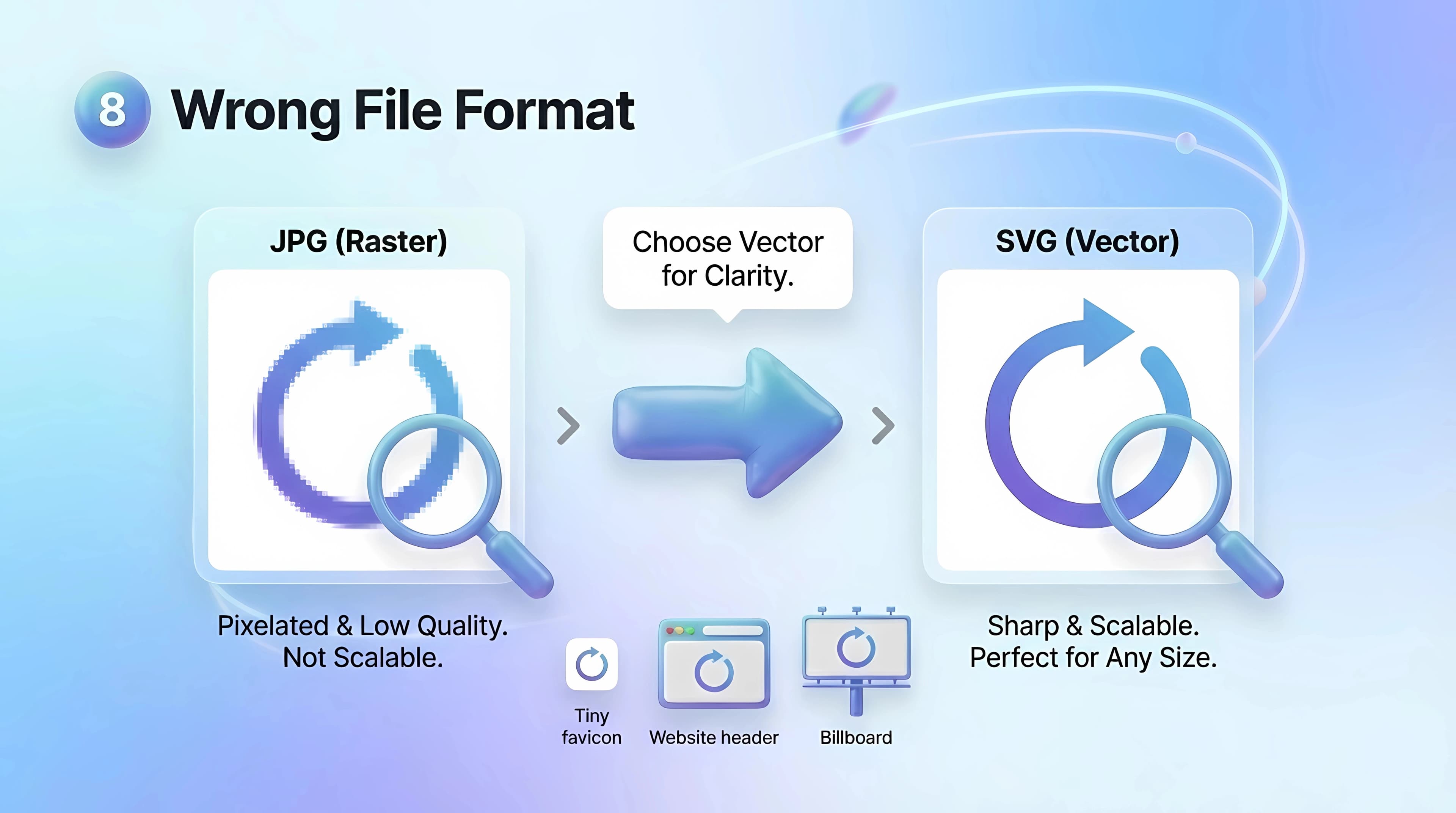
8-Using the Wrong File Format
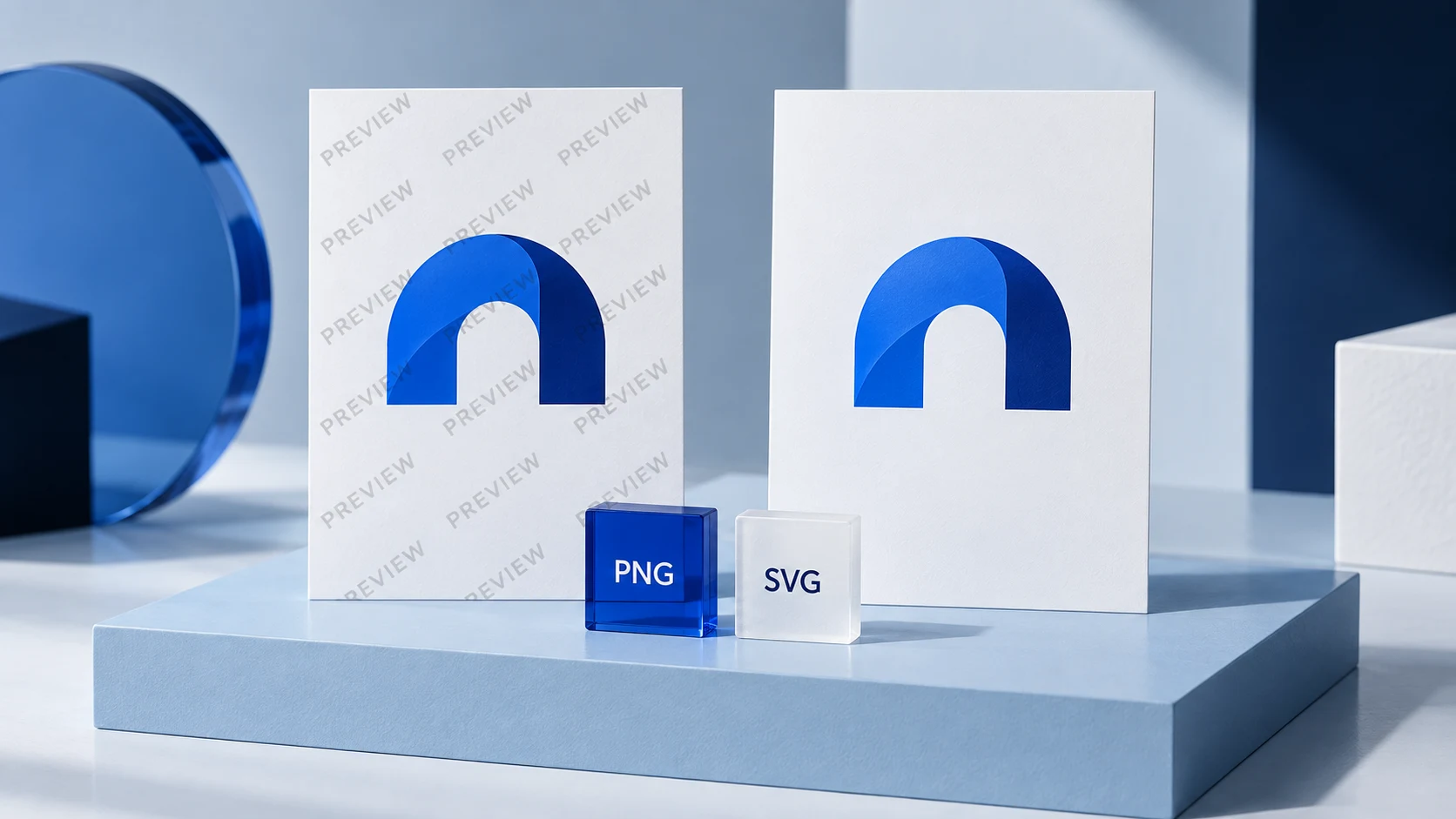
PNG, SVG, and JPG each serve a different purpose. PNG is ideal for transparent backgrounds. SVG scales to any size without losing quality. JPG is preferred for print materials.
Saving a logo in only one format creates serious usability issues — especially across different platforms and print requirements. Ficonica delivers high-resolution files in multiple formats, providing a logo set that is ready for every use case.
9-Moving Forward Without a Brand Kit
When the logo is ready, the work is not finished. Without documented color codes, typefaces, and usage rules, every new design decision has to be made from scratch. Inconsistencies accumulate — and the brand gradually loses visual credibility.
A brand kit is the single reference point for all visual decisions. Without one, every content creator pulls in a different direction. Ficonica delivers logo, color system, and typography together within a single structured system — ready to use as a brand kit from day one.
10-Designing for Trends
Every era has its popular design trends. A visual mark shaped around a trend, however, looks dated once that trend fades — and the logo design process starts all over again.
Avoiding this logo design mistake comes down to one principle: clarity, simplicity, and brand context outlast temporary aesthetic trends by a significant margin.
Ficonica's multiple visual style options support brand-driven decisions — not trend-driven ones.
Conclusion
Logo design mistakes are often made without awareness — and their effects only become visible as the brand grows. With the right tools and approach, most of these mistakes can be avoided from the very beginning.
Ficonica brings logo, color system, and typography together in one place. Explore all features, see how it works, or go straight to the brand kit generator and preview your brand for free.
Start with a free brand preview. See current plans and download features and review the refund conditions before purchasing.
Related Pages:
AI Logo Generator for Businesses Choosing the Right AI Logo Generator for Your Business: Features That Matter Most
Frequently asked questions
Why is considering the industry important in logo design?
Because logos communicate within a specific sector, aligning design elements with industry norms helps meet audience expectations and avoids confusion.
What happens if a startup uses the first logo design without exploring options?
They may miss better visual directions, resulting in a logo that doesn't fully represent the brand or connect with the audience.
How can a logo clash with brand colors and typography?
If the logo is designed separately from the color palette and fonts, it can create a visually inconsistent and fragmented brand identity.
Why should logos be tested across different platforms?
Because a logo might look good on a screen but perform poorly on social media, websites, or print, affecting brand perception.
What is the risk of skipping commercial usage rights checks?
Using logos without clear legal ownership can lead to serious legal complications when used for business purposes.
Recommended Articles
Join Our Newsletter
Join our creative community and stay ahead of the curve with fresh design perspectives.