What is brand evolution?
Brand evolution is a deliberate update that preserves useful continuity while changing what no longer fits. In this article, the focus is the visual identity and its use: symbols, wordmarks, colors, typography and templates. Those assets communicate the business, but they do not replace its offer, service quality or positioning.
A useful brief identifies both sides of the decision: what should remain familiar and what specific problem must improve. “The name must remain, but it needs a usable mobile header” is more actionable than “make the brand modern.” The first statement gives a designer something to preserve and a condition to test.
Brand evolution vs rebranding: choose the scale of change
A focused evolution may be enough when the business still serves the same audience with a relevant identity, but the artwork or templates perform poorly. A broader rebrand may be appropriate when the name, category or positioning now describes the wrong business. Inconsistent implementation is a third possibility: the identity itself may be suitable, while the team needs better files and rules.
Signs worth investigating before a redesign
Look for repeated workarounds: staff retyping the wordmark, removing a tagline differently in every document, or improvising colors because no usable palette exists. These observations suggest a system problem, but do not automatically justify replacing the symbol.
New channels can expose constraints that were previously irrelevant. A detailed storefront mark may become hard to use in a small booking interface. A growing team may need editable templates with fonts everyone can access. Collect the actual failing materials so the brief addresses those constraints rather than a general dislike of the old design.
Changes in the audience or offer deserve a separate discussion. If a repair shop expands into fleet maintenance, customers may need clearer service information before they need new artwork. Ask what misunderstanding the update is meant to remove. Do not use a change in sales alone as proof that the visual identity is responsible.
Decide what to keep, refine and replace
Collect representative touchpoints: the website, profile image, invoice, proposal, packaging and signage where relevant. For each item, record the current asset, the observed problem and who maintains it. Then divide proposed changes into three groups.
- Keep: elements that remain appropriate, such as the name or a distinctive silhouette.
- Refine: elements with a specific usability problem, such as spacing or a compact composition.
- Replace: elements that no longer fit or cannot reasonably be adapted.
Write the reason beside each choice. Keeping the name because the offer is unchanged is different from assuming customers recognize every detail of a logo. If recognition is central to the decision, investigate it with relevant people and record the limits of that evidence.
A brand evolution decision framework
Our editorial framework starts with an observable problem rather than an aesthetic preference. It is a way to organize evidence, not a validated prediction of revenue or customer recognition.
| Observation | First intervention | Evidence to collect |
|---|---|---|
| Different teams use different colors and old files | Repair brand operations | Audit current templates and where staff obtain assets. |
| The name works, but the logo fails in small placements | Develop and test an identity evolution | Compare the same old/new artwork at the failing sizes. |
| The business now serves a different buyer with a different offer | Revisit positioning before artwork | Document the offer, audience and recurring misunderstandings. |
A declining conversion rate alone does not establish a logo problem. Check the offer, traffic mix, page clarity and buying process before assigning the decline to visual identity.
A small real test: a color edit is not a complete rollout
For a controlled interface check on 25 September 2026, we used a fictional Morrow Studio brand in Ficonica. We kept its horizontal composition, name and subtitle fixed. In Manual Edit → Colors, we changed only Icon color from #097407 to #126e67, then moved focus out of the field.
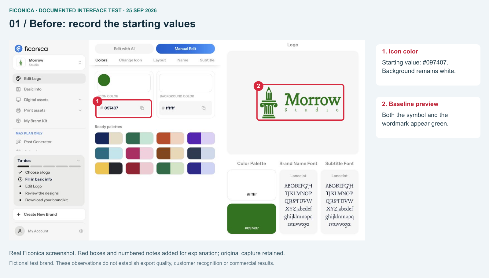
- The icon-color field contains #097407.
- The symbol and editable name both appear green before the change.
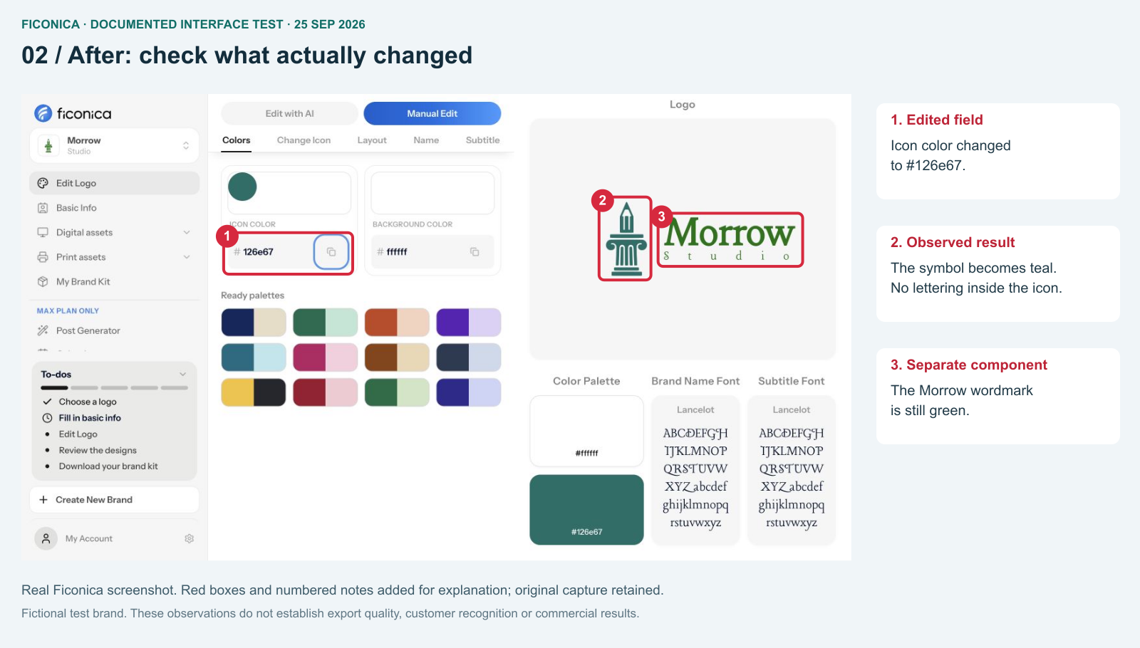
- The edited field now contains #126e67.
- The preview shows the teal symbol.
- Morrow remains green; the interface did not recolor every component.
The useful observation is the boundary of the change: this field updated the symbol, not the entire identity. The column-and-pencil symbol contains no embedded lettering; the editable Morrow and Studio text remains separate.
Use the same discipline for a genuine refresh: list every component meant to change, identify its owner and verify the resulting files. “We updated the color” is too vague if the wordmark, social templates and printed materials still use different values. Conversely, a deliberate two-color composition is not inherently wrong; what matters is whether it matches the approved design.
Ficonica is our own product. This test demonstrates a component-level editor change only. It does not establish that teal is more effective, that people prefer the revised mark, or that a rollout is complete.
Worked example: expanding a fictional repair shop
Imagine a bicycle repair shop adding servicing for delivery fleets. This is a hypothetical exercise, not a customer story. The owner wants to replace everything because the existing identity “feels too small.”
Write two separate briefs. The operational brief asks whether fleet customers understand the service, booking process and maintenance terms. The visual brief asks whether the mark remains legible on invoices, a mobile booking page and small vehicle labels. A new logo cannot answer missing service information.
If the existing name remains suitable and familiar to local customers, first prototype a clearer wordmark, a compact mark and a consistent document system. Preserve recognizable elements deliberately. If the old name now describes an offer the company no longer provides, broader positioning work may be justified. The decision depends on the mismatch—not the age of the logo.
Use a release sheet
List each touchpoint, its owner, the approved asset version, replacement cost and rollout date. Change inexpensive digital materials together where practical. For existing printed stock, decide whether a gradual transition will confuse customers before discarding it. Archive old files so they remain available for historical documents but cannot be mistaken for current assets.
Before release, test specific tasks with relevant people: identifying the business, reading its name at a chosen size and finding the service they need. Record participants and conditions honestly; a small informal check is not a statistically representative study. After release, compare consistent time windows and keep other changes visible. Do not attribute every commercial change to the design.
Extend the decision beyond the logo
Define how the approved palette, typography and compositions work in everyday templates. Choose a small set of representative materials to update first, then test whether another team member can use them without inventing new rules. A finished logo with no usable templates often leaves the original operational problem unresolved.
Separate prototype approval from launch approval. The prototype establishes what the identity should look like; the launch check establishes whether the right files have reached the website, documents and other touchpoints. Keep a record of unfinished replacements rather than declaring the entire brand updated after one editor change.
When should you rebrand your business? covers broader strategic triggers. Small-business rebrand examples provides a separate reading path; examples should not be treated as evidence that the same change will work for you.