Most small business branding trends are moving in one clear direction: simpler brand systems, faster production, and more consistent use across websites, social media, email, and print. For a small business, that matters more than chasing whatever style is popular this month. A useful brand is one you can actually apply everywhere without redesigning it every week.
That practical shift is shaping how newer brands are built and how older ones are cleaned up. The trend is not just about how logos look. It is about whether a founder, small team, or solo operator can keep the brand recognizable across real business materials. If you are launching, rebranding, or comparing DIY tools with hiring a designer, these are the small business branding trends worth paying attention to.
Why small business branding trends look different now
Small businesses do not usually have the same budget, timeline, or internal design support as larger brands. That changes what a trend means in practice. A design direction may look good in a portfolio, but if it falls apart on Instagram, invoices, packaging labels, and email signatures, it is not very useful.
That is why current branding choices are becoming more system-focused. Businesses want a logo, but they also need font pairings, color rules, social assets, and files that work in digital and print settings. The visual identity has to be flexible enough for daily use, not just polished enough for launch day.
1. Simpler logos with fewer fragile details
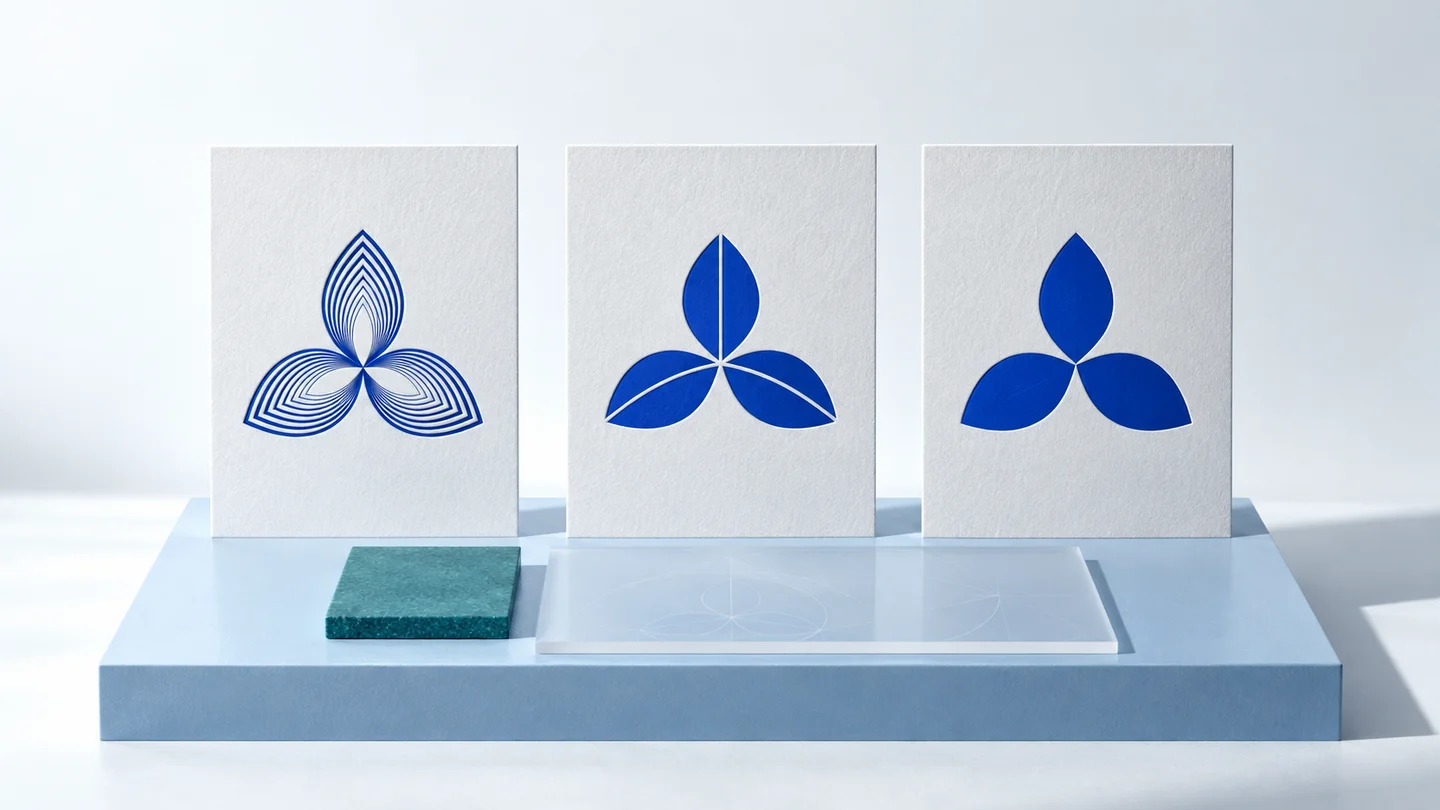
One of the clearest small business branding trends is the move toward cleaner logo concepts. That usually means fewer decorative effects, less visual clutter, and shapes that still read clearly at small sizes. This does not mean every brand should look plain. It means logos are being asked to work harder in more places.
A mark that looks impressive on a website header may become unreadable in a profile image or on a shipping label. Small businesses are increasingly choosing logos that survive size changes, background changes, and fast digital use. In practical terms, that often leads to stronger silhouettes, clearer spacing, and more restrained typography.
There is a trade-off here. Minimal logos can become generic if they remove too much personality. A business should simplify until the identity becomes usable, not until it becomes interchangeable with every other startup in its category.
2. Brand systems are replacing one-off logo files
A few years ago, many small businesses stopped after getting a logo. Now, more founders realize that a logo alone does not create a usable identity. A more complete visual system generally includes logo variations, a defined color palette, selected fonts, and basic guidelines for applying them.
This shift matters because inconsistency is one of the fastest ways for a small business to look unfinished. If the website uses one font, social posts use another, and the business card introduces a third style entirely, the brand starts to feel accidental.
That is why trend-watchers sometimes miss the bigger story. The real change is not a single design look. It is the growing expectation that even a very small company should have repeatable visual rules. For early-stage teams with limited time, an AI-assisted platform such as Ficonica may help create that kind of coordinated starting point faster than assembling assets piece by piece. For businesses that need deep strategy, custom illustration, or a highly original visual language, a designer or agency may still be the better fit.
3. More flexible color palettes
Another noticeable trend is the move away from overly rigid brand color use. Small businesses still need a primary palette, but many are choosing systems with one or two anchor colors plus supporting neutrals and accents. That gives them room to create social graphics, presentations, and promotional materials without looking repetitive.
This does not mean using every color available. It means planning for variety while staying recognizable. A useful palette usually balances personality with restraint. If every piece of content uses the loudest possible combination, the brand can become tiring. If every asset uses the exact same flat treatment, the brand may feel static.
The right answer depends on how the business shows up. A consultant may benefit from a narrower, calmer palette. A creator brand or product-based business may need more range for campaigns, launches, or seasonal visuals.
4. Typography is getting more attention
Fonts used to be an afterthought for many small businesses. That is changing. As more brands publish directly through websites, social posts, pitch decks, lead magnets, and email newsletters, typography has become one of the main ways a business signals tone.
Current branding trends favor font pairings that are clear, modern, and easy to reuse. That usually means one primary typeface for headlines and another for body text, with enough contrast to create structure but not so much that the brand feels fragmented.
This is one area where trend-following can go wrong. A fashionable font may look current for a moment but become dated quickly or hard to use across platforms. Small businesses generally benefit more from type choices that are readable, consistent, and broad enough to support regular content production.
5. Real-world mockups matter more than abstract design presentations
A growing expectation in branding is that you should be able to preview the identity in realistic contexts before committing to it. That means seeing how the logo, colors, and fonts behave on a website section, social profile, business card, or packaging surface.
This trend reflects a practical problem. Many branding decisions sound good in theory but fail once applied. A color pairing may look balanced in isolation and weak on a mobile screen. A wordmark may feel elegant in a brand sheet and too thin for signage. Mockups are not proof that a brand will succeed, but they are useful for stress-testing decisions before rollout.
For small businesses, this reduces rework. It helps answer a simple question early: can I actually use this brand in the places my business appears?
6. AI-assisted branding is becoming a serious starting point
One of the biggest shifts in small business branding trends is not visual at all. It is workflow-related. More entrepreneurs are willing to use AI-assisted tools to create an initial brand system, especially when speed and budget are tight.
That makes sense for businesses that need a professional-looking identity without a long agency process. If the goal is to move from idea to launch with coordinated visual assets, an AI-assisted platform may be suitable. It can reduce the blank-page problem and help non-designers make decisions faster.
But this is not a universal answer. AI-assisted branding is generally strongest when the need is straightforward: logo concepts, color direction, font pairing, and a practical set of branded materials. It may be less suitable when the project requires detailed market research, packaging architecture, custom illustration, naming strategy, or highly specialized creative direction. In those cases, a freelance designer or agency may justify the extra investment.
7. Consistency now matters more than originality for many small brands
This may be the most useful trend to understand. Many small businesses are no longer trying to look radically different at every touchpoint. They are trying to look stable, clear, and recognizable. That is a smart shift.
Originality still matters, but consistency usually delivers more value at the early stage. A business that applies the same logo variations, color system, and font choices across its website, proposals, social media, and email often appears more established than a business that experiments constantly without a visual framework.
There is a limit, though. If consistency becomes rigidity, the brand can feel stiff. The goal is controlled repetition, not visual monotony.
How to use these branding trends without copying everyone else
The safest approach is to treat trends as filters, not instructions. Ask whether a trend improves usability, clarity, and consistency for your specific business. If it does, consider it. If it only makes the brand look temporarily current, be more careful.
A local service business may need a clearer, more trust-building visual identity than a highly expressive one. A creator brand may benefit from more personality and range. An ecommerce business may need branding that works on product thumbnails, shipping inserts, and social promotions. The right move depends on where the brand lives and how often the business needs to produce assets.
Small business branding trends worth ignoring
Some trends create more noise than value. Constant logo redesigns, overly complex gradients, hyper-stylized fonts, and brand systems built around one social platform can all create maintenance problems later. If a design choice only works in a narrow context, it may not be a strong foundation.
It is also worth ignoring the pressure to make branding do every job in the business. Visual identity can improve recognition and professionalism, but it is not a substitute for a strong offer, clear messaging, good service, or smart marketing. Keeping those boundaries clear leads to better decisions.
The most useful branding trend for a small business is not any specific color, logo shape, or font style. It is the move toward practical brand systems that are easy to apply, easy to repeat, and strong enough to grow with the business. If your brand helps you show up consistently without slowing you down, you are already following the part that matters.