
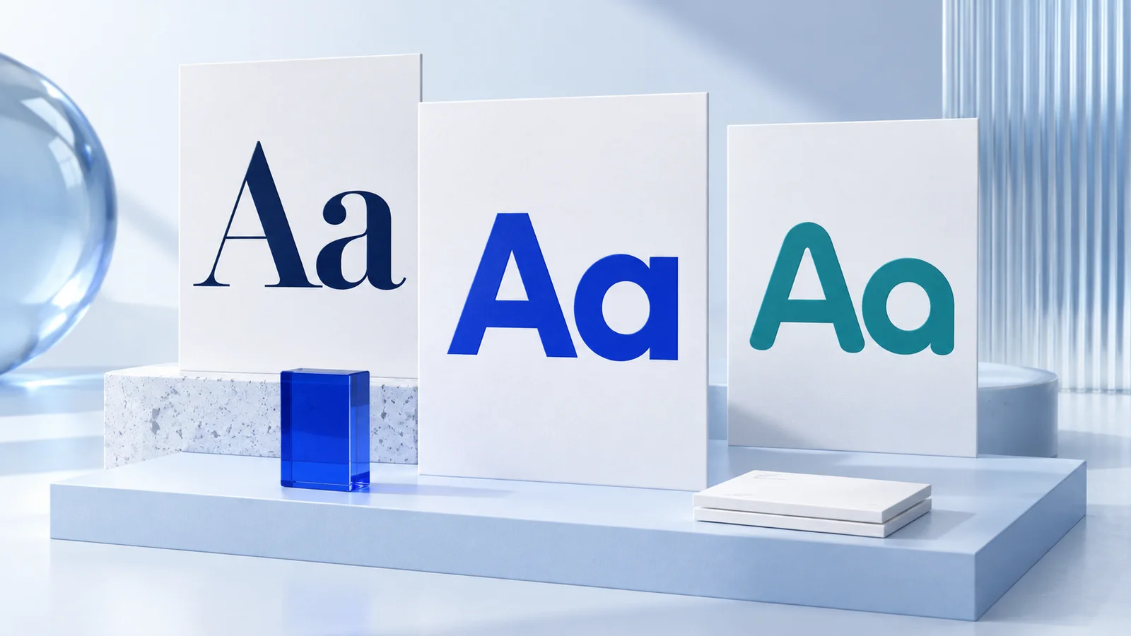
A font that looks convincing on a large presentation slide can fail in a narrow mobile header. Before downloading another typeface, write down your three most important logo placements. For a software company, those might be a website header, sign-in screen, and sales deck. For a coffee business, they might be packaging, a storefront, and a delivery label.
This guide combines an editorial shortlist with a repeatable selection exercise. The recommendations are design judgments, not results from a customer study or a measured ranking of font performance.
Compare the 12 options
Use this table to choose three candidates. The suggested directions are prompts to explore, not rules about what an industry must look like.
| Font | Direction to explore | What to check in your name |
|---|---|---|
| Inter | Restrained, digital, direct | Does the wordmark have enough identity alongside competitors? |
| Avenir Next | Calm, polished, approachable | Compare the same name in regular and heavier weights before choosing. |
| Helvetica Now | Understated and precise | Is the visual distinction coming from spacing, layout, or a separate symbol? |
| Montserrat | Bold, open, geometric | Does a longer name still fit the space available? |
| Poppins | Rounded and informal | Do repeated circular letters make your particular name feel too uniform? |
| DM Sans | Quiet and minimal | Does the name remain recognizable when supporting graphics disappear? |
| Space Grotesk | Expressive and technical | Are its distinctive letter shapes helpful for your audience? |
| Futura | Geometric and structured | Inspect each letter pair; do not assume default spacing is final. |
| Gotham | Solid and straightforward | Does it communicate the right tone without relying on color? |
| Canela | Soft, expressive, editorial | Inspect fine details at the smallest intended use. |
| Cormorant Garamond | Literary and decorative | Do delicate strokes survive your actual screen and print sizes? |
| Sora | Contemporary and digital | Compare its proportions with the icon and surrounding interface. |
How to narrow the shortlist
Inter and DM Sans: compare these first if you want the name to feel straightforward. Inter's official project includes text and display optical sizes; the particular cut and settings matter, so keep a record of the version you choose. Source: Inter project.
Avenir Next, Helvetica Now, and Gotham: useful alternatives when you want a restrained direction but prefer a different rhythm or shape. Compare the actual names side by side. A label such as “professional” does not tell you whether the spacing in your logo works.
Montserrat, Poppins, Futura, and Sora: start here when a more geometric direction interests you. Avoid stretching letters horizontally to squeeze a name into a header. Change the layout, size, or candidate instead.
Space Grotesk: include it when you want the letters to contribute more personality. Compare it with a quieter option using identical words, color, and space. Otherwise, you may be choosing the presentation rather than the typeface.
Canela and Cormorant Garamond: explore these when a more editorial treatment fits the brief. Inspect the precise weight you intend to use. A beautiful large specimen is not evidence that small packaging text or a narrow wordmark will remain clear.
A practical comparison exercise
Create one sheet with three candidates. Use your actual business name, the same capitalization, and black text on white. Adjust the sizes until the options have roughly comparable visual height; identical font-size values do not necessarily produce equally sized letters.
Then check four situations:
- Your mobile header. Place each option in the real layout at its intended display width. View it on a phone without zooming.
- Your smallest printed placement. Print at actual size. If packaging matters, ask for a proof on the intended material before committing to a production run.
- A single-color version. Compare dark-on-light and light-on-dark applications. Identify details that depend on a particular background to remain visible.
- The full name and required characters. Check punctuation, accents, and any alternate-language version you will actually use.
Google's typography guidance also stresses choosing for the application, display size, and language coverage. These are practical constraints, not details to postpone until launch. Source: Google Design.
Record “works,” “needs adjustment,” or “fails” for each placement. Reject a candidate that fails an essential use even if it is your favorite on the large specimen sheet. This is a suggested review method; it is not a validated scoring system.
What we measured with real font files
We rendered the fictional name Morrow using actual DM Sans, Space Grotesk, and Cormorant Garamond font files from the Google Fonts repository, downloaded on September 20, 2026. This specimen was generated from font files, not drawn by an image model.
| Font | Advance width at 64 px / weight 400 |
|---|---|
| DM Sans | 229 px |
| Space Grotesk | 234 px |
| Cormorant Garamond | 204 px |
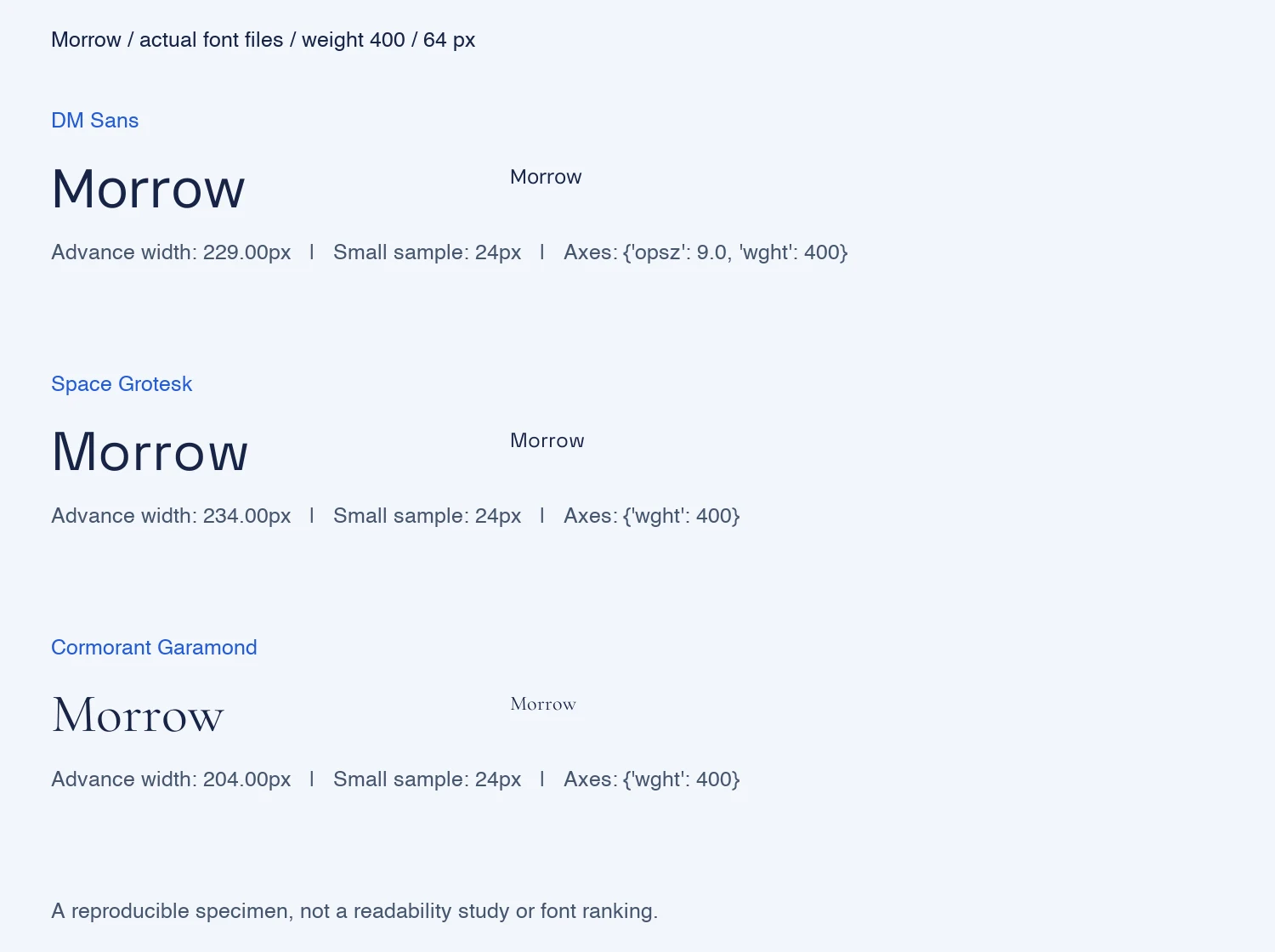
Method: Pillow/FreeType rendering, normal font spacing, weight 400, variable axes otherwise set to their file defaults. DM Sans uses its default optical-size axis of 9; this is not an optical-size-matched comparison. Smaller samples use 24 px. The image may scale on your screen, so labels describe source rendering sizes, not the displayed CSS size. Advance width measures the horizontal space allocated to the text, not just the visible ink.
What this tells you: for this name and these settings, Space Grotesk needs 30 px more horizontal space than Cormorant Garamond. Replacing a typeface without checking the actual name can change a header layout even when the font-size setting stays the same.
What it does not tell you: narrower is not better; we did not run a reader study or a physical print test. Other names, versions, spacing, weights and optical-size settings can produce different results. Compare at similar visual height when making the final design decision.
Measurement record and exact source-file hashes.
Example: choosing a direction for Morrow
Imagine Morrow, a fictional coffee startup that needs a packaging label, a business card, and an online storefront. Its brief is “quiet and considered,” with no requirement to look like a technology company.
A useful first comparison would be DM Sans, Space Grotesk, and Cormorant Garamond: three visibly different directions rather than three nearly identical candidates. Keep the packaging layout unchanged during the comparison.
If the editorial option fits the brief but loses detail on the smallest label, try a stronger weight or a simpler alternative. If the straightforward option works everywhere but lacks character, explore spacing and composition before adding another decorative element.
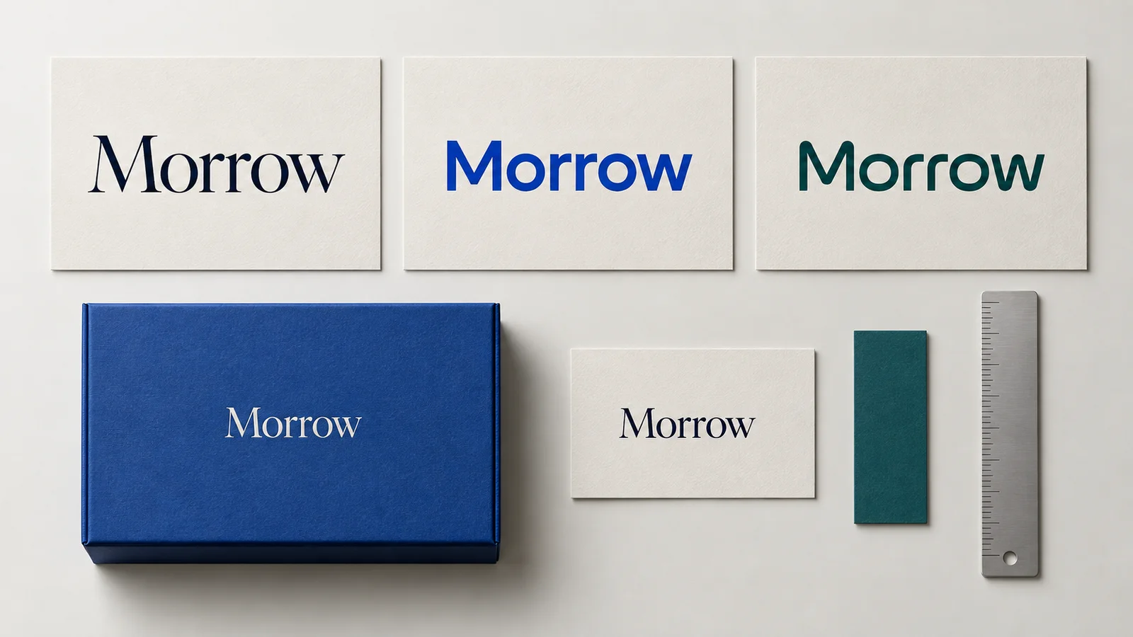
AI-generated concept illustration for this article. Morrow is a fictional example, not a customer project. The lettering is illustrative and does not reproduce a verified specimen of any font in the shortlist.
The image illustrates three lettering directions and a possible packaging application. Colors are used for presentation; use the same color for all candidates in your actual comparison exercise. It does not demonstrate that a named font passed a print or readability test. Those checks require the actual font files and production proofs.
Separate the wordmark from the tiny icon
A full business name does not have to fit inside a browser favicon. Treat that as a separate application: a symbol, initial, or simplified mark may be more appropriate. Test your full wordmark where readers will actually encounter it, rather than forcing a long name into an unreadably small square.
Similarly, your logo font does not have to carry every paragraph on your website. Choose supporting typography for the reading tasks it needs to perform, then document both roles in your brand guidelines.
Check the font source before finalizing
Record the exact family, weight, version, download source, and license supplied with the font. Do not assume all 12 options have identical terms or are included in your design tool. For a paid family, review the foundry's current terms for your intended uses before purchasing or handing files to another person.
Once your direction is clear, explore a coordinated brand identity with Ficonica. Use your shortlist as a brief, then judge the resulting logo in the placements your business needs.