The best logo maker for startups is usually the one that helps you create a usable brand system, not just a logo image. For a founder preparing a website, pitch deck, social profiles, invoices, and printed materials, the practical question is whether the tool gives you enough control and the right assets to stay consistent after launch.
A fast logo generator can be a sensible starting point when your business is early-stage, your budget is limited, and you need a clear visual direction quickly. It is less suitable when your brand requires deep positioning work, a distinctive illustration style, or a complex packaging and product ecosystem. The right choice depends on what your startup needs to communicate and where the identity will appear.
What a startup should get from a logo maker
A logo is only one part of what people see. If you choose a mark that looks acceptable in a preview but cannot apply it consistently elsewhere, you may create more work for yourself later. A useful logo maker should help you make decisions about the visual pieces that work together: logo layout, colors, type, and supporting applications.
Start by checking whether you can customize the concept rather than accepting the first generated result. You should be able to adjust details that affect everyday use, such as the business name, tagline, icon choice, colors, fonts, spacing, and the relationship between the symbol and wordmark. The goal is not unlimited creative control. It is enough control to make the identity feel specific to your business rather than generic to your industry.
Also look beyond the main horizontal logo. A startup often needs a compact version for profile images, a single-color version for simple applications, and a mark that remains readable at small sizes. A design that works only as a large website header can become difficult to use on social media, presentation slides, email signatures, or labels.
6 checks for the best logo maker for startups
1. Start with the quality of the brief
The output can only be as relevant as the information you provide. A useful tool should ask for more than a company name. Your industry, audience, personality, and preferred visual direction all influence the result.
Before generating anything, write a short working brief for yourself. Include what you sell, who you serve, three words you want the brand to suggest, and two or three things you do not want it to resemble. For example, a bookkeeping service for independent creatives may want to feel organized, approachable, and calm, while avoiding the cold visual language common in large financial firms.
This step helps you evaluate concepts with a purpose. Otherwise, it is easy to choose a logo simply because it looks polished in isolation.
2. Check whether the logo works at small sizes
Startup logos spend much of their life in small spaces. Browser tabs, social avatars, mobile headers, and email signatures are less forgiving than a large landing page.
When reviewing a concept, reduce it mentally to the size of a profile image. Are the letters still easy to read? Does the icon contain tiny details that will disappear? Is there enough contrast between the logo and a likely background color? Simple forms are not automatically better, but they are generally easier to reproduce across small digital uses and basic print materials.
Ask for or create variations before you become attached to one layout. A full logo with an icon and name may be appropriate for a website header, while a simplified icon may be more practical for an account avatar.
3. Evaluate the complete asset set
A logo file alone does not create a ready-to-use identity. Consider the places where you plan to show up during the next six to twelve months: a website, social channels, proposals, invoices, slides, product packaging, printed cards, or a storefront sign.
The best tool for your situation may include coordinated assets or brand previews that help you see how a visual direction carries across those uses. This matters because a color palette and font pairing can make everyday materials look connected, even when different people create them.
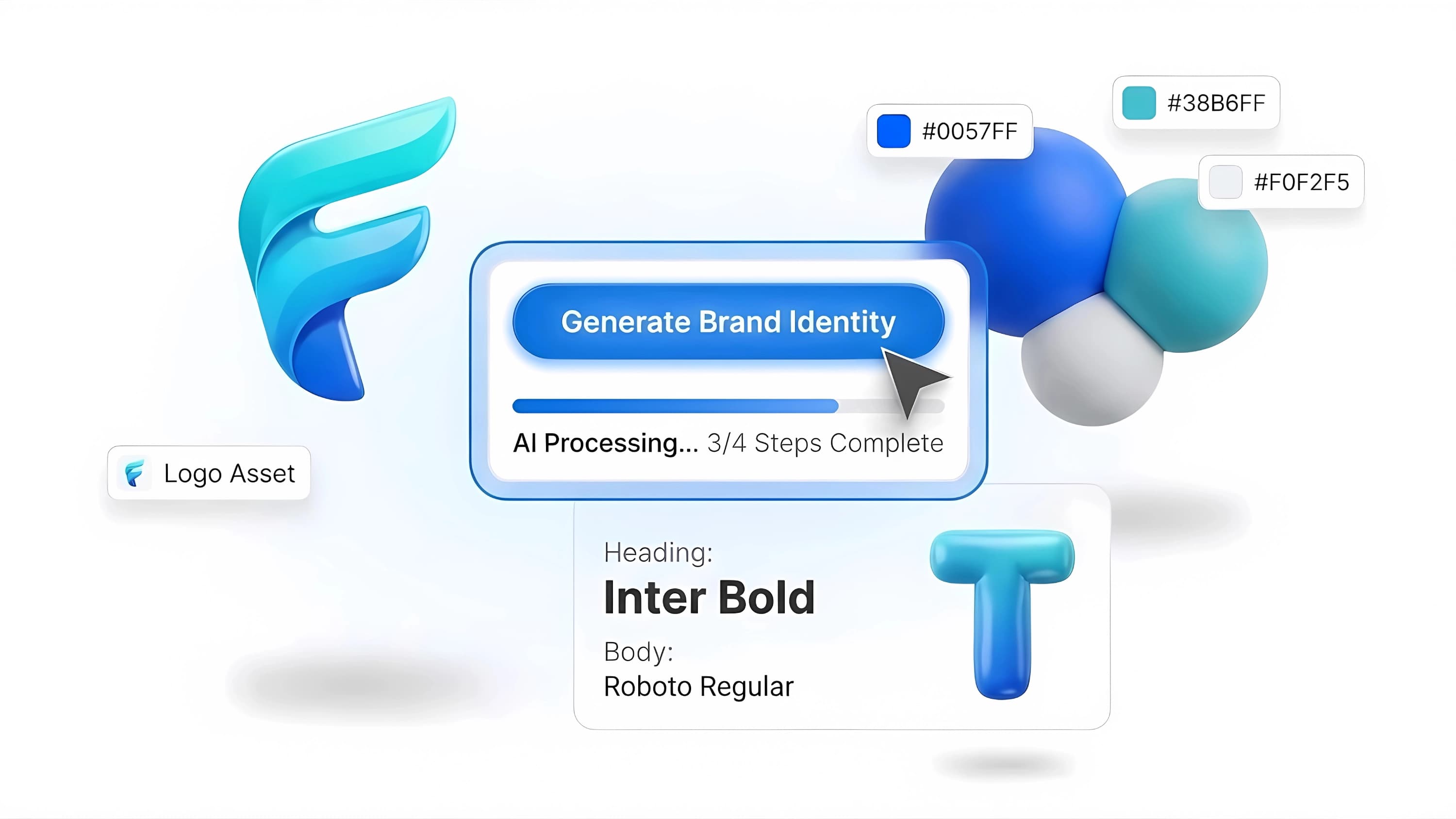
Ficonica is one practical option for founders who want to move from a business description to logo concepts, customization, color and font choices, brand previews, guidelines, and downloadable assets in one workflow. That approach may be useful if you need a coordinated starting system rather than a standalone logo. Confirm the specific assets available with the product you select, since needs vary by business and product option.
4. Understand the files you will need
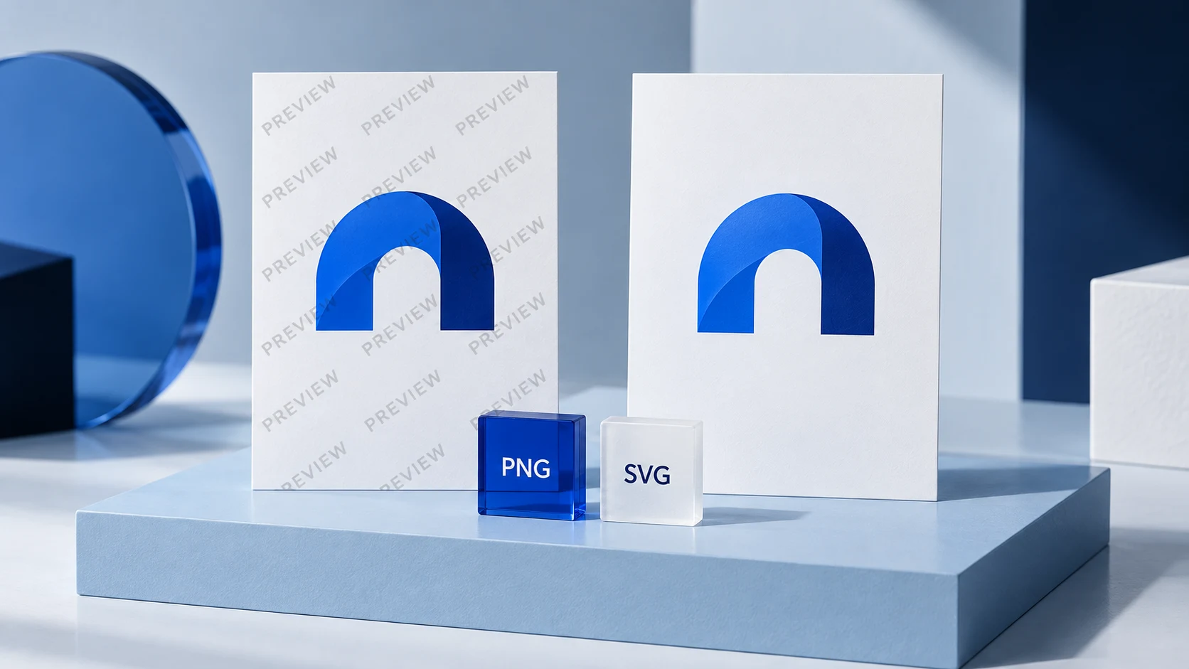
You do not need to become a print-production expert, but you should know why file types matter. Raster files, such as PNG and JPG, are made from pixels. They are useful for many digital placements, and a PNG can support a transparent background. Vector files are built from paths and can generally be scaled without becoming blurry, making them useful for larger print and signage applications.
Ask what files are included before committing to a tool. Consider whether you need files for a web developer, a print vendor, or editable internal materials. You may also need light and dark logo versions, depending on the backgrounds you use.
Do not assume that every export will suit every purpose. A JPG may be fine for a basic social post but is usually not the most flexible choice for a logo placed over different website backgrounds. Save your final files in an organized folder and give them clear names. That small habit prevents the common problem of a team using an outdated or low-resolution version months later.
5. Look for guidance, not just options
More logo choices do not necessarily make the decision easier. For non-designers, a platform that explains color, typography, and layout choices can be more helpful than one that produces hundreds of disconnected concepts.
A basic brand guide should show the approved logo versions, colors, type choices, and simple rules for use. It does not replace a full brand strategy. It does, however, give a founder, contractor, or future employee a shared reference when creating a slide, post, document, or webpage.
Be cautious about making every element highly decorative. A distinctive font can be appealing, but it may be difficult to read in long text or unavailable in the tools your team uses. Similarly, an elaborate icon may look memorable in a mockup but lose clarity in small placements. Practical use should carry as much weight as visual novelty.
6. Compare the tool with human help honestly
An AI-assisted logo maker is generally suitable for businesses that need a credible, cohesive visual starting point without a traditional agency engagement. It can also help founders test directions before investing in more customized work.
A freelance designer may be a better fit when you want close collaboration and a tailored identity but do not need the scope of an agency. A branding agency may be more appropriate for businesses facing a major launch, multiple audiences, a complex naming challenge, extensive research needs, custom illustration, packaging systems, or broad creative direction across many touchpoints.
The trade-off is not simply speed versus quality. It is the level of strategy, originality, collaboration, and revision your situation requires. A simple local service business and a consumer product entering a crowded retail category may need very different levels of design support.
Avoid these common selection mistakes
Do not choose a concept because it resembles a familiar company in your category. Familiarity can make a design feel safe, but it can also make your business harder to distinguish. Use competitors as context, then look for a direction that reflects your own offer and audience.
Do not treat a generated logo as a trademark or business-name clearance process. Visual branding tools can help create and organize design assets, but questions about name availability, trademark registration, ownership, and legal rights require appropriate independent review.
Finally, do not keep changing the identity after every new social post or piece of feedback. Once you have selected a practical direction, use it consistently long enough to learn how it performs in real contexts. You can refine your brand over time, but consistency gives customers and collaborators a clearer experience of your business.
Choose a logo maker by testing a few concepts against the real places your startup will appear next week. If the design stays clear, the files meet your needs, and the supporting colors and type are easy to apply, you have a workable foundation to build on.