
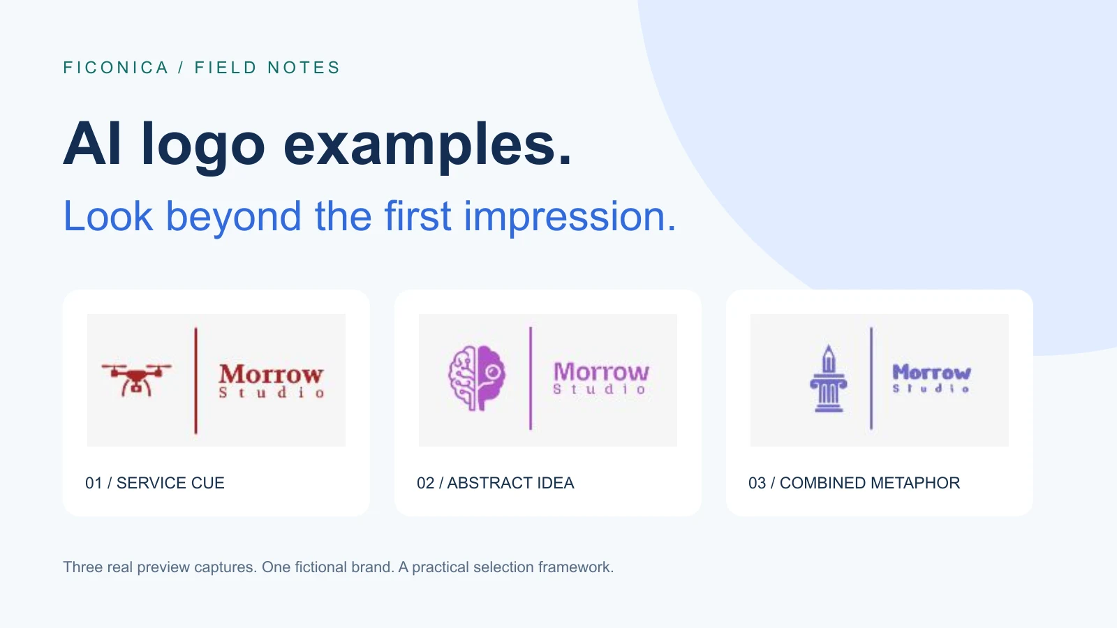
We reviewed Ficonica’s results screen on October 11, 2026 using the fictional name Morrow Studio. The three examples below came from the account’s Your unlocked logos section, which includes earlier previews. They were not three newly generated responses to an identical prompt. This is Ficonica’s own editorial analysis of its interface, not an independent tool ranking.
Start with the job, not the gallery
“Morrow Studio” could describe a photographer, a design practice, or a technology consultancy. The name alone cannot tell us which logo is right. For this worked example, imagine a small design studio that creates editorial layouts and visual identities. Its first uses will be a proposal cover, a website header, and a social profile. The intended character is structured, thoughtful, and creative.
That short brief gives us a reason to compare the designs. A drone symbol may be easy to recognize but suggest a service the studio does not offer. An intricate technology symbol may be relevant to a different business. A column and pencil may connect more closely with this particular brief. These are interpretations of visible shapes, not measurements of customer recognition or evidence that a logo will increase sales.
Three AI-assisted logo examples, with different trade-offs
1. Drone: a direct cue for a specific service
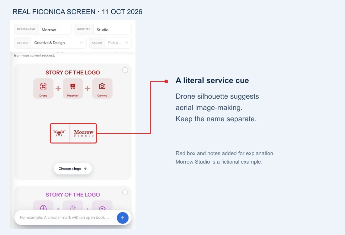
The drone silhouette gives this direction a fairly literal subject. The interface describes the story as Drone + Propeller + Camera. A reader can inspect the visible symbol instead of relying on that description alone. The business name sits beside it, separated by a vertical line; the word “Morrow” is not baked into the symbol.
Where it could fit: a fictional aerial photography studio whose core work is drone imagery. Where it could mislead: our editorial design studio. A coherent-looking logo can still point toward the wrong service. For our brief, we would set this one aside before spending time on its color.
Next check: view the propellers, camera detail and subtitle at the smallest intended placement. The large preview does not prove they will remain legible in a compact header. If aerial work is only a temporary service, also consider whether the literal subject would constrain future positioning.
2. Brain and circuit: an idea-led technology direction
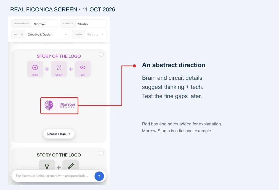
This symbol combines organic-looking contours with circuit-like geometry. It offers a richer conceptual story than a single literal object. We would consider it for a fictional business whose positioning connects thinking and technology, such as a creative software consultancy. That is an editorial fit judgment, not a claim about a real client.
The trade-off is visible interior detail. Several curves and gaps need space. A symbol may work well on a presentation cover yet need a simpler companion for very small placements. Do not assume that adding “intelligence” or “innovation” to its story makes those ideas obvious to someone who has not read the explanation.
For our brief: keep it as a secondary direction only if technology is central to the studio’s offer. Next check: inspect the actual icon file at the intended size and in one color. We did not export or recolor this mark in this session, so those checks remain open.
3. Column and pencil: a metaphor tied to the brief
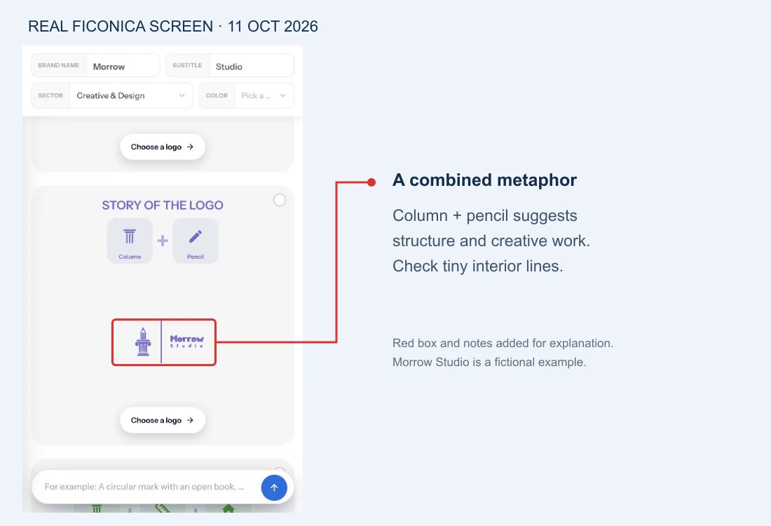
The column supplies a structural shape; the pencil introduces a creative association. For our fictional editorial design studio, that combination gives us a clearer reason to shortlist it than the drone. It connects with the words in the brief without needing to illustrate every service the business offers.
There is still a trade-off. The pencil tip and the column’s interior lines are fine details. The presence of a strong overall idea does not excuse skipping size tests. We would also review the name typography separately: a promising icon does not automatically make the whole composition suitable.
Our decision: shortlist this direction for refinement, not immediate launch. It fits this specific brief best among the three shown. We have not established that it is exclusive, legally cleared, print-ready, or preferred by an audience.
What about wordmarks, lettermarks and badges?
The screenshots above are combination marks: a symbol plus a name. They do not demonstrate every kind of AI-assisted logo. Use the other structures when they solve a real placement problem, rather than choosing the format with the most decoration.
| Structure | Useful when | Question to ask |
|---|---|---|
| Wordmark | The name itself should lead. | Can the full name be read in the smallest header you need? |
| Lettermark | A long name needs a compact companion. | Will new visitors know what the initials stand for? |
| Abstract symbol | The business needs a flexible visual association. | Does it still make sense alongside your positioning? |
| Badge or emblem | A contained shape suits packaging or larger placements. | Will enclosed lettering and detail survive reduction? |
No one structure is universally more professional. A wordmark may be the clearest solution for one business, while a symbol gives another business a useful profile image. Those alternatives are explanatory categories here; we did not generate or test examples of all of them.
Four checks before committing to a concept
- Meaning: show the concept without its story and ask what kind of business it suggests. Record the answers rather than coaching the viewer toward the intended meaning.
- Small use: place the actual logo file in your intended website header and avatar. Choose dimensions from those placements. There is no universal minimum size established by our screenshots.
- Color independence: inspect a genuine one-color version, plus the version intended for dark backgrounds. A full-color preview does not prove either exists or works.
- Delivery: inspect the files you will actually receive and the current plan and usage terms. A preview is not an export, and a file extension alone does not establish the contents or suitability of the file.
For this article, we completed a visual review of the live previews only. We did not run an audience study, download paid files, test a printed sample, or perform trademark clearance. Keep these as explicit next steps where relevant to your business. Do not turn an attractive screenshot into a claim that all four checks passed.
Use a shortlist, not an endless gallery
Write one sentence for each candidate: “This supports our brief because…” Then add the strongest reason against it. For our studio, the drone points toward the wrong service; the brain direction overemphasizes technology; the column-and-pencil direction fits structure and creative work but still needs detail and typography checks.
That leaves one concrete next action: refine the shortlisted direction with one change at a time. Our logo customization guide shows a separate, documented color-edit workflow. This article chooses a direction; that guide helps you edit one. Keep a record of the original concept so each adjustment has a visible baseline.
If none of the candidates supports the brief, revisit the brief or explore a different direction. A platform can help you compare possibilities, but specialized illustration, research-heavy positioning or a complex identity system may call for a designer. More results are useful only when they improve the decision.
FAQ
Were these logos generated from one prompt?
No. They are existing unlocked previews shown with the same fictional brand name. The interface explicitly says that this section can include logos from earlier searches. No fresh paid generation was performed for this article.
Which example is best?
For the fictional editorial studio brief, we would shortlist column and pencil. For an aerial photography business, the drone could be the more relevant starting point. “Best” depends on the job, not the position in a gallery.
Can I use the screenshots as my finished logo?
Treat them as educational examples. Use the platform’s proper file workflow and check the applicable terms for your own chosen design. This article does not grant rights to the illustrated assets.
Does an AI logo example prove a design is unique?
No. A visual preview and its story cannot establish exclusivity or legal clearance. Those questions require a separate check before you rely on either claim.
Start with your business name and compare the meaning of the symbols you see.
Explore Ficonica →Check current plans and download terms before purchasing.
Recommended Articles
- Choose a brand name and logo — define the brief first.
- Logo customization for beginners — refine the shortlisted direction.
- Create logo variations — plan different placements.