What are logo variations, and which ones do you need?
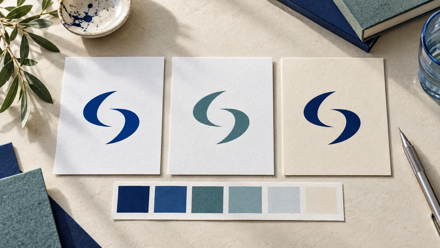
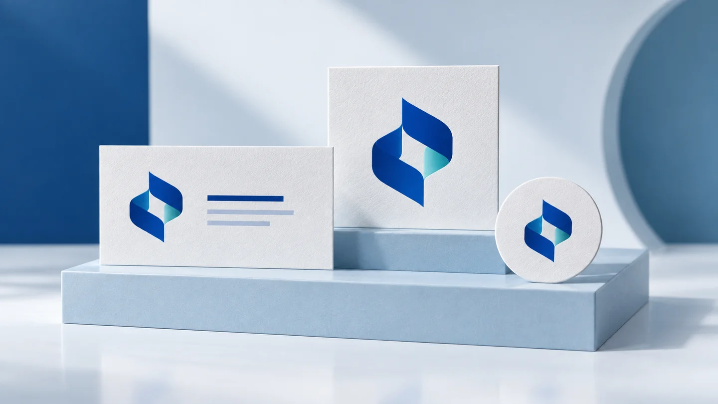
Logo variations are approved arrangements or color treatments of the same identity. They preserve its recognizable ingredients while adapting to different spaces. A horizontal logo, a stacked logo and an icon-only mark solve different placement problems; they are not three unrelated logo concepts.
Start with the places where your business actually appears. A wide website navigation bar and a circular profile image impose different constraints. A stamp introduces another constraint: one ink color and a production process that may lose small gaps. Do not create a large export folder before deciding which of these problems you need to solve.
| Variation | Useful starting point | What to check |
|---|---|---|
| Primary logo | Your complete, approved identity | The full name, symbol and spacing work together. |
| Horizontal logo | Wide headers and document headings | The available height still permits a readable name. |
| Stacked logo | Square labels and compact compositions | Rearranging elements does not crowd the name. |
| Icon-only logo | Small avatars or favicon candidates | The symbol is useful without the name and survives the crop. |
| One-color or reversed logo | Single-ink production or dark backgrounds | Every essential shape remains visible. |
How to create logo variations step by step
1. Approve the primary logo before making alternatives
Check the spelling, the symbol and the letterforms first. Keep an editable master and distinguish the symbol from the wordmark and optional tagline. If the primary artwork contains an unwanted name or too much fine detail, rearranging it will spread that problem into every variation.
2. Build horizontal and stacked compositions
Move the elements rather than stretching the complete logo. Compare alignment, the distance between the symbol and name, and the balance of their visual sizes. A long name may need a deliberate line break; a short name may not. Save both arrangements only if they solve different uses.
3. Decide whether a compact mark can stand alone
A symbol-only version removes the name, which can also remove useful information. For an unfamiliar brand, retain a readable name wherever the layout permits it. Test a compact mark in context before assuming that viewers will identify the business from the icon alone. This article does not report a recognition study.
4. Make background and single-color versions
Composition and color are independent choices. A horizontal composition may need both dark-on-light and light-on-dark treatments. A one-color version should work as a silhouette without relying on a gradient to separate its parts. Inspect the result on the intended background; a transparent canvas does not guarantee sufficient contrast.
5. Set spacing rules and hand off approved files
Choose a repeatable clear-space reference, such as the height of a particular letter, and test whether that margin works in your actual layouts. Treat it as your identity's rule, not a universal measurement. Record minimum sizes only after checking the artwork at those sizes. Name exports by composition, color and format so another person can choose correctly.
Horizontal vs stacked logo: our documented editor test
On 25 September 2026, we used Ficonica in a desktop browser at a 1280 × 720 viewport. We created a fictional test brand, Morrow Studio, and selected an available unlocked logo preview. Ficonica is our own product; this is a documented interface test, not an independent comparison or a customer case.
In Edit Logo → Manual Edit → Layout, we first selected the stacked layout to place the symbol above the name. We then selected the upper-right horizontal layout tile, leaving the name, subtitle and icon-size setting unchanged. The right-hand preview moved the symbol beside the name. This is an observed layout change; we did not measure recognition or test a printed output.
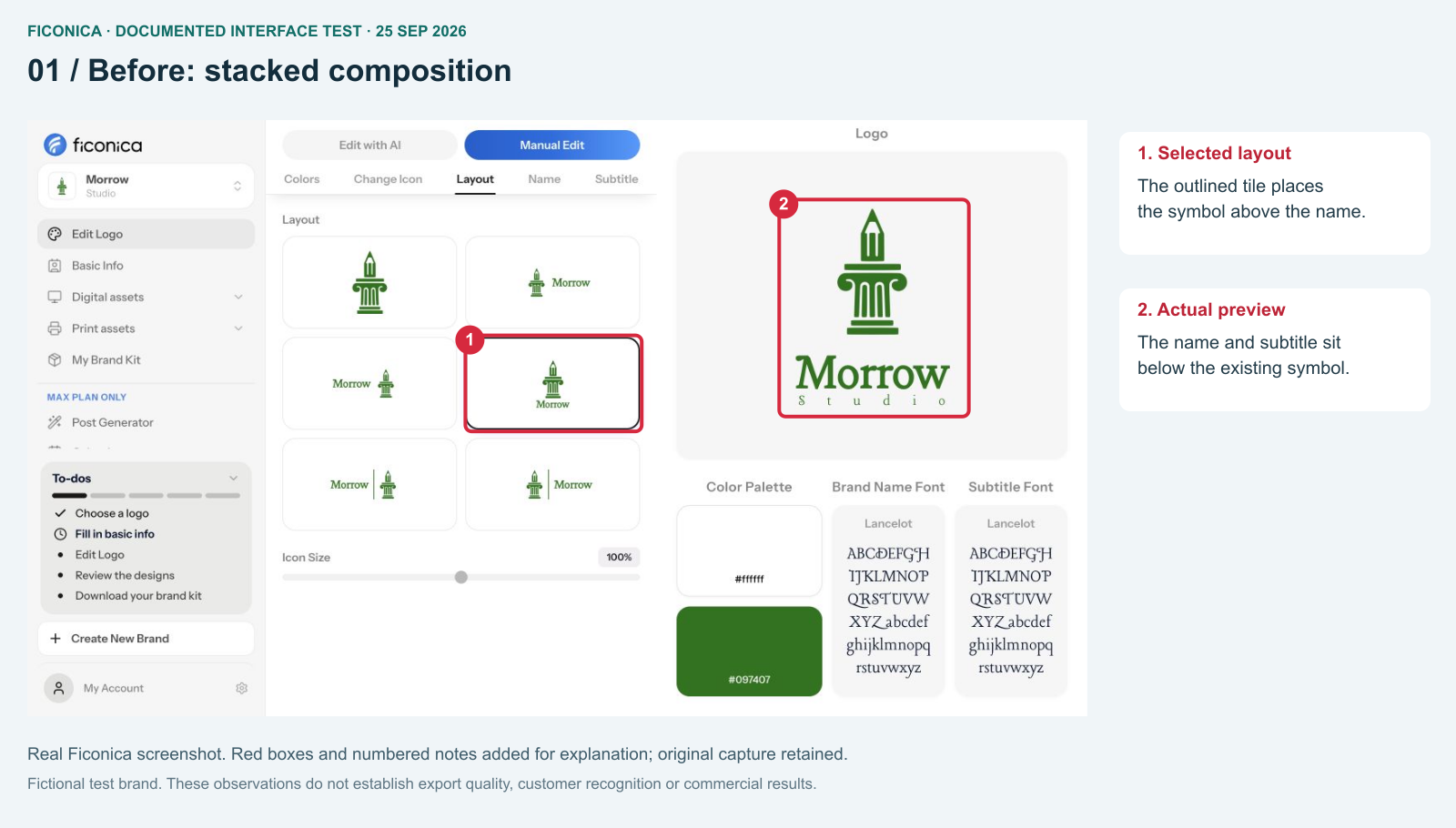
- The selected tile identifies the current composition.
- The right-hand preview is the result to inspect, not just the thumbnail.
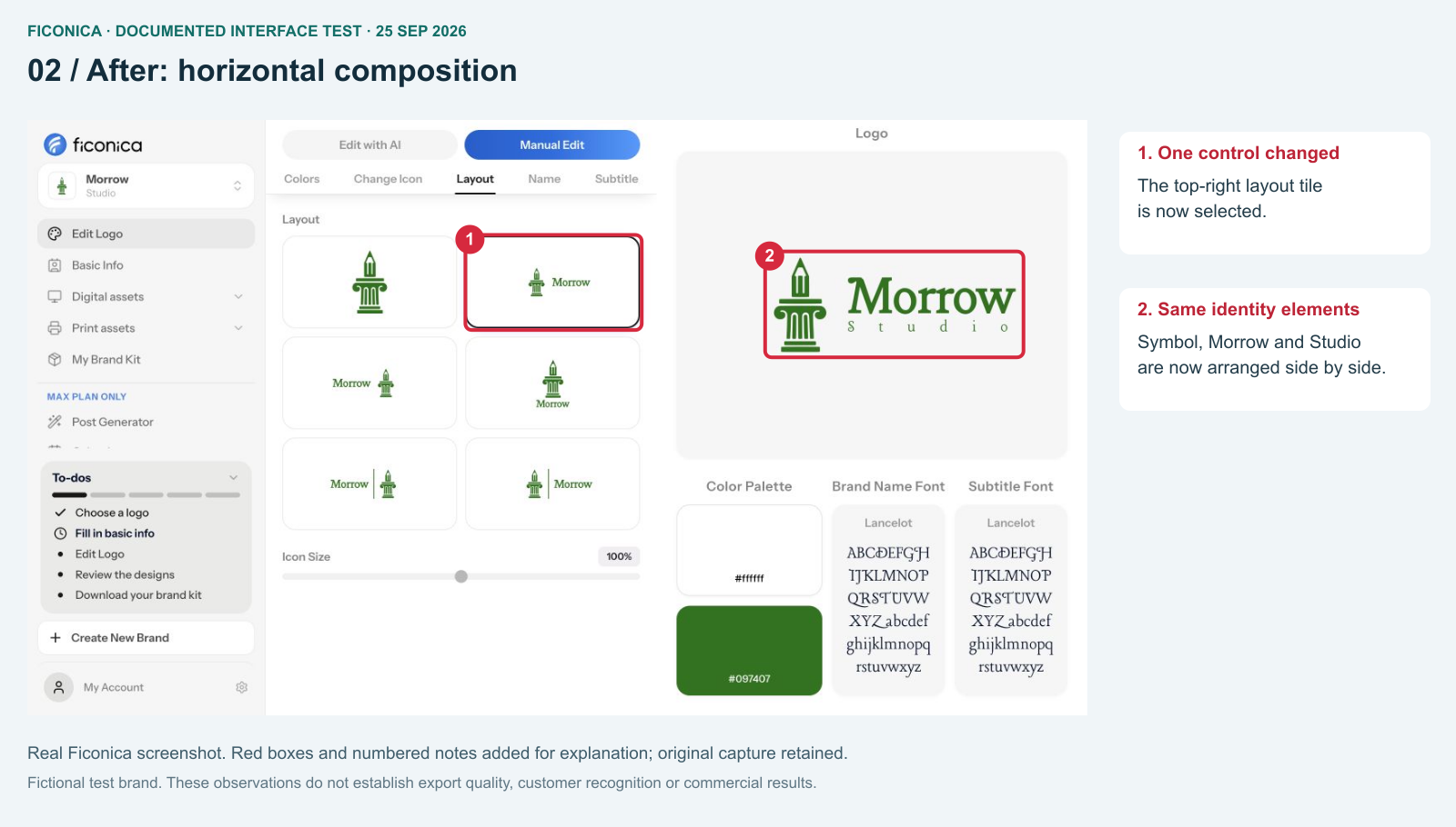
- Only the composition was changed in this step.
- The name and subtitle remain visible next to the symbol.
Approve the symbol separately from the wordmark
For this retest we selected a column-and-pencil symbol and visually checked that it contains no embedded lettering. Morrow and Studio are separate text elements in the composition. That separation keeps the same clean symbol available for a compact icon-only version.
Inspect the symbol before testing layouts: there should be no unrelated name or accidental lettering inside the artwork. Then inspect the whole composition at the intended small size. A successful editor preview does not establish a minimum print size; request a production proof for physical materials.
A worked example: a fictional neighborhood bakery
The bakery below is a separate planning example, not the Morrow Studio interface test or a customer case. A fictional bakery needs a website header, a round social avatar, a paper stamp and a square package label. List those destinations before making files.
| Placement | Proposed composition | Reason to test |
|---|---|---|
| Wide website header | Symbol beside the name | The name should remain legible at the header's actual height. |
| Round profile crop | Symbol, if recognizable | The circle must not clip meaningful edges. |
| One-color paper stamp | Name and simplified symbol | Small gaps may close in the chosen production process. |
| Square package label | Stacked symbol and name | Reserve room for product information rather than enlarging the logo to fill every space. |
The matrix explains why each variation exists. If two compositions solve the same placement equally well, keep one. If the symbol is not recognizable alone, use a compact name-based design for the avatar instead of assuming every brand needs a standalone icon.
Decide what stays fixed
Choose the identity elements that carry recognition: the symbol's core silhouette, the wordmark's letterforms and the relationship between them. Start with approved artwork. Adapt spacing and orientation deliberately; do not stretch the master to fit a rectangular box. A stacked composition is a designed arrangement, not a squeezed horizontal one.
Next make a color-use table. Specify which version belongs on a light background, which belongs on a dark background and which works in one color. Test light-on-dark versions directly: reversing colors can change how fine gaps and thin strokes appear.
Inspect the output, not only the editor canvas
Put each export into a mock placement at its intended size. For the bakery example, inspect a 240 × 48 CSS-pixel header slot and a 48 × 48 CSS-pixel avatar as chosen test fixtures—not universal minimum sizes. Check a circular crop, a dark background and a grayscale copy. For a stamp, request a proof from the actual supplier before setting a minimum-size rule.
Record the reason for every rejection: unreadable name, clipped edge, disappearing gap or wrong background. This produces a useful revision brief. “Make it pop” does not tell a designer which constraint failed.
Organize the logo variation system
Deliver a usage sheet showing each composition on its intended background. Use names such as morrow-horizontal-dark.svg and morrow-icon-transparent-96w.png only when those descriptions match the actual exported files. Keep the editable master separate from everyday exports. Assign someone to approve additions so a new layout does not silently become a second identity.
What files does a logo need? addresses export formats. Website logo optimization addresses implementation.