Cover: AI-generated editorial concept, not a customer project or a product screenshot.
This beginner’s guide focuses on making and evaluating edits after you have chosen a logo direction. For the broader decisions about your audience, identity and creative direction, read our guide to logo customization. The worked example here is an editorial exercise using fictional Morrow Studio, not a completed customer project or a measured usability study.
1. Write the problem before touching a control
“Make it better” is too vague to evaluate. “The symbol disappears against the background used in our proposal” gives you something to check. Other useful problems are a name that is difficult to read, a cramped gap between the icon and wording, or a layout that does not fit a website header.
Separate a functional problem from a preference. You may prefer a warmer color without making the logo more legible. That is a valid design choice, but record it as a preference rather than claiming that it improves recognition or sales.
| What you notice | Try first | What to compare |
|---|---|---|
| The symbol fades into the intended background | A different approved logo color or background | The same symbol, at the same size, on the actual background |
| The business name is hard to read | A simpler typeface, or more room for the name | Read the complete name at its intended display size |
| The icon crowds the text | The gap between those elements, if the editor provides that control | The same layout before and after the gap change |
| A long logo does not fit an avatar | An approved compact variation | The avatar crop, without stretching the original |
These are starting points, not guaranteed fixes. If a logo needs several changes, make them in separate comparisons so you can tell which change helped.
2. Save a baseline you can reproduce
Before editing, save the original through the tool’s available save or duplicate function, or record enough settings to restore it. Do not assume that a tool’s undo history will survive closing the page.
Record the business name, chosen symbol, font, color values where available, layout and intended background. Keep a screenshot of the original view with the logo visible. A screenshot documents appearance; it does not replace an editable source or prove that an export works.
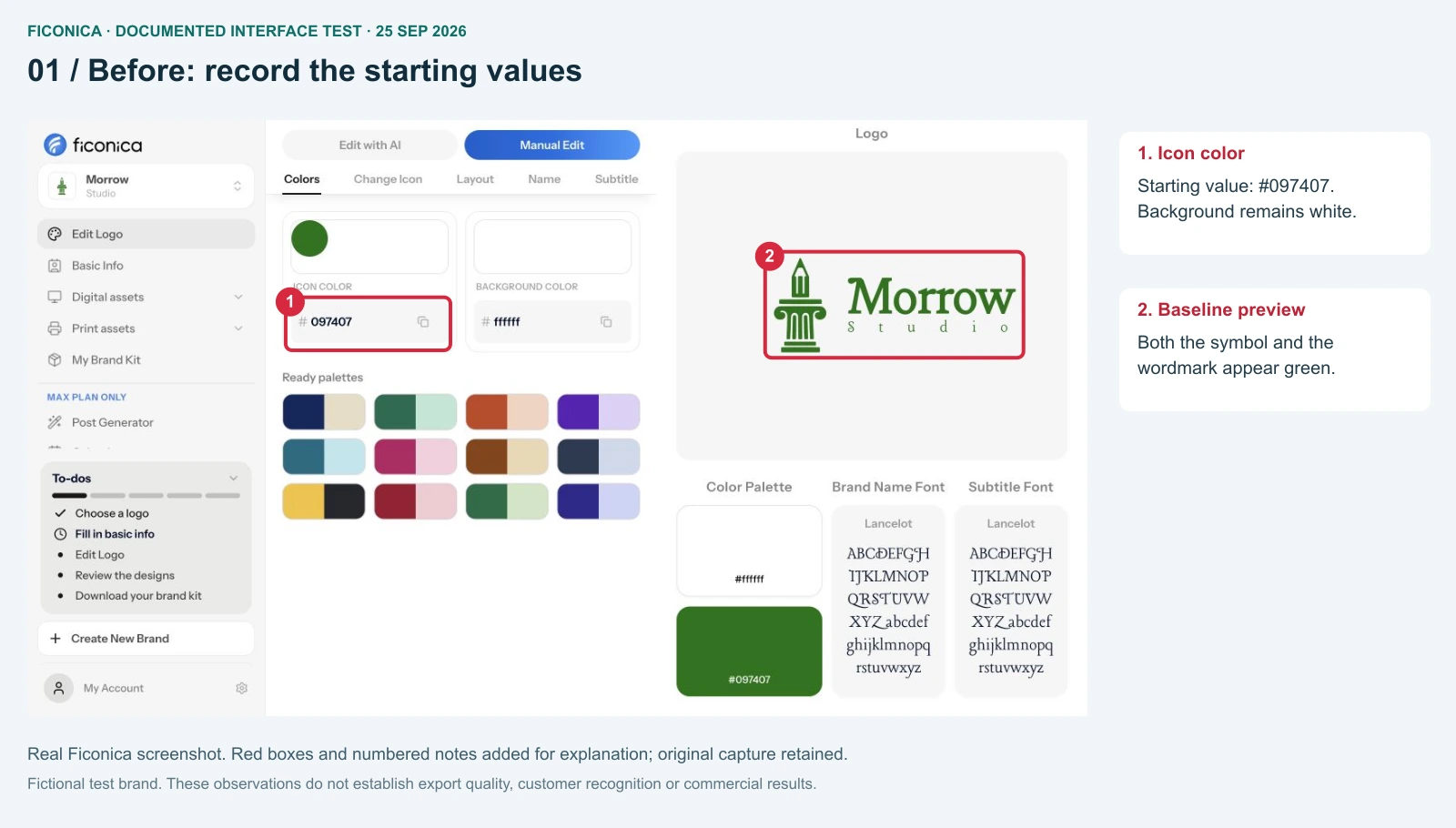
The protocol below keeps the name, symbol, font and layout fixed while comparing color. The documented example uses our existing 25 September 2026 Morrow Studio test; it is not a new test conducted for this revision.
3. Compare one color change fairly
Choose a candidate from your intended brand palette. Avoid deciding on the basis of a large preview alone: a logo will often appear smaller, alongside other content, or against a different background.
- Put the original on the background where you intend to use it.
- Create a comparison using the same logo size, wording, font and layout.
- Change only the color you are evaluating.
- Compare the two versions at the same zoom and size.
- Check the chosen version in its intended placement before keeping it.
If you change the background as well, treat that as a separate comparison. Otherwise you cannot tell whether the color edit or the background produced the difference. Likewise, enlarging the second preview makes it easier to see, but does not show that the edit improved the logo at the original size.
You do not need a universal numerical score to document a useful result. Record specific observations such as which part of the symbol is difficult to distinguish. Avoid claims such as “this color builds trust” or “the new version will convert better” without evidence about the relevant audience and use.
A documented example: the icon changes, the name does not
In our 25 September 2026 desktop test, we changed Manual Edit → Colors → Icon color from #097407 to #126e67. The symbol became teal while the Morrow wordmark remained green. The column-and-pencil symbol contains no embedded lettering. These are screenshots from that earlier test, reused to explain which component a control affects. Ficonica is our own product; this is not an independent review.
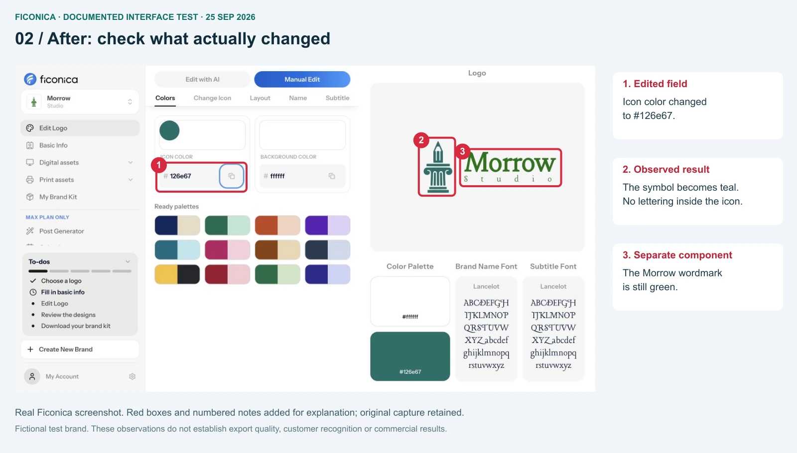
The lesson is to inspect every component named in your brief. If both the icon and the name are meant to change, changing an icon-color field alone does not complete that brief. For broader rollout decisions, see our brand evolution guide.
4. Check the edited logo in the places that matter
Choose placements you actually use. For this fictional studio, a proposal header and portfolio header are more relevant than a truck mockup. A store that ships orders would need a different set of checks.
- Website header: check the available width and the surrounding navigation. A large isolated preview may hide a fit problem.
- Proposal: check the mark against the actual page background. For a print check, view or print at the intended size rather than relying on a zoomed document.
- Avatar: check the crop and whether a compact mark is needed. Do not force the full name into a space that cannot display it usefully.
- One-color use: confirm that essential shapes remain understandable without color differences separating them.
These checks answer different questions. A good avatar does not establish that the full wordmark reads well in a proposal, and a screen preview does not establish physical print quality.
5. Review typography and spacing separately
Once the color decision is recorded, address another problem if one remains. Check the actual letters in your business name: a typeface specimen or a different brand name does not show how yours will look.
If the icon appears too close to the name, adjust that gap separately from letter spacing. These are different relationships. Use the controls the editor actually offers; do not infer that every tool supports detailed kerning or independent spacing adjustments.
Keep typeface, size and spacing changes separate during comparison. A less decorative font may help a difficult name, but no single style is automatically the most professional. Keep supporting paragraph fonts practical even if the logo uses a distinctive display face.
6. Save the decision, then check the export
Keep the chosen settings with a short note explaining why you kept them. If neither version solves the original problem, return to the baseline and try another approach. Do not keep an edit merely because you spent time making it.
Check the actual downloaded file in the intended application when export is available. A preview, a download entitlement and a successfully opened file are three different states. For transparent digital use, inspect the background of the exported asset rather than assuming the preview represents it.
For scaling or print work, inspect the file’s contents and the supplier’s requirements. An SVG or PDF extension alone does not guarantee that every element is a vector path. Our raster versus vector guide explains that distinction.
7. Decide whether to keep editing or ask for help
Logo concept editing needs a stopping rule. Write down the unresolved problem, the place where it appears and the change you tried. Then make one of three decisions:
- Keep the edit: the original problem is resolved in the required placement, and no required use became worse.
- Make a supporting variation: the main composition works, but a specific crop or small placement needs a compact version. Do not rebuild the entire identity to fit an avatar.
- Escalate the task: the remaining problem needs shape redrawing, custom lettering or a control the tool does not provide. Give a designer the baseline, the failed comparison and the destination constraints.
For example, if a symbol still loses an essential shape at the intended size after a color change, another palette is unlikely to address that geometric problem. That is a reason to reconsider the shape or simplify the compact variation, not evidence that a particular tool has failed. This is an editorial decision framework, not a measured test outcome.
Ask reviewers a concrete question such as “Which name can you read at this size?” Keep preference feedback separate from functional observations. A small informal review is useful feedback; it does not prove that the logo will sell more.
- Guide to logo customization — the broader identity decisions.
- How to create logo variations — adapt the layout for different placements.
- How to design business stationery — apply the approved identity to documents and cards.