A brand name and logo should work as a pair: the name gives people something to remember and search for, while the logo gives that name a recognizable visual form. For a new business, the goal is not to make either element say everything. It is to make both clear, relevant, and easy to use consistently.
A strong starting point is a name that fits your business direction and a logo that remains legible across the places customers will see it: a website header, social profile, invoice, email signature, storefront sign, or product label. The right choices depend on your audience, industry, budget, and how much customization your business needs.
Start With the Brand Name Before the Logo
A logo can support a name, but it cannot fix a confusing one. Before looking at colors, icons, or fonts, decide what your business name needs to communicate.
For many small businesses, a useful name is distinctive enough to separate the business from similar options and simple enough for people to pronounce, spell, and recall. A consultant may choose a personal-name brand because their expertise is the service. An online shop may prefer a more descriptive or invented name that can grow beyond one product category. Neither route is automatically better.
Ask practical questions early. Can a customer say the name after hearing it once? Does it fit your intended audience and price position? Will it still make sense if you add services, products, or locations later? A highly literal name can explain an offer quickly, but it may become limiting as the business changes. A more abstract name can be flexible, but it usually needs more supporting messaging at launch.
Do not treat naming as a substitute for legal clearance. Before investing heavily in signs, packaging, or advertising, consider checking name availability and speaking with a qualified legal professional where appropriate. Brand naming, trademark registration, and legal ownership are separate subjects.
Write a Short Brand Brief
You do not need a long strategy document to make better early decisions. A one-page brief can provide enough direction for a first visual identity. Include what you sell, who you serve, the feeling you want to create, your main competitors or alternatives, and the words you want customers to associate with the business.
For example, a bookkeeping service for independent creatives might want to feel organized, friendly, and straightforward. Those words point toward a different name and visual style than a premium interior design studio that wants to feel editorial, refined, and personal. The brief does not dictate one correct design. It gives you criteria for choosing among options.
Make Your Brand Name and Logo Feel Connected
Connection does not mean your logo must literally illustrate the name. A bakery called Morning Fold does not need a croissant icon, and a software company with a descriptive name does not need a computer symbol. Literal imagery can be useful when it improves recognition, especially for a local service or simple product category, but it is only one approach.
The better question is whether the logo’s style supports the expectation created by the name. This comes through in typography, spacing, color, shape, and visual complexity. A playful name paired with a rigid, corporate-looking wordmark may feel inconsistent unless that contrast is intentional. A serious financial-services name paired with hand-drawn lettering may also send mixed signals.
A logo generally needs to do three things well: identify the business, stay readable at small sizes, and remain usable in different formats. It does not need to explain every service, audience, and value proposition on its own. Your website copy, product descriptions, and customer experience handle much of that work.
Choose a Logo Type That Matches the Use Case
Most early-stage businesses do well with a flexible logo system rather than one elaborate mark. That system may include a primary logo, a simplified version for tight spaces, and a small icon or monogram for profile images.
A wordmark, built primarily from the business name, is often suitable when the name is short and distinctive. It keeps attention on the name and can look polished without relying on a generic symbol. A combination mark pairs text with an icon and may help when you need both a readable name and a recognizable social-media image. An abstract symbol can become memorable over time, but it may require more deliberate brand building because it does not immediately explain what the business does.
Avoid choosing a logo type based only on what looks impressive in a large presentation. Test it where it will actually appear. If fine details disappear in a browser tab, profile photo, or small label, simplify the design.
Build the Supporting Identity, Not Just a Logo
A logo alone rarely creates a consistent business presence. The practical value comes from having a small set of visual decisions you can repeat without guessing each time you publish a post, send a proposal, or update a web page.
Your basic identity system should include a color palette, font choices, logo variations, and simple guidance on how to use them. A limited palette is generally easier to maintain than a collection of unrelated colors. Choose one or two primary colors, then add neutrals and, if needed, an accent color for buttons, calls to action, or highlights.
Typography deserves the same attention. Select a display font or treatment for headings and a highly readable font for body copy. Decorative type can work in small doses, but it becomes difficult to use when it is responsible for every paragraph, document, and social post. Consider where your fonts will appear before committing to them.
Consistency does not mean making every asset identical. It means repeating enough recognizable elements that the business feels like the same business in different settings. A clean website, a proposal document, and an Instagram graphic can look different while still sharing the same logo, color balance, type style, and overall tone.
Prepare Files for Real-World Use
A brand identity becomes more useful when it is prepared for the formats you actually need. Digital platforms commonly require logos with transparent backgrounds, while print projects may need files that can scale cleanly for larger applications.
In general, keep a version of your logo for light backgrounds and one for dark backgrounds. You may also need a full-color option, a one-color option, a horizontal layout, and a stacked layout. The exact set depends on your business. A solo consultant may need website and proposal assets first, while a retail brand may need packaging, labels, signage, and social templates.
It helps to understand the difference between raster and vector files. Raster files, such as PNG or JPG, are made of pixels and are commonly used online. Vector files are created from paths, so they can usually be enlarged without becoming blurry. Printers and signage providers may request vector artwork, although their requirements vary. Confirm specifications with the vendor before placing an order.
Store final files in a clearly named folder and avoid editing the original master logo for everyday tasks. Create copies for social posts or presentations instead. This small habit reduces accidental changes and keeps your branding more consistent over time.
Decide Whether to Use a Platform, Designer, or Agency
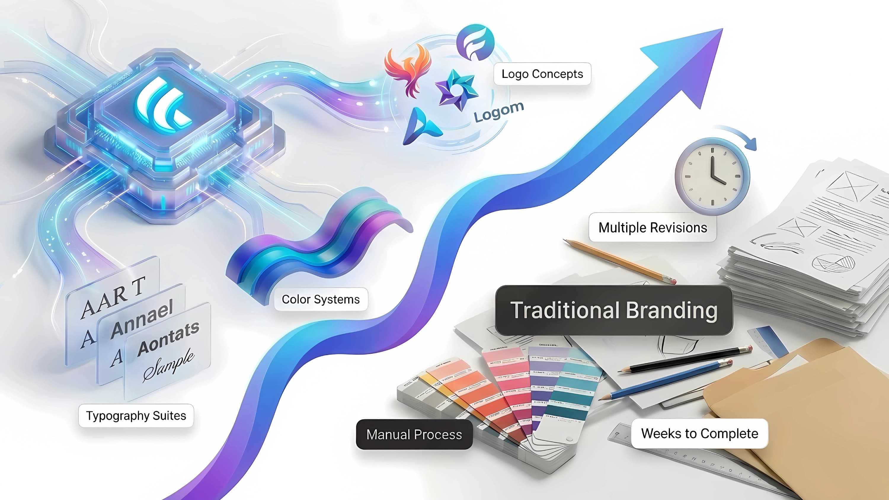
The best branding workflow depends on the scope of the job. An AI-assisted branding platform may be a practical fit when you need to move quickly from a business name and industry description to logo concepts, color directions, font pairings, and coordinated assets. Ficonica is one option designed for that early-stage workflow, with customization tools, brand previews, guidelines, and downloadable materials available depending on the selected product.
A freelancer or designer may be a better fit when you need close creative collaboration, a highly original illustration style, or specialized expertise for your category. An agency is generally more appropriate for complex positioning, audience research, naming programs, packaging systems, extensive rollout plans, or a larger team with multiple stakeholders.
Budget matters, but so does decision-making time. A lower-cost option can lose value if it leaves you with unusable files or no coherent system. A larger engagement can be unnecessary if your immediate need is a clear, professional starting point for a simple business. Match the process to the complexity of the work, not just the ambition of the brand.
Test Before You Commit
Before finalizing, place your selected name and logo into a few realistic settings. View the logo at small size, in black and white, and against light and dark backgrounds. Add it to a basic website header, social profile image, invoice, or business card mockup. These tests reveal issues that are easy to miss when a design sits alone on a white screen.
Then give yourself a practical test: could you create your next five business materials without inventing new colors, fonts, or logo versions? If the answer is yes, you have more than a logo. You have a workable visual foundation that can support the business while it grows.