Brand guidelines are a practical reference for using your business’s visual identity consistently. They tell you, your collaborators, and future vendors which logo to use, which colors and fonts belong together, and how to avoid improvised designs that make a business look disconnected.
For a new or small business, the goal is not to produce a thick agency-style document. It is to create a clear set of decisions that can be applied on a website, social profile, invoice, presentation, email signature, and printed item without starting from scratch each time.
What brand guidelines do and do not do
A visual guideline document turns design choices into repeatable rules. If your logo appears one way on your website and another way on a flyer, or if each social post uses a different typeface, guidelines give you a shared reference point. This can save time when you create new materials or hand work to a freelancer, printer, or team member.
They are not a complete business strategy. Brand guidelines do not define your target market, set your prices, prove marketing performance, or guarantee that people will trust or choose your business. They also do not replace legal review, trademark searching, or trademark registration. Those are separate decisions that may require appropriate professional support.
Think of guidelines as the operating instructions for your visual identity. They should make common tasks easier, not create rules so complicated that nobody uses them.
What to include in brand guidelines
The right scope depends on how and where you communicate. A consultant who mainly uses a website, LinkedIn, and proposals may need a compact guide. A product business selling through retail, packaging, events, and multiple social channels will generally need more detail.
Logo rules and file choices
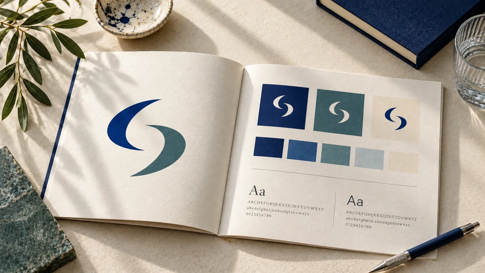
Start with the versions of your logo that are approved for use. Many brands need a primary logo, a compact version for small spaces, and a simple mark or icon for profile images. Include light and dark versions if the logo will appear on different backgrounds.
Your guide should show minimum clear space around the logo and a recommended minimum size. Clear space means leaving an uncluttered area around the mark so it remains easy to recognize. Minimum size prevents fine details or small text from becoming unreadable.
Also identify common mistakes. For example, do not stretch the logo, add unapproved effects, change its colors, place it over a busy image without sufficient contrast, or rebuild it with a different font. A few visual examples are more useful than a long warning paragraph.
Keep the source files organized separately from the guide. For digital use, you may need web-ready files with transparent backgrounds. For print, a printer may request a different format or color setup. Requirements vary by supplier and project, so confirm specifications before sending files to print.
Color palette with specific values
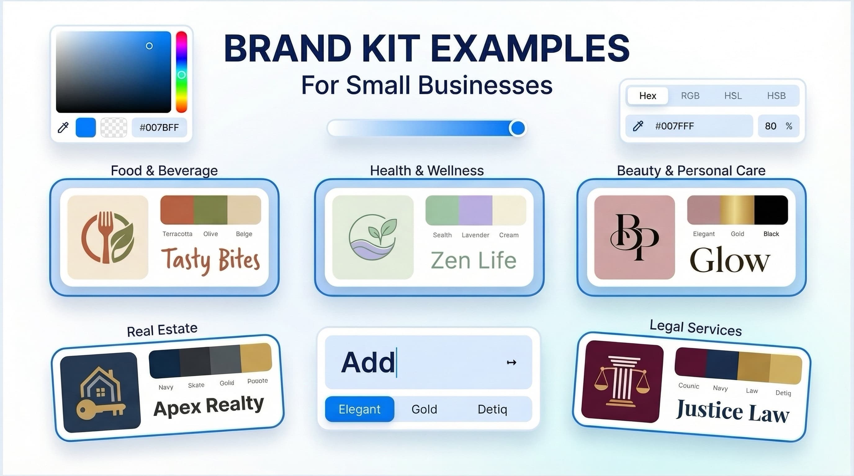
Saying “use navy and cream” leaves too much room for interpretation. A useful palette lists the exact color values needed for each channel. Hex codes are commonly used for websites and digital graphics, while RGB values are useful for screens. Print work may call for CMYK or spot-color specifications depending on the printer and project.
Choose a small working palette: one or two main colors, supporting colors, and neutrals for backgrounds and text. The number is less important than the roles. Someone creating a social post should know which color is for primary buttons or headlines, which is for accents, and which is safe for body text.
Color choices should also account for readability. A pale accent color may look appealing in a palette but fail when used for small text on a white background. Test key combinations in the places you actually use them, especially website buttons, forms, and presentation slides.
Typography that works in everyday materials
Typography guidelines identify the fonts used for headings, body copy, and optional accents. They should also state what to use when the preferred font is unavailable. A practical fallback helps keep an email, document, or social post close to the intended look without forcing every contributor to guess.
Avoid prescribing too many font weights and styles for a small business. Usually, a heading font, a body font, and a limited set of weights are enough. The guide can show a simple hierarchy: large headline, section heading, body text, and caption.
A typeface can express a certain character, but there is no universal rule that one font automatically makes a brand credible or another automatically makes it creative. The better test is whether the type is readable, appropriate for your audience, and used consistently across your most important touchpoints.
Images, icons, and graphic details
If your business uses photography, include direction on style rather than vague instructions such as “make it modern.” Describe useful specifics: natural versus studio lighting, close-up versus wide framing, quiet backgrounds versus energetic scenes, or product-only images versus people using the product.
The same principle applies to icons, illustrations, borders, patterns, and shapes. If graphics use rounded corners, a hand-drawn texture, or a particular line weight, document it. These details often create a recognizable system, but only when they are repeated with restraint.
For small teams, a short mood board with a few approved examples and a few examples to avoid may be enough. A larger brand with frequent campaigns may need separate guidelines for photography, editorial illustration, and motion graphics.
How to create useful brand guidelines
Begin by collecting the identity pieces you already use. Pull together your current logo files, colors, fonts, social templates, website screenshots, proposals, and printed materials. This often reveals where the inconsistency is coming from. You may find several versions of the logo, a color used only in old documents, or fonts that are difficult for others to access.
Next, decide which applications matter first. A business that sells online may prioritize its storefront, product graphics, email, and social profiles. A local service provider may focus on its website, quote template, vehicle signage, uniforms, and business cards. Guidelines are more useful when they reflect actual work rather than an idealized checklist.
Then set the core rules. Define logo versions, color values, type hierarchy, and basic image direction before adding optional details. Test these choices by making two or three real items, such as a social post, a one-page proposal, and a website section. If the rules are difficult to apply, simplify them.
Finally, put the guide where people can find it. A well-organized PDF can work for a solo business. A shared workspace may be more practical for a growing team that updates templates regularly. Review the guide when you add a new channel, change a product line, or discover that an instruction is unclear.
A simple structure for a first version
Your first guide does not need to be lengthy. It can be effective with a short introduction, approved logo variations, color codes, font rules, image direction, and a page of examples for common uses. Add sections only when they solve a recurring problem.
This approach has a trade-off. A concise guide is quick to make and easy to follow, but it may not answer every question from a packaging supplier, web developer, or external designer. More complex businesses may need a broader identity system with detailed component libraries, campaign rules, and production specifications.
An AI-assisted platform such as Ficonica may help entrepreneurs assemble core visual elements, including logo concepts, color palettes, font pairings, previews, and brand guidelines, without beginning with a traditional agency engagement. It is generally suitable when the main need is a coordinated starting point and usable visual assets. A designer, freelancer, or agency may be a better fit when you need original illustration, extensive research, packaging systems, highly customized direction, or a complex brand architecture.
Keep the guide useful as the business changes
Consistency does not mean using the exact same layout everywhere. A profile image, storefront banner, invoice, and presentation have different constraints. The goal is to retain the recognizable parts of the system while adapting the format to the task.
Use the guide whenever you create something new, then improve it based on real questions. If you repeatedly ask which logo belongs on a dark background or what font to use in a proposal, add that answer. The most useful brand guidelines are not the most elaborate ones. They are the ones that help your business make clear, recognizable materials on an ordinary busy day.