Brand guidelines are a practical reference document that shows your team exactly how to use your visual identity. If you are learning how to build brand guidelines, focus less on making a long design document and more on answering the everyday questions that cause inconsistency: Which logo should I use? What colors are approved? Which fonts belong in a social post or proposal?
For a new or small business, useful guidelines can be short. A clear 8- to 15-page document is generally more valuable than a 60-page brand book that no one opens. Start with the assets people use most often, write plain-language rules, and update the document when your business adds new channels or materials.
Start with the job your guidelines need to do
Brand guidelines are not a business plan, marketing strategy, or legal document. They will not determine your positioning, validate a business name, register a trademark, or guarantee that customers will respond to your marketing. Their job is narrower and very useful: they help people create materials that look and feel like they came from the same business.
Before choosing colors or typefaces, decide who will use the document. A solo consultant may need it as a reminder when creating presentations and invoices. A growing startup may need a shared reference for contractors, social media managers, and web developers. An online seller may need rules for product inserts, marketplace images, and email campaigns.
This decision affects the level of detail. If only one person will use the guidelines, simple rules and accessible files may be enough. If several people work on the brand, include more examples, clear file names, and instructions for common edge cases.
Build the brand system before documenting it
Guidelines cannot fix an unfinished identity. First, gather the elements that should remain consistent across your website, social profiles, documents, and printed materials. At a minimum, this usually includes a logo system, color palette, typography, and a few examples of the brand in use.
Define your logo system
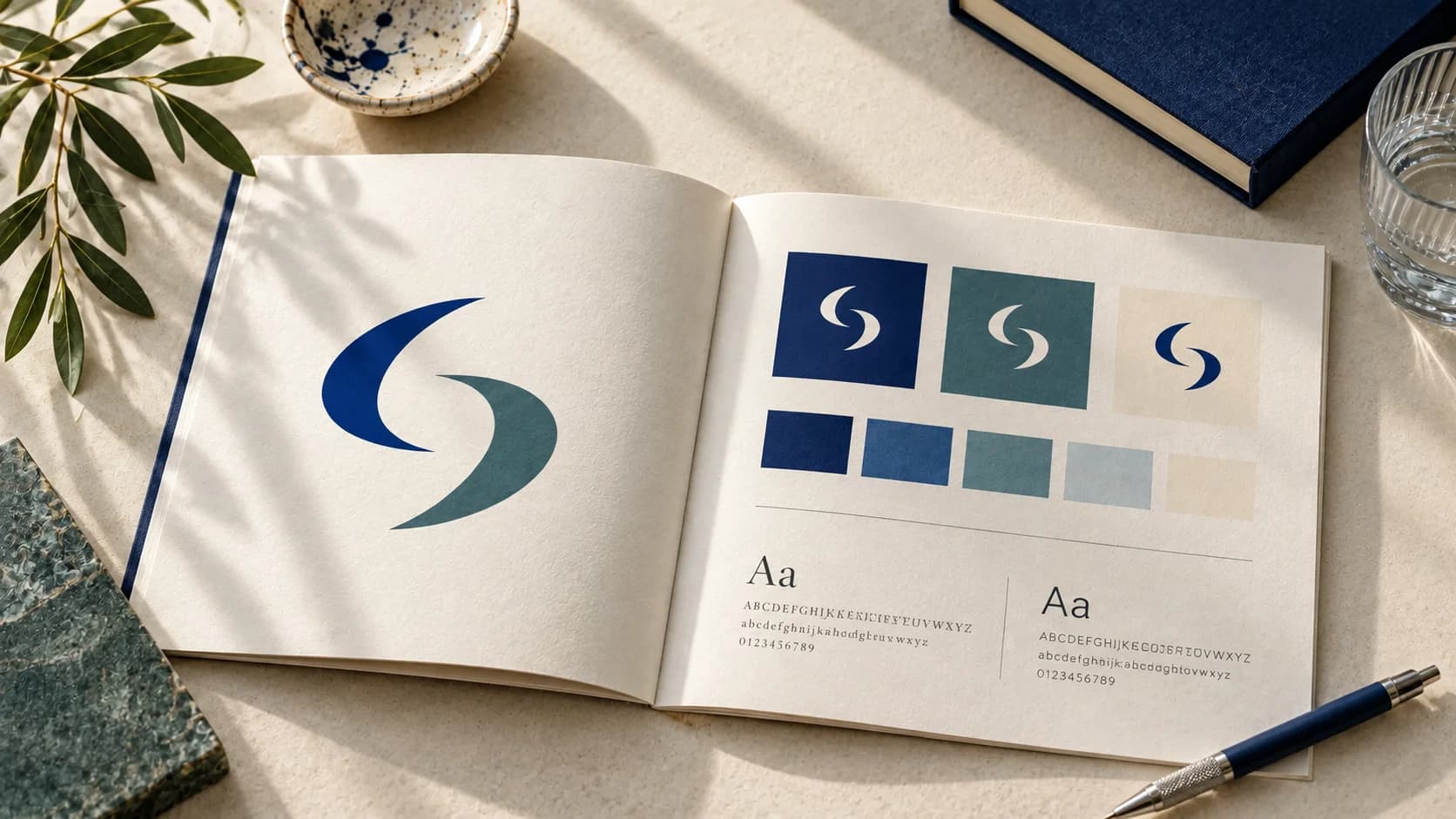
Your logo is rarely one file used in every situation. A complete system may include a primary logo, a horizontal or stacked alternative, an icon or symbol, and versions for light and dark backgrounds. Not every business needs each variation, but most need more than one.
Show the preferred version first, then explain when to choose the alternatives. For example, a horizontal logo may fit a website header, while a compact mark may be more suitable for a social media profile image.
Include clear-space and minimum-size guidance. Clear space means the empty area around a logo that keeps it readable. You do not need complicated measurements. A practical rule can use part of the logo itself as a reference, such as leaving space equal to the height of a letter in the wordmark.
Also show a few incorrect uses. Stretching the logo, changing its colors without approval, adding effects, placing it over a busy image, or rebuilding it in a different font can make even a well-designed identity look inconsistent. Visual examples are faster to understand than a paragraph of warnings.
Choose colors with roles, not just names
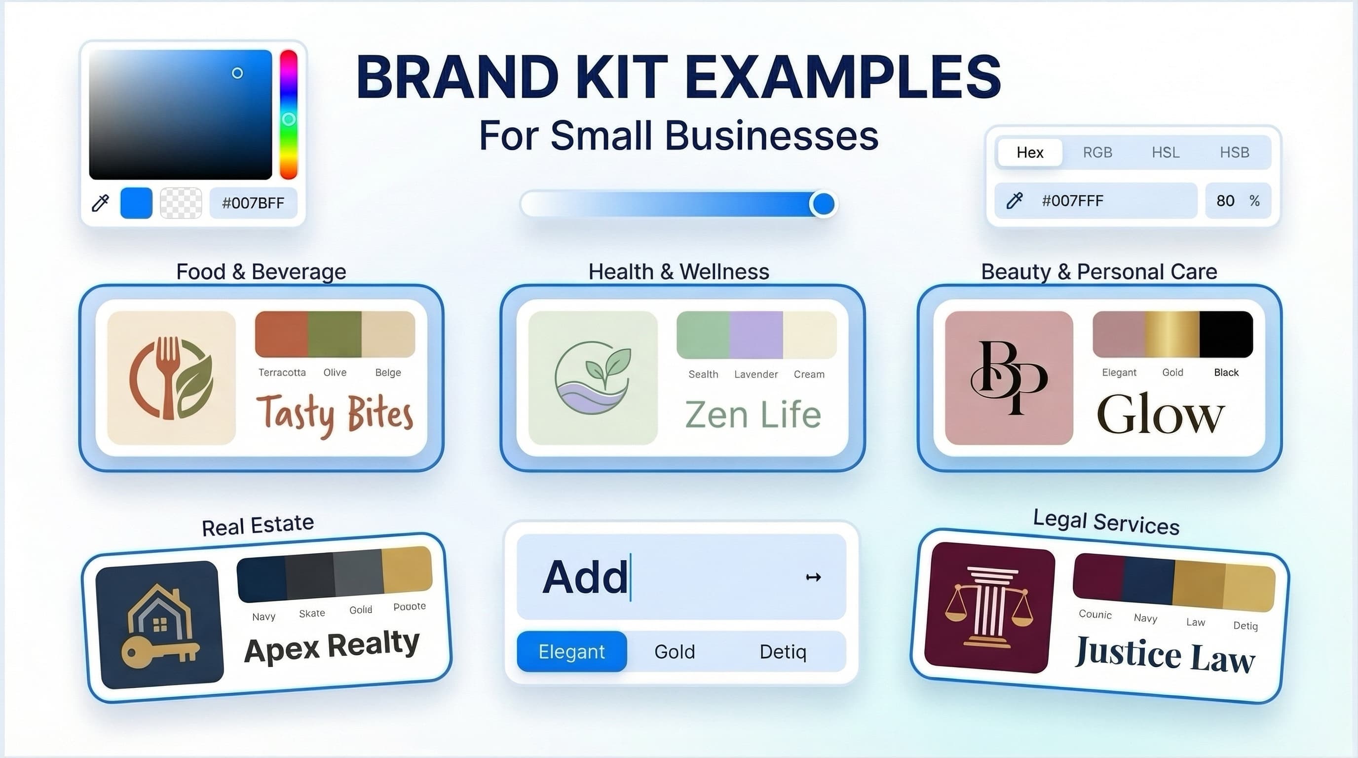
A palette is more useful when every color has a job. Instead of presenting six attractive swatches with no guidance, identify a primary brand color, supporting colors, neutral colors, and any accent color used sparingly.
For each color, provide the values needed for the formats you use. Hex codes are useful for websites and digital design. RGB values may be requested in some screen-based tools. CMYK values are commonly used for print production, although a printer may have specific requirements. The exact color appearance can vary by screen, paper, ink, and printing process, so treat printed proofs as part of a print project when color accuracy matters.
Consider contrast as well. Text must remain readable against its background, particularly on buttons, presentations, and social graphics. A light brand color may work well as a background or detail but be hard to read when used for small text.
Set typography rules people can follow
Typography guidelines should answer two questions: what font is used for what, and what should someone do if that font is unavailable?
Choose a primary typeface for headings and a secondary typeface for body copy, if your system calls for two. Then give simple direction: use the heading font for page titles and short statements; use the body font for paragraphs, emails, and documents. Specify a limited set of weights, such as regular, medium, and bold, rather than encouraging every available style.
Avoid overly precise rules unless they serve a real purpose. A freelancer creating a one-page flyer does not need a complex typography scale. They do need to know whether headings should be bold, whether all caps are appropriate, and how much spacing keeps the page easy to scan.
How to build brand guidelines around real materials
The most effective way to build brand guidelines is to create them from the places your brand actually appears. Open the homepage, an Instagram post, a sales presentation, an invoice, an email signature, or a product card. Then document the decisions that should stay consistent.
A short “brand in use” section can be especially helpful. Show how the logo, colors, and typography come together in a social post, a web section, and a document header. These are examples, not rules that every future design must copy exactly. Their purpose is to establish a recognizable visual direction.
If your business relies on photography, add a few practical notes. Describe the subject matter, lighting, crop, or editing approach that generally fits the brand. If you do not have a distinct photography style yet, it is better to say so than to invent one for the sake of completing the document.
The same applies to illustrations, icons, patterns, and graphic shapes. Include them only if they are a repeatable part of your identity. Decorative elements with no clear rule can create more inconsistency, not less.
Organize the document for quick decisions
A guideline document should work when someone has five minutes to prepare a post or send a proposal. Put the most frequently needed information near the beginning: the core logo, color codes, font names, and links or locations for approved files.
Use descriptive asset names. “Logo-primary-dark-background” is easier to find than “final-logo-new-2.” Keep editable working files separate from approved exports so people do not accidentally modify the logo. If you maintain folders for social graphics, presentation templates, and stationery, use the same names found in the guidelines.
Your document can follow this simple order:
- Brand overview and intended visual character
- Logo versions, spacing, size, and misuse examples
- Color palette with digital and print values
- Typography rules and fallback options
- Image, icon, or graphic-element direction
- Real-world examples and asset locations
Do not treat this structure as fixed. A restaurant with menus and signage may need print examples. A software startup may need product interface guidance. A personal brand may place more emphasis on profile images, slide decks, and video thumbnails.
Make the rules specific enough to use
Vague guidance creates hesitation. “Use colors consistently” leaves the reader to guess. “Use navy for headlines and calls to action, cream for large backgrounds, and coral only for small highlights” gives them a workable starting point.
At the same time, avoid turning the guidelines into a set of rigid restrictions. A small team needs enough consistency to look organized, but it also needs room to adapt content to different formats. The balance depends on how varied your marketing materials are and how many people create them.
Separate non-negotiables from flexible choices. Your approved logo files, core colors, and typefaces are usually fixed. Layout, image selection, and accent use may allow more interpretation. Labeling this distinction reduces unnecessary back-and-forth.
Choose the right way to create your guidelines
You can build a basic document yourself using existing logo files, colors, and fonts. This is often suitable when your identity is already clear and your immediate goal is consistency. A freelance designer may be a better fit when you need custom visual direction or help refining an identity that feels disconnected.
A branding agency is generally more appropriate for organizations that need research, stakeholder alignment, detailed positioning work, packaging systems, extensive naming exploration, or a highly customized identity across many touchpoints. That level of work requires more than a template or a visual asset library.
For early-stage businesses that need a coordinated starting point, an AI-assisted platform such as Ficonica may help bring logo concepts, color palettes, font pairings, brand previews, and guidelines into one practical workflow. Review any output carefully and adapt it to your actual business needs. A generated starting point is still a decision-making tool, not a replacement for strategy or specialist advice.
Treat guidelines as a working document
Your first version does not need to predict every future use. Create the essentials, share them with anyone making brand materials, and notice where questions keep appearing. If people repeatedly ask which logo to use on dark backgrounds or which font belongs in email, add that answer.
The goal is simple: make the next on-brand decision easier than the off-brand one. When your guidelines do that, they become part of how your business works rather than another file stored and forgotten.