
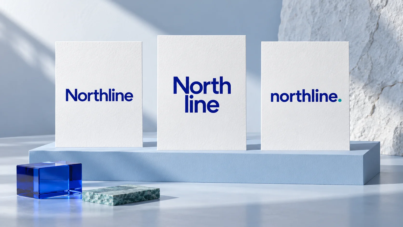
Give the wordmark a job
For this editorial exercise, Northline is a fictional repair service. It needs a name that can appear on a booking page, a work-van panel and a short invoice header. Those placements call for different shapes; they do not automatically call for three different identities.
The specimens below use the same local Inter 4.001 font file, distributed under the SIL Open Font License 1.1. Display sizes reduce on narrow screens; the settings beside each card describe the desktop reference. They are layouts drawn in the browser, not Ficonica exports, custom lettering or a customer project. We have not run a user-reading study, printed the designs or checked trademark availability. The point is to make the choices inspectable.
If you are still choosing a family, use our startup logo font guide. Here we hold the family constant and explore the arrangement.
Six treatments of the same name
1. Start with a plain reference
Title case, default spacing and a single line provide the reference. It is intentionally quiet: you need something to compare later changes against.
Starting settings: 44px, regular weight, normal letter spacing. No letter shapes edited.
2. Change the case
Lowercase removes the initial capital’s height contrast. Decide whether this more even silhouette fits the brief; do not assume lowercase will make every business feel approachable.
Only case changes from the reference. Compare the opening of the word and its overall outline.
3. Give capitals room
Capitals and added spacing produce a wider arrangement. This card also reduces type size to fit, so it is a layout proposal rather than an isolated case experiment. Check a long name before adopting it for a narrow header.
34px uppercase with 0.08em tracking. Wider spacing is not a universal readability improvement.
4. Tighten the rhythm
Negative tracking pulls the letters closer. Inspect individual gaps instead of accepting the compact appearance as finished. Uniform tracking is not the same as adjusting each letter pair.
44px, −0.045em tracking. No claim of an optimal spacing value.
line
5. Stack the name
Two lines offer a different footprint for a square panel. The break also changes how the name is read. Keep a one-line companion and decide whether splitting this particular name is acceptable.
Same size and family; deliberate line break after “North”. Not a favicon recommendation.
6. Add one small accent
A dot gives the composition a stopping point without another symbol. Its color should be optional to recognition: inspect the same arrangement in one color. Decide whether the dot belongs to the logo artwork or the written business name.
Added punctuation and color. The accent is a proposed design choice, not a tested brand asset.
Choose by the placement
Do not select the most dramatic card and retrofit every use around it. Put the shortlisted layouts in the spaces they must occupy. Compare them at the same available width, not only at the same font size: a wider arrangement will need smaller letters to fit.
| Placement | Question | What to try next |
|---|---|---|
| Mobile header | Does the full name fit beside navigation? | Compare the reference and a less widely spaced version at the actual width. |
| Square panel | Does the line break still read as one name? | Compare horizontal and stacked versions before choosing a separate icon. |
| Invoice | Does the identity survive one-color output? | Remove the teal accent and inspect a real print sample. |
| Tiny browser icon | Is a full wordmark the right format? | Develop a separate compact mark; do not force all letters into a tiny square. |
These are checks to perform, not completed test results. Keep a note of the placement, the observed problem, the single adjustment you made and what still needs checking. Avoid “more premium” as the only reason for a change when the actual problem is that the name no longer fits.
Keep the approved version repeatable
Once a direction survives your checks, record the exact font file and applicable license, case, spacing, line breaks and allowed color versions. Save the approved artwork separately from editable experiments. A colleague should not have to reconstruct the logo from a font name and memory.
The wordmark does not need to become your paragraph font. Choose supporting text for its own job using the brand font pairing guide. For small placements, see our favicon size and format guide.
FAQ
Is a typography logo the same as a wordmark?
A wordmark uses the business name as the logo. Typography-led designs can also use initials or other lettering, so define the actual format before comparing examples.
Do I need a custom typeface?
Not for this exercise. Start by exploring layout with a suitably licensed font. Custom lettering is a separate design decision and does not automatically establish exclusivity or legal clearance.
Which of these six designs is best?
None has been tested enough to earn that label. They demonstrate different choices for a fictional brief. The intended placement and the name itself determine which deserves further work.
Are these Ficonica-generated logos?
No. They are browser-rendered editorial specimens. To explore the product, preview Ficonica logo options and check current plans for download access.