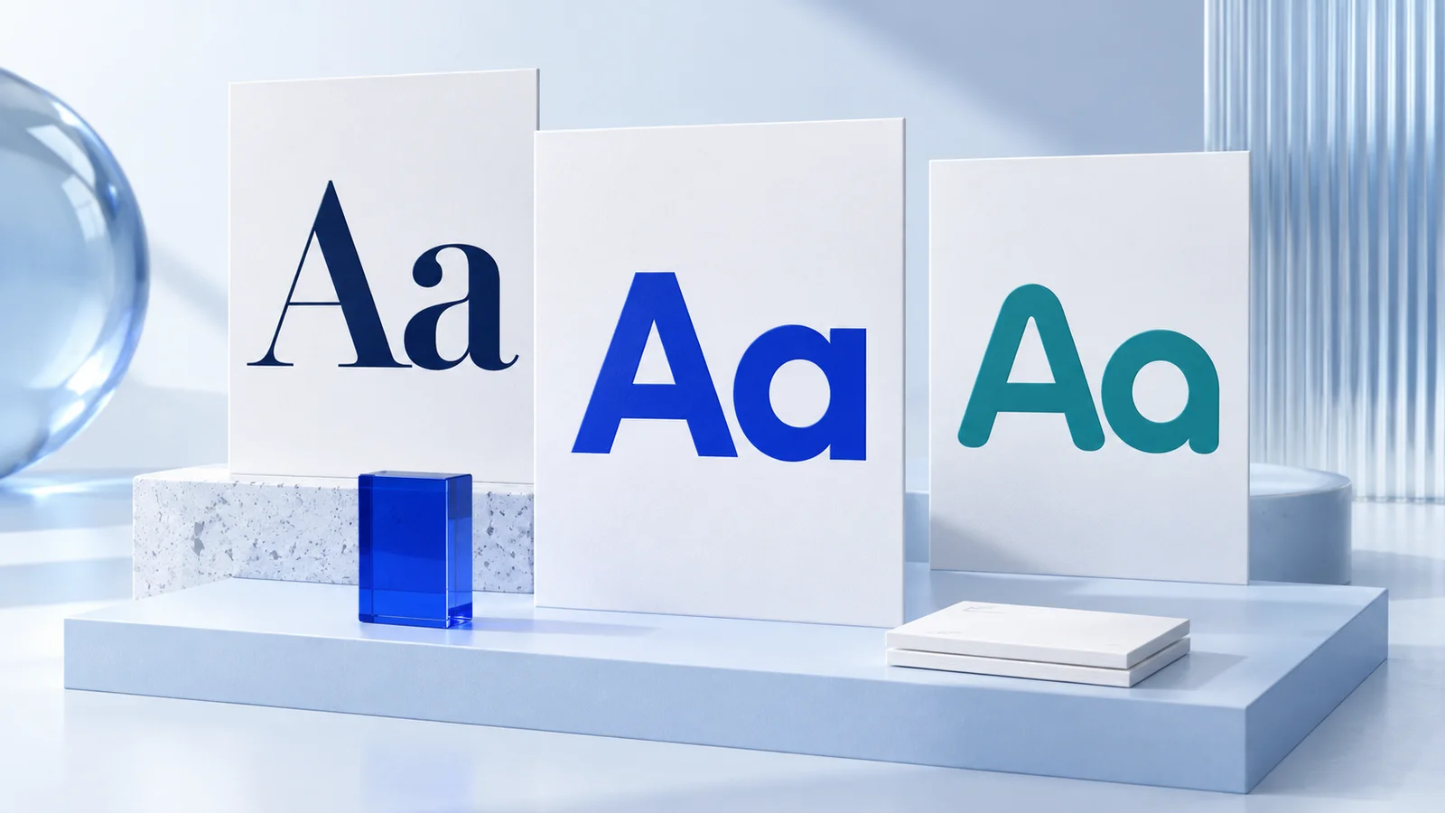
Pair brand fonts by giving each typeface a clear job: one usually handles headings and another handles body text. Choose fonts with enough contrast to create hierarchy, but enough shared character to feel like they belong to the same business. When you are learning how to pair brand fonts, readability across your actual website, social posts, presentations, and printed materials matters more than choosing the most distinctive typeface.
A good pairing should make your brand easier to recognize and easier to read. It does not need to be visually dramatic. For many new businesses, a simple sans serif pairing or a serif-and-sans-serif combination is more practical than mixing several expressive display fonts.
Start with the role each font needs to play
Before comparing font styles, decide what each font will do in your brand system. Most small businesses need a heading font for attention and structure, plus a body font for longer text. That is enough for a website, pitch deck, invoice, email signature, and most social graphics.
Your heading font carries more personality because it appears in short, prominent phrases: page titles, product names, calls to action, and campaign graphics. Your body font has a different responsibility. It needs to remain comfortable at small sizes in paragraphs, captions, menu descriptions, and mobile screens.
A third font may be appropriate for a specific use, such as a handwritten accent in packaging or a condensed font for data-heavy labels. But it should be the exception, not a default. Each additional typeface gives your team another decision to make and makes consistency harder to maintain.
Choose contrast, not conflict
Font pairing works when the difference between fonts is intentional. If two fonts are almost identical, readers may assume the mismatch is accidental. If they are too different, the page can feel fragmented.
The most reliable source of contrast is classification. A serif heading font with a clean sans serif body font is a familiar combination because the visual roles are easy to understand. A serif has small finishing strokes on its letterforms, while a sans serif does not. That difference creates separation without requiring decorative typography.
You can also pair two sans serif fonts, especially for modern service businesses, software products, consultants, and online stores. In that case, make the distinction clearer through proportions or weight. For example, a wider, bold geometric sans serif may work for headlines while a neutral, highly readable sans serif handles body copy.
Avoid choosing two fonts solely because they are both popular. Look at how their letters behave together. Do their lowercase letters have similar visual density? Does one have unusually wide spacing while the other feels tightly packed? Do their bold weights create a similar level of emphasis? A pairing can look attractive in a font menu but become awkward once used in real sentences.
Match the pairing to your brand personality
Fonts communicate tone, although they do not determine whether a business is trustworthy, premium, friendly, or successful. Context matters: your logo, colors, images, writing, pricing, and customer experience all shape the impression people receive. Still, typography can support the direction you want your visual identity to take.
A traditional serif with a restrained sans serif is generally suitable for businesses that want an editorial, established, or considered look. Think of a boutique consultancy, a specialty food brand, or a creative studio. A clean sans serif system may fit a technology startup, home service business, or independent professional who needs a direct, current appearance.
More expressive fonts can be useful for a creator brand, beauty business, event concept, or product line with a strong personality. Use them carefully. Script and display fonts often become difficult to read when reduced for profile images, mobile banners, or business cards. They are usually more effective as a headline accent than as the main font for every message.
Rather than asking which pairing is universally right, ask whether the type matches the level of formality, energy, and clarity your customers should encounter. A playful headline font may be appropriate for a children’s product but less suitable for a financial consultant. The decision depends on the audience and the context where the brand will appear.
How to pair brand fonts with a practical test
Do not approve a font combination from a single logo preview. Test it in the places where you will use it most. Set a realistic headline, a paragraph, a button label, an email subject line, and a social post graphic. This reveals issues that a sample alphabet cannot.
Use this quick review process:
- Check body text at a small size, especially on a phone screen. If letters blur together or the spacing feels tiring, choose a more readable body font.
- Compare headings at several lengths. A font that looks good in a two-word logo may become cramped in a six-word headline.
- Test uppercase and lowercase text. Some display fonts look acceptable in uppercase but lose clarity in sentence case.
- View the pairing in black and white. If hierarchy disappears without brand colors, use larger size differences or clearer font weights.
- Print a basic page if you expect to use flyers, packaging inserts, menus, or stationery. Thin strokes and tiny text may reproduce poorly depending on the printer and paper.
This test is not about finding a perfect combination. It is about removing avoidable problems before your fonts appear across dozens of business materials.
Set a simple type hierarchy
A font pairing becomes a usable brand system only when people know how to apply it. Define a small hierarchy rather than choosing a different style each time you create a post or page.
For example, use your heading font in bold for primary page titles and section headings. Use the body font in regular weight for paragraphs. Reserve one heavier body weight for buttons, labels, navigation, or short calls to action. If your brand needs an accent style, define exactly where it belongs, such as promotional banners or pull quotes.
Size and spacing are as important as font choice. A 16-pixel body font with generous line spacing can feel more readable than a more fashionable font set too small. Headings need enough size difference from body copy to create a clear reading path. If every text block is bold, oversized, or all caps, nothing receives meaningful emphasis.
Write these decisions in your brand guidelines. Include the font names, weights, standard sizes, and examples of what not to do. This gives freelancers, employees, and future collaborators a practical reference instead of a vague instruction to "keep it on brand."
Common font pairing mistakes to avoid
The most common mistake is using too many fonts. A logo font, headline font, body font, social font, and email font can quickly become an inconsistent collection. For a small business, two families with a few defined weights are usually easier to manage.
Another issue is choosing personality over function. A highly decorative font can make a strong first impression, but it may not work in an online booking form, a long product description, or a small printed disclaimer. Let expressive type do limited, high-visibility work and choose a practical supporting font for everyday communication.
Be careful with font weight as well. Many brands pair a very thin headline font with a very light body font, creating a look that appears refined on a large desktop mockup but lacks contrast on a phone or in print. A medium or regular body weight is often a safer starting point.
Finally, do not rely on a pairing only because it resembles another company’s design. Your business may need different language support, content length, price points, customer expectations, or channels. Reference brands can help you identify a direction, but they should not replace testing your own materials.
Build the pairing into your brand kit
Once you have selected fonts, apply them consistently to the assets you use first: your website, social templates, business card, presentation, and email signature. A coordinated kit reduces the chance that each new document starts with a new font decision.
If you are building a visual identity without a traditional agency process, a tool such as Ficonica may help you explore coordinated logo, color, and font directions in one workflow. That can be useful when speed and a clear starting system are the priority. A designer or agency may be a better fit when you need extensive brand research, a complex packaging system, original illustration, or highly customized art direction.
Give your chosen pairing a few weeks of real use before adding another font. The goal is not to make every asset look different. It is to make each touchpoint feel like it came from the same business, while remaining clear enough for people to read and act on.