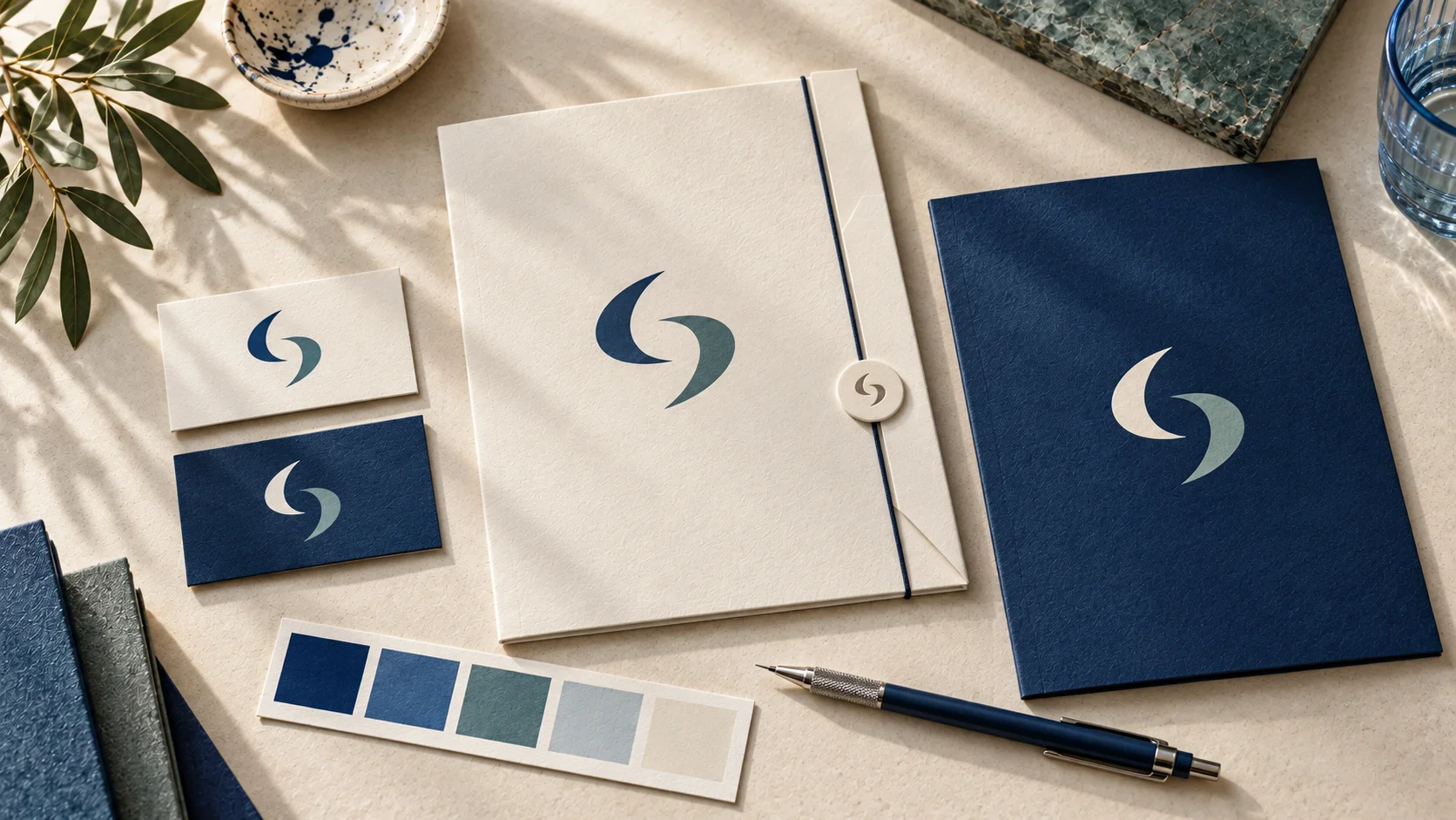
A brand kit is a practical set of visual rules and ready-to-use assets that helps your business look recognizable wherever people find it. If you are learning how to create a brand kit, start by defining the pieces you will actually use: your logo, colors, fonts, image style, and templates for common touchpoints such as social posts, email, and documents.
The goal is not to make every item look identical. It is to make each item clearly feel like it belongs to the same business, even when it appears on a phone screen, website, invoice, or printed card.
What a brand kit should include
A useful brand kit gives you decisions you do not have to remake every time you publish something. For most new and small businesses, it should include a core logo system, a color palette, typography choices, basic visual guidance, and the files or templates needed for day-to-day work.
The right scope depends on your business. A freelance consultant may need a website header, presentation cover, and email signature. An online seller may also need product labels, social graphics, and packaging artwork. A restaurant, salon, or local service business may need menus, appointment cards, signage, and promotional materials.
A brand kit is part of visual branding, not a complete business strategy. It can make your materials more consistent and easier to produce, but it does not determine your pricing, positioning, customer service, marketing performance, or legal rights to a business name.
Start with the business context, not the logo
Before choosing colors or reviewing logo concepts, write a short creative brief. Keep it simple enough to use. Describe what you offer, who you serve, what makes your approach distinct, and the feeling you want your visual identity to support.
For example, a bookkeeping service for independent creatives may want to feel organized, approachable, and calm. A specialty coffee brand may lean more tactile, energetic, or craft-focused. These are directions, not rules. Two businesses in the same category can reasonably make different choices if their customers, pricing, and personality differ.
Also list where the brand will appear during the next six to twelve months. This step prevents a common problem: choosing a logo that looks fine as a large website image but becomes unclear in a small social profile icon or on a narrow business card.
Build a logo system, not one logo file
Your main logo is the primary version of your business name and symbol, if you use one. But a brand kit generally needs a few related logo variations for different spaces.
A typical set includes a primary horizontal logo, a stacked or vertical version, a compact mark for small spaces, and single-color versions for light and dark backgrounds. You may not need every variation on day one, but planning for them makes future applications easier.
Check each version at realistic sizes. A detailed icon may work on a homepage but lose clarity in a social avatar. A long wordmark may be difficult to place on a square graphic. Simplifying is often more useful than adding decoration.
Save logos in formats appropriate to the intended use. Raster files, such as PNG or JPG, are common for digital use. Vector files, such as SVG or PDF, can usually be scaled without losing sharpness and are often useful for print or signage workflows. Your printer or production partner can confirm what they need for a specific job.
Choose a color palette with clear roles
A good palette is not simply a collection of colors you like. Each color should have a job. Begin with one or two core brand colors, then add supporting neutrals and, if needed, a limited accent color.
Your core colors should do most of the recognition work. Neutrals give you room for backgrounds, body text, and layouts that need to feel less busy. An accent color can draw attention to a button, offer, label, or key detail, but it loses impact if it appears everywhere.
Record each approved color in the formats your team will use. Hex codes are useful for websites and digital design. RGB values are used for screens, while CMYK may be requested for print production. Printed color can vary by paper, ink, finish, and supplier, so a digital color value is not a guarantee of a matching physical result.
Contrast matters as much as personality. Text and essential information need enough distinction from their background to remain readable. If a brand color is too light for body text, reserve it for larger shapes or decorative details and use a darker neutral for copy.
Select fonts for everyday use
Typography affects how professional and usable a brand feels, particularly when your business creates frequent content. Choose a heading font and a body font that work together without competing. In many cases, one flexible font family can be enough.
Prioritize readability over novelty. Your body font should be comfortable at small sizes on screens and in documents. Your display font can carry more personality, but it should still be easy to recognize in a headline, social graphic, or simple promotional piece.
Document exactly which weights and styles are approved. “Use a modern sans serif” is too vague for someone building a slide deck three months later. A more useful instruction is to specify the font family, heading weight, body weight, typical sizes, and line spacing range.
Font availability also matters. If your collaborators do not have access to a typeface, they may substitute something that changes the design. Consider where the font will be used and whether your team can apply it consistently before making it central to the system.
Define the supporting visual style
This section turns separate assets into a recognizable system. Decide how photography, illustrations, icons, shapes, and spacing should generally look. You do not need a long design manual. A few specific rules are more useful than broad statements such as “keep it clean.”
For imagery, clarify whether you will use bright product photography, candid people-focused images, textured closeups, simple editorial visuals, or another direction. For graphics, identify preferred corner shapes, line styles, patterns, and icon treatment. Include a few examples of what does not fit as well, such as overly filtered photos or crowded layouts, when relevant.
Consistency should not mean rigidity. A social post, proposal, and event banner have different jobs. They can use different layouts while still sharing the same colors, typography, logo treatment, and visual tone.
Turn the kit into usable templates
A brand kit only saves time when it is easy to apply. Build templates for the materials you create repeatedly. For many small businesses, that means social media posts, story graphics, presentation slides, invoices or proposals, email signatures, and simple promotional flyers.
Templates should include the parts that need consistency, such as font styles, color blocks, logo placement, and spacing. Leave room for changing content. If a template is too locked down, it may encourage people to make off-brand workarounds when they need a different message or image.
This is also where an AI-assisted branding platform may be useful. Ficonica is one practical option for entrepreneurs who want to develop coordinated logo concepts, colors, font pairings, brand previews, guidelines, and downloadable assets without starting with a traditional agency engagement. It is generally suitable when you need a focused visual identity quickly. A designer or agency may be a better fit for extensive brand research, custom illustration, packaging systems, or highly tailored creative direction.
Write simple rules people will follow
Bring the final assets into a short brand guide. The guide does not need to be complicated, but it should answer the questions that cause inconsistency: Which logo version goes where? How much empty space should surround it? Which colors are approved? What fonts and weights should be used? What should never happen to the logo?
Include practical do-and-don't guidance. For example, do use the approved one-color logo when the full-color version lacks contrast. Do not stretch, rotate, outline, or add effects to the logo. Do use the body font for long text. Do not turn every heading into all caps unless that treatment is part of the defined system.
Store the guide and source files in one shared location with clear names. Separate folders for logos, colors, fonts, templates, and print-ready assets reduce the chance that an outdated file becomes the default.
Review the kit in real situations
Before calling the work finished, test it against the materials your business actually needs. Create a homepage section, a social profile image, one social post, an email signature, and a basic print item. You will quickly see whether the logo is legible, the colors work together, and the templates are flexible enough.
Expect a few adjustments. A brand kit is a working system, not a one-time art project. Update it when your offerings, audience, or channels change, but avoid changing visual elements casually. Stable use over time is what gives the system a chance to become familiar.
Start with the assets you need this month, document the decisions clearly, and use them consistently. A simple brand kit that your team can apply is more valuable than an elaborate one that stays unused.