Prioritize the next customer touchpoint, prepare a usable handoff, and stop collecting files with no clear purpose.
Brand assets for new business launches should give you one clear, repeatable visual system - not just a logo file. At a minimum, that means logo variations, defined colors and fonts, usable image and template rules, and the right files for the places where customers will find you.
The goal is not to make every new business look like a large corporation. It is to prevent the common early-stage problem of rebuilding your look every time you create a website header, invoice, social post, or printed card. A small, well-organized set of assets makes everyday decisions faster and helps your business appear more consistent.
Start with a logo system, not one logo
A primary logo is the central version of your visual identity. It may include your business name, a symbol, or both. But it will not fit every placement. A wide horizontal logo can work well in a website header but become unreadable in a square social profile image. A detailed mark may also lose clarity when printed very small.
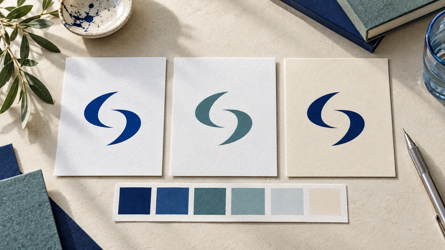
For that reason, a new business generally needs a few related logo versions: a primary logo, a stacked or compact version, a symbol or icon where appropriate, and a one-color version. You may also need light and dark versions depending on the backgrounds you use.
Consistency matters more than using every variation. Choose the version that is clearest at the intended size, and do not stretch, recolor, crop, or add effects to it without a reason. A simple logo used consistently is usually more useful than a complicated one that only works in one format.
Get files for different uses
Your logo should be available in both vector and raster formats. Path-based vector artwork can scale without the pixelation associated with enlarging a raster image. An SVG or PDF can also contain raster images, so inspect the actual artwork and confirm supplier requirements. Raster files, such as PNG or JPG, are made of pixels and are common for websites, social posts, and everyday documents.
A transparent PNG is particularly practical because it can sit on colored backgrounds without a white box around it. Keep an original master file in a safe location, then use copies for individual projects. File requirements can vary by printer, web platform, and vendor, so confirm specifications before ordering anything.
Define a practical color palette
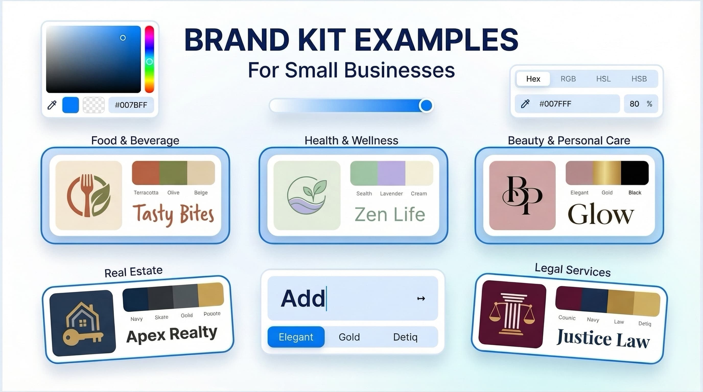
Brand colors help separate your business from a collection of unrelated materials. They also make it easier to create new items without starting from scratch. A useful palette does not need ten colors. For many new businesses, a core color, one or two supporting colors, and neutral shades for text and backgrounds are enough.
Record each color in the formats you are likely to use. HEX values are common for websites and digital design. RGB is used for screen-based applications, while CMYK is often requested for print. The same color can look different across screens, papers, inks, and finishes, so printed samples may be worth reviewing for items with a high production cost.
Color selection depends on your category, audience, and the personality you want to communicate. A financial consultant may prefer a restrained palette, while a children’s activity business may need more energy and contrast. Neither approach is automatically better. The more practical question is whether the colors remain readable, work together, and can be applied consistently.
Choose fonts that work beyond the logo
Typography is one of the most visible brand assets, especially for service businesses that communicate through proposals, websites, presentations, and email. Your font system should identify the typeface used for headings and the one used for body text. In some cases, one versatile font family is sufficient.
Prioritize readability over novelty. A decorative display font may work for a short headline but can become difficult to read in paragraphs, navigation menus, or small captions. Consider the weights you will need, such as regular, medium, bold, and italic, along with whether the fonts are available in the tools your team uses.
Document simple rules: which font is used for headings, which for body copy, typical sizes, and acceptable alternatives when the preferred font is unavailable. This prevents a business from looking different across a website, presentation, and invoice simply because each tool offers different defaults.
Build the assets you will actually use first
It is easy to spend time designing materials that will not be needed for months. Start with the customer touchpoints you expect to use in the next 90 days. For an online consultant, that may mean a website logo, social profile image, proposal cover, and email signature. For a local retail business, it may include a storefront sign, business cards, simple packaging labels, and social templates.
A practical first set often includes:
- Logo variations in suitable digital and print formats
- A color palette with documented values
- Heading and body font choices
- Social media profile and post templates
- A business card or contact card, if you meet customers in person
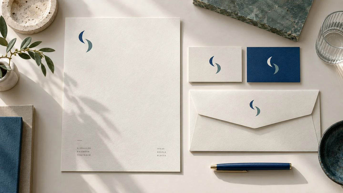
- A letterhead, invoice, proposal, or presentation template when relevant
- An email signature with consistent contact details
Not every business needs every item. A freelance writer may have no need for packaging files, while a product business may need labels before it needs a formal letterhead. Build around your operating reality rather than copying another company’s checklist.
Create simple rules before more people touch the brand
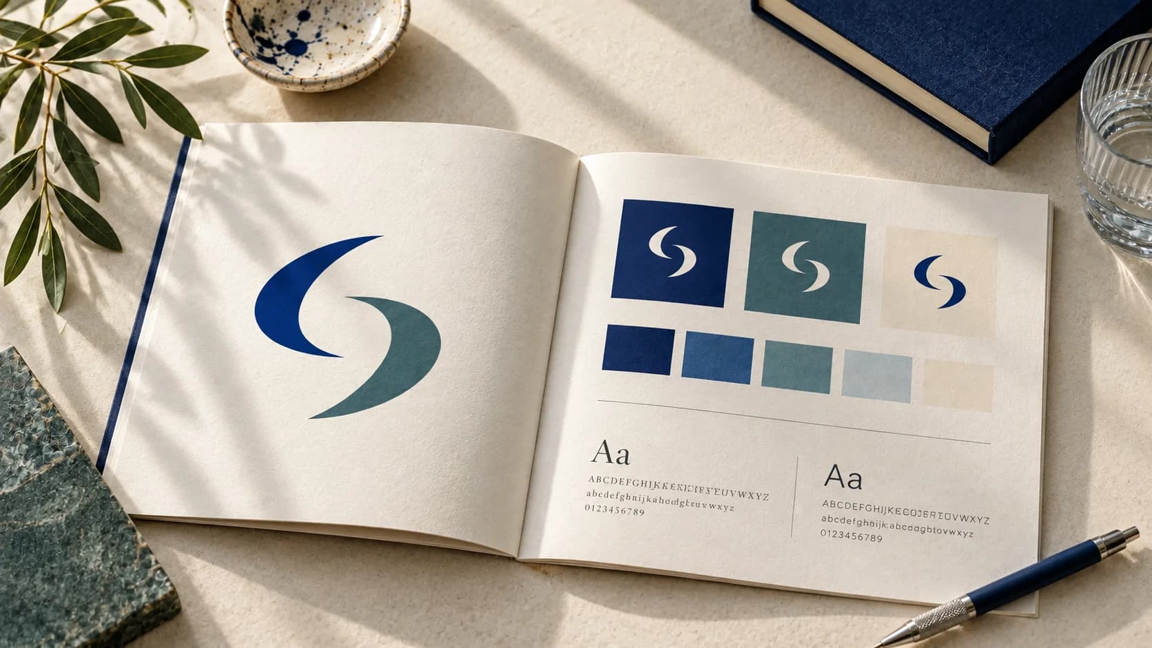
Brand guidelines do not need to be a long document at this stage. A concise guide can make a major difference when a co-founder, virtual assistant, printer, or freelance marketer needs to create something on your behalf.
Include the approved logo versions, minimum clear space around the logo, colors, fonts, and a few examples of correct and incorrect use. Add guidance on image style if photography or illustrations will be a frequent part of your marketing. For example, you might specify bright natural photography, close-up product images, or minimal editorial illustrations.
The point is not to remove all flexibility. It is to create a baseline so routine materials feel connected. Update the guide as the business grows and real use cases reveal what is missing.
Keep naming and storage organized
A strong set of brand assets becomes less useful when no one can identify the current version. Use straightforward file names, such as `businessname-logo-primary-color.svg` or `businessname-logo-white.png`. Store final approved assets separately from drafts, old concepts, and files supplied by outside vendors.
Create folders by purpose, such as logos, social media, print, documents, and guidelines. If a team shares the files, establish one source of truth and avoid sending edited logo copies back and forth through email. This small operational step can prevent outdated colors or logos from reappearing later.
Choose the right way to create your brand assets
The right branding workflow depends on the complexity of your needs. An AI-assisted branding platform can be a practical option when you need a coordinated starting point, want to explore logo directions quickly, and need common digital or print materials without a traditional agency process. Ficonica’s entry flow begins with a business name and logo exploration. Check the current product and plan details for the assets and download access available to you.
A freelance designer may be a better fit when you want close collaboration and a more tailored outcome but do not need an agency-level strategic process. A branding agency is generally more appropriate for businesses that need research, positioning work, complex naming, packaging systems, original illustration, extensive rollout support, or highly customized creative direction.
These options are not interchangeable, and cost alone should not decide the choice. Consider your timeline, budget, number of touchpoints, internal ability to make decisions, and how much original creative work the project requires. Visual branding supports recognition and consistency, but it does not replace business strategy, customer research, marketing execution, or legal review.
Review your assets in real situations
Before treating your kit as finished, test it where it will be used. View the logo at a small mobile size. Place it on a dark background. Print a business card at actual size. Read body text on a phone. Open a social template and see whether someone without design training can update it without breaking the layout.
This review often reveals more than looking at a polished mockup. If an asset is hard to use, simplify it now. The most valuable brand system is one your business can apply confidently every week as it grows.
A practical priority matrix
The following is an editorial planning framework, not a tested customer case or a package included in a particular plan. List the next three ways a customer will encounter your business. Build the assets for those touchpoints before expanding the kit.
| Business | Prepare first | Defer unless needed |
|---|---|---|
| Independent consultant | Website logo, proposal, email signature | Packaging and storefront graphics |
| Local service business | Contact page, quote, service-vehicle or sign requirements where relevant | Large social template library |
| Product business | Product listing, packaging specifications, label hierarchy | Corporate presentation library |
Worked example: a proposal-first studio
For the fictional Morrow Studio, assume the next job is sending a proposal. The minimum handoff includes an approved logo, a readable heading/body system, chosen background and accent colors, and an editable proposal master. The studio does not need ten social layouts to complete that task. If the logo is only shortlisted or the font is missing from the proposal application, the kit is not ready for that handoff.
Use three states: missing, needs checking and ready for this use. A file can be ready for a web header and still need checking for a printed sign. Avoid marking an entire kit “complete” because a folder contains many files.
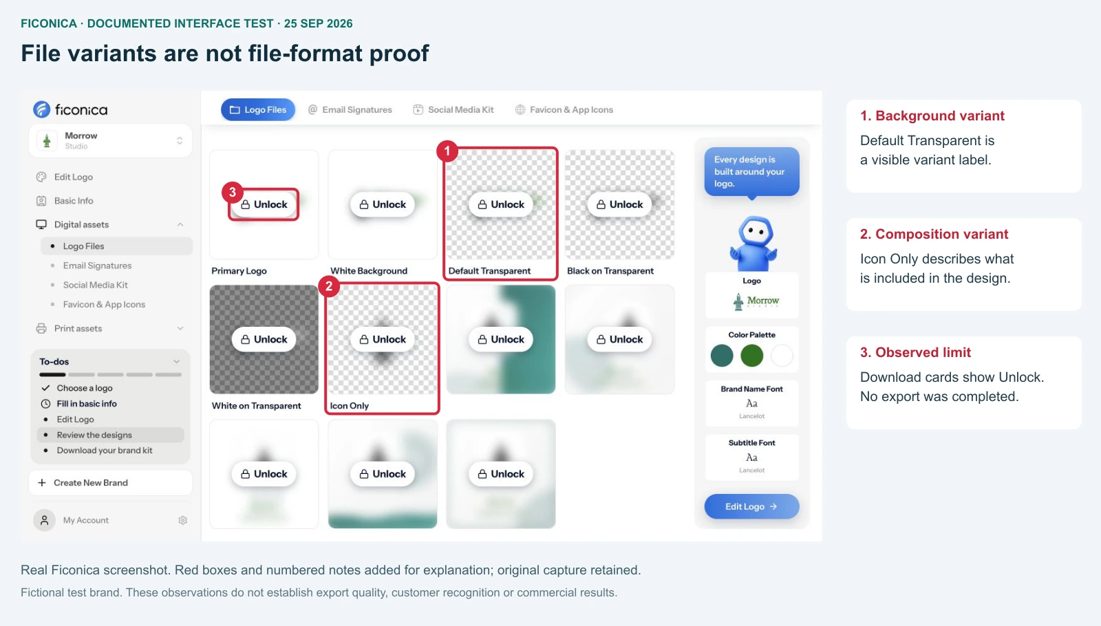
Audit an existing kit before buying more assets
A business can have many files and still be unable to use them consistently. Check the approved version, actual file contents, font availability, usage rules and the person responsible for changes. If one of those is unknown, record the gap rather than replacing everything immediately.
- Choose one upcoming task, such as an invoice or a product listing.
- Find the current master files without searching through message attachments.
- Open them in the application or workflow that will actually use them.
- Record missing versions, unavailable fonts or unclear rules.
- Fix those gaps first, then approve that particular use.
Use the editable handoff worksheet to record file locations, status and an approver. It is an article resource, not an automatically exported product document. It saves no entries remotely; print a copy if you want to retain your work.
Keep strategy and visual assets separate
Logo files, colors, fonts and templates help apply an identity. They do not establish positioning, validate demand, settle naming questions or guarantee sales. If those decisions are unresolved, a bigger asset package may simply repeat the uncertainty in more places.
FAQ
Is a logo enough for a new business?
A logo may start the identity, but recurring materials also require color, typography and usable files. Decide the minimum from the next real job.
Does every business need business cards?
No. Prioritize a contact card when it supports how you meet customers. An online service may need a proposal and email signature first.
Does a PDF prove artwork is vector?
No. File containers can include raster imagery. Inspect the actual file and check the supplier’s specifications before relying on it.
Should I replace an inconsistent kit?
Audit it first. Missing rules or an outdated copy may be the problem; you may be able to repair the handoff without replacing the whole identity.