Brand consistency for social media means using a repeatable visual system so people can recognize your business before they read every caption. It does not mean making every post match perfectly. It means your colors, type, logo use, imagery, and overall tone feel connected wherever someone encounters your brand.
For a small business, this matters because social media is often where potential customers see the brand most often. A polished website cannot fully compensate for a profile that uses random colors, mismatched graphics, and a different voice every week. The good news is that consistency is less about advanced design skills and more about making a few clear decisions and using them repeatedly.
What brand consistency for social media includes
A consistent social presence starts with visual identity, but it also includes the choices that shape how your posts feel. Your profile image, cover graphics, post templates, photography, illustrations, color palette, and font choices should work from the same basic system.
The written side matters too. A business that speaks in short, plain-language captions one day and formal corporate language the next may feel less defined, even if its graphics look polished. This is not a reason to make every caption sound identical. It is a reason to set a recognizable range for your voice.
Think of consistency as a set of boundaries, not a rigid formula. A neighborhood bakery may use warm food photography, a handwritten-style accent font, and conversational captions. A financial consultant may use cleaner layouts, restrained colors, and direct educational language. Both can vary their content while remaining recognizable.
Start with the brand elements people see first
Before building social templates, decide which visual elements are fixed and which can change. Fixed elements are the parts that help viewers identify your business quickly. Flexible elements keep the content from becoming repetitive.
Your fixed elements will generally include your primary logo, one or two brand fonts, a core color palette, and basic rules for imagery or graphic style. You may also choose a preferred profile photo treatment, such as a logo on a solid background or a founder portrait with consistent cropping.
Flexible elements can include post layouts, photo subjects, secondary colors, icon styles, and content formats. For example, a fitness coach might use the same navy, cream, and coral palette across every channel while alternating between workout clips, educational carousels, client-free quote graphics, and behind-the-scenes photos.
Avoid treating your logo as a decoration to place anywhere it fits. Use it consistently, with enough clear space and at a readable size. A small logo in the same corner of every graphic can work, but it is not required on every post. If it crowds the design or distracts from the message, a consistent color and typography system may do more for recognition.
Build a practical social media brand kit
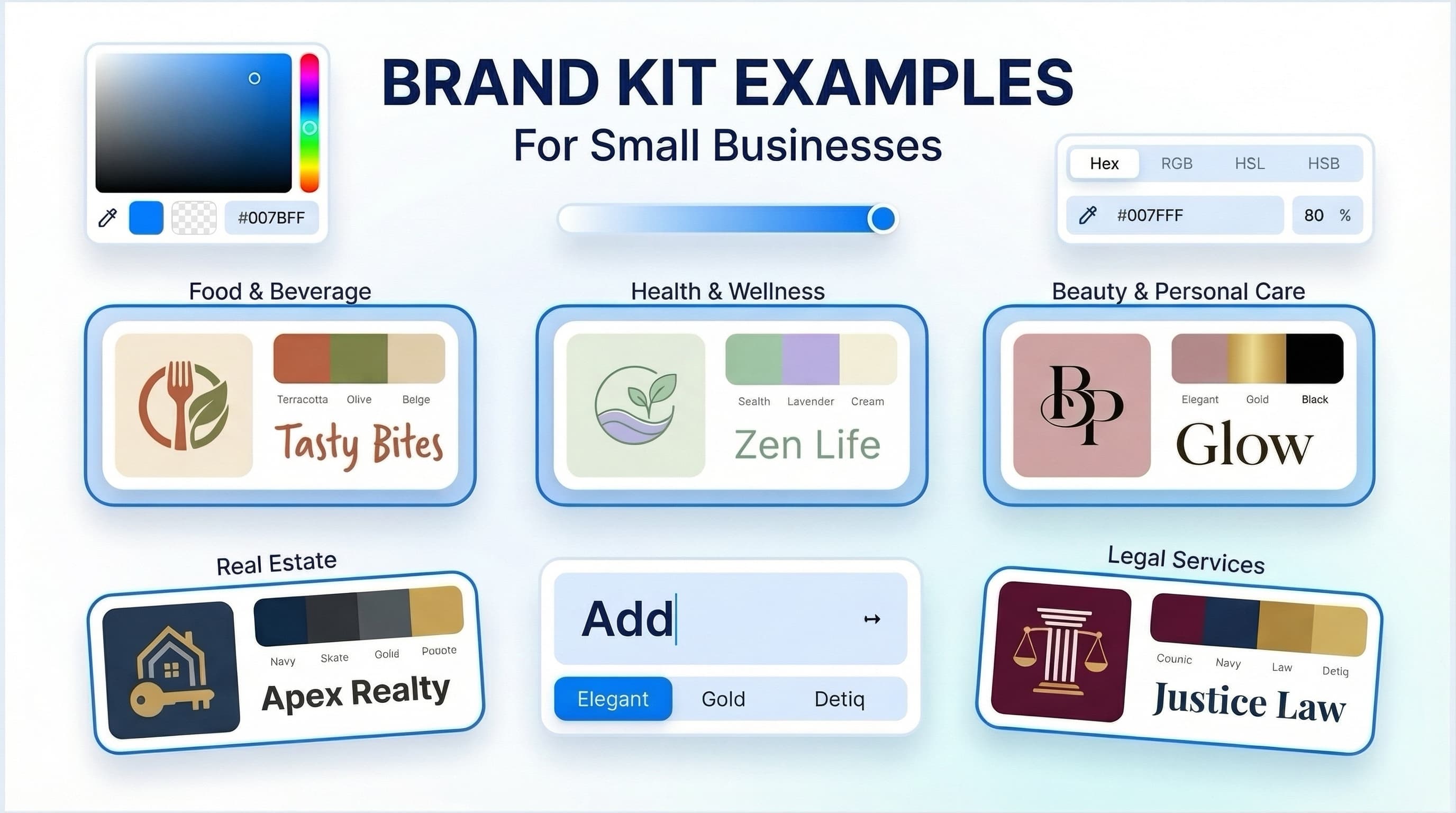
A social media brand kit should be simple enough that you will actually use it. For most early-stage businesses, a one-page reference document is a useful starting point. It should show your approved logo versions, color codes, font names, and a few examples of the visual direction you want to maintain.
Include decisions that prevent common day-to-day delays. Define the background colors you use most, the text colors that remain readable on them, and the maximum number of fonts in a post. Set a direction for photos: bright and natural, moody and editorial, product-focused, candid, or graphic-led. These choices reduce the temptation to reinvent the brand for each new idea.
If your business does not yet have a coordinated identity, an AI-assisted platform such as Ficonica may help you create logo concepts, color palettes, font pairings, and brand guidelines in one workflow. That approach is generally suitable when you need a practical foundation quickly. A designer or agency may be a better fit when your business requires extensive strategy, custom illustration, packaging systems, or highly specific creative direction.
Your social kit does not need to dictate every detail. It needs to answer the questions that come up when you are creating a post on a busy Tuesday afternoon.
Use templates without making your feed look copied
Templates are one of the easiest ways to maintain consistency, especially when several people create content. The risk is that overly strict templates can make every post look like an advertisement, even when you are sharing something useful or personal.
Create a small family of templates rather than one universal design. Most businesses can begin with four to six layouts: a text-led educational post, a quote or testimonial layout when relevant, a product or service feature, an announcement, a photo post, and a carousel cover. Each layout should use the same core type hierarchy and color relationships, while leaving room for different messages.
A type hierarchy simply means readers can tell what to read first. Use one font style and size for headlines, another for supporting text, and consistent spacing between them. Do not shrink text just to fit more words into a graphic. A post that is difficult to read on a phone is unlikely to communicate well, no matter how closely it follows your brand palette.
Consistency also depends on format. A vertical video, square graphic, and carousel slide have different needs. Instead of forcing one layout into every format, carry over the recognizable elements: your font choices, a familiar color treatment, similar image editing, and a clear approach to headlines.
Match the system to each platform
Your brand should be recognizable across platforms, but the content should not be copied blindly. A detailed carousel may work well on Instagram or LinkedIn, while a shorter visual statement may be more appropriate for a fast-moving channel. The platform changes the packaging, not the underlying identity.
Start with the places that remain visible all the time: your profile image, bio, header or cover image where available, pinned content, and link-preview graphics. These items are often seen by people who are deciding in seconds whether to follow, inquire, or keep scrolling.
Then adapt your content rhythm. LinkedIn may call for more professional context and legible document-style graphics. Instagram may allow more visual personality and behind-the-scenes content. A local service business might prioritize clear before-and-after images, while a consultant may rely more on educational posts. Brand consistency should support the way people use each channel, not ignore it.
Audit what is already inconsistent
You do not need to delete your entire content history to improve your brand. Start by reviewing your last 12 to 20 posts and asking a few practical questions. Could a new visitor tell they came from the same business? Do your colors and fonts repeat enough to create familiarity? Are your photos edited in dramatically different styles? Is the message clear before someone reads the caption?
Look for patterns rather than isolated imperfections. One off-brand post is rarely a major issue. A feed with no repeating visual cues is harder to recognize over time.
Also check for inconsistencies beyond the feed. Your email signature, website graphics, presentation slides, downloadable documents, and social profiles should not appear to come from unrelated businesses. This is visual branding, not a promise of better marketing performance. Consistency can make your communications easier to recognize and manage, but it cannot replace a clear offer, useful content, or a sound business strategy.
Set a workflow your team can repeat
The strongest brand system can still break down if creating content takes too long. Keep your approved logo files, colors, fonts, templates, photo guidelines, and example posts in one accessible location. If you work with a freelancer, assistant, or social media manager, give them the same reference rather than explaining the brand from memory each time.
Before publishing, use a short review process. Check that the graphic is readable at mobile size, the colors match your palette, the logo is used appropriately if included, and the caption sounds like your business. This takes minutes once the system is in place.
Some inconsistency is acceptable when the moment calls for it. A timely community post, a casual founder video, or user-generated content may not match every design rule. In those cases, preserving your voice and adding one or two recognizable visual cues is usually enough.
A consistent brand is built through repetition, not perfection. Choose a system you can maintain with the time and tools you actually have, then let each post reinforce the next.