Most people looking for ai logo ideas do not need more random symbols. They need a logo direction that makes sense for their business, looks credible in real use, and can grow into a full brand system. That usually means choosing a concept based on what you sell, how formal your market is, and where the logo will appear first.
A good AI-assisted starting point can help you explore directions quickly. But speed only helps if you know what to look for. If you pick a logo idea because it feels trendy for five minutes, you may end up replacing it when you print business cards, update your website header, or try to make social graphics match.
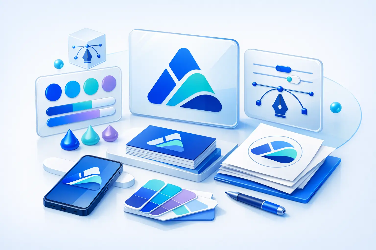
12 ai logo ideas worth considering
The best logo idea depends on context, not taste alone. A consulting firm, handmade product shop, SaaS startup, and local service business should not all use the same visual logic.
1. Wordmark logos for name recognition
If your business name is distinctive, a wordmark is often the cleanest option. This means the name itself becomes the logo through typography, spacing, and small styling choices.
Wordmarks are generally suitable for consultants, agencies, creators, software products, and online-first businesses. They also scale well across websites, email signatures, and social profiles. The trade-off is that a weak business name will not get much help from the design alone.
2. Monogram logos for long names
A monogram uses initials instead of the full name. This can work well when the full business name is long, formal, or hard to fit into compact spaces.
This direction may help law-adjacent consultants, studios, real estate teams, and premium service brands. It can look polished, but it depends on good typography. If the initials are common or visually awkward, the result may feel generic.
3. Icon plus wordmark for flexibility
This is one of the most practical formats for small businesses. You get a symbol for profile images and a full logo lockup for websites, invoices, and presentations.
For many early-stage brands, this is a safer choice than using a symbol alone. It gives you flexibility without asking the icon to carry all the meaning by itself.
4. Abstract symbols for modern brands
Abstract marks use shape, rhythm, or geometry rather than literal objects. They are often used by startups, digital products, and companies that want a more current look.
This direction can feel more ownable than a common industry icon, but it also asks more from the rest of the brand. If your business is very new, an abstract symbol may need stronger support from color, typography, and messaging before people understand what you do.
5. Minimal geometric logos for clarity
Geometric logos rely on simple circles, lines, grids, or repeating forms. They tend to look organized and contemporary.
They are generally suitable for tech, architecture, productivity tools, and professional services. The risk is over-simplicity. Many AI-generated concepts in this style can start to look interchangeable unless the proportions, spacing, or letter treatment are customized.
6. Industry hint logos, not literal clichés
Sometimes a subtle reference to your category helps. A finance brand might use structure and balance. A wellness brand might lean into calm shapes. A food business might use warmth and softness.
The key is subtlety. Literal icons like houses for real estate, leaves for eco brands, and lightbulbs for innovation often appear everywhere. AI can generate them quickly, but quick does not mean memorable.
7. Badge logos for local and product-based businesses
Badge logos place the name inside a contained shape such as a circle, shield, stamp, or label. They can work well for coffee brands, barbers, makers, trades, and packaged goods.
They often feel established and practical, especially on signage, labels, and merchandise. But badges can become hard to read at small sizes. If your logo will often appear as a social icon or mobile header, test that early.
8. Signature-style logos for personal brands
A script or signature-inspired logo can suit photographers, coaches, designers, authors, and creators. It adds personality without requiring an illustrated symbol.
This works best when the brand is centered on the individual. It is less useful if multiple people represent the company or if the audience expects a more structured, corporate feel.
9. Serif-led logos for credibility and restraint
Not every AI logo idea needs an icon. A serif wordmark can feel thoughtful, established, and premium when handled well.
This style may suit advisors, boutique firms, interior brands, and editorial businesses. Still, serif does not automatically mean trustworthy or high-end. The details matter, and some serif styles feel dated rather than refined.
10. Sans-serif logos for clean digital use
A sans-serif logo is often the easiest to use across websites, apps, decks, and social media. It usually reads well at small sizes and fits modern interfaces.
For startups and online businesses, this is often the most functional route. The downside is sameness. If you choose a very common font treatment with no distinct character, the logo may disappear into the crowd.
11. Emblem-inspired logos for niche communities
An emblem is more enclosed and decorative than a standard badge. It can suggest tradition, craftsmanship, or belonging.
This may work for specialty clubs, heritage-style product brands, or organizations with a strong community angle. It is less ideal if you need a highly flexible logo system for many digital formats.
12. Logo systems instead of one fixed mark
Sometimes the best answer is not a single logo idea but a small system. That might include a full logo, a short version, an icon, and clear rules for color and spacing.
This is especially useful if your brand will show up in many places, from website headers to profile photos to print materials. A simple system usually serves a growing business better than one isolated logo file.
How to choose between ai logo ideas
Start with use cases, not aesthetics. Ask where the logo will appear in the next six months. If the answer is mostly Instagram, a storefront sign, and invoices, your needs are different from a software company launching a website, pitch deck, favicon, and email signature.
Then look at your business name. If it is short and strong, a wordmark may be enough. If it is long, a monogram or icon-plus-wordmark may be easier to use. If the name is generic, stronger typography and a clearer visual system may matter more than an elaborate symbol.
Also consider your market. In some categories, playful design helps you stand out. In others, it may weaken the impression you want to give. A kids' brand and a financial consultant can both use AI-assisted branding, but they should not evaluate concepts by the same criteria.
What makes an AI-generated logo concept usable
A usable logo is not just attractive on a preview screen. It should stay clear at small sizes, work in black and white, and still look intentional when placed on a website, social post, document, or printed material.
This is where many early choices fail. A logo with thin lines, tiny details, or complicated layering may look polished in a mockup but break down in real-world use. AI can help generate directions quickly, but human judgment is still needed when narrowing them down.
If you are using a platform to build a broader identity, consider whether it also helps you coordinate colors, font pairings, and brand previews. That matters because a logo rarely works alone. A tool like Ficonica may be useful when you want to move from a logo concept to a more consistent starter brand without beginning with a traditional agency process.
When AI logo ideas are enough, and when they are not
AI-assisted logo generation is often a practical fit for new businesses, side projects, local services, creators, and startups that need a credible visual identity quickly. It can also help teams compare directions before investing in deeper design work.
But there are cases where it may not be enough. If you need original illustration, extensive packaging design, highly strategic positioning, or a custom identity built through research and collaboration, a designer or agency is usually the better choice. The same applies if multiple stakeholders need alignment or if the brand carries high complexity from the start.
That is not a flaw in AI tools. It is just a scope question.
A simple filter before you pick one
Before choosing from any set of ai logo ideas, put your top options through one practical test. Can you imagine each one on your website header, profile image, proposal PDF, and a simple black-and-white printout? If one concept only works in a polished mockup, it probably is not your strongest option.
The right logo idea should make your business easier to present consistently, not harder. Start there, and your brand will have a much better foundation for everything that comes next.