If you want to know how to ai logo design, the short answer is this: start with clear brand inputs, generate several directions, refine one concept with restraint, and judge the result by usability rather than novelty. A logo is not just an image you like on screen. It needs to work at small sizes, fit your business category, and stay consistent across your website, social profiles, documents, and print materials.
That is where many first-time founders get stuck. AI can produce logo options quickly, but speed does not remove the need for decisions. You still need to define what your business is, who it serves, and what kind of impression you want to create. If those inputs are vague, the outputs usually are too.
How to AI logo design step by step
The most useful way to approach AI logo design is to think like a brand owner, not a prompt writer. Before you generate anything, write down your business name, a plain-English description of what you sell, your audience, and three words that describe the brand personality. Practical, premium, playful, technical, calm, bold, and traditional can all work, but choose words that fit the market rather than words that simply sound attractive.
Next, decide what kind of logo you are aiming for. Most small businesses do not need a highly complex mark. A clean wordmark, a simple icon paired with a name, or a monogram is often more usable than an intricate illustration. If you run a consulting practice, software startup, home service business, or online store, clarity will usually matter more than originality for its own sake.
Then generate multiple concepts instead of trying to get the perfect logo in one attempt. This is one of the main strengths of AI. You can compare different directions quickly and see whether your business feels better represented by a text-led identity, a geometric symbol, or a softer and more approachable style. At this stage, range matters more than polish.
Once you have a few promising options, narrow down to one direction and refine it. Change too many things at once and the process becomes random. Adjust the symbol style, letter spacing, color direction, or typography one step at a time so you can see what is actually improving the result.
What to prepare before generating a logo
Good AI results usually come from specific inputs. If you type only your business name and industry, you may still get usable ideas, but they are more likely to feel generic. A better starting point is a short creative brief written in normal language.
Include what your business does, who it serves, where it will appear first, and what you want to avoid. For example, a bookkeeping service for independent contractors may want a logo that feels clear and reliable, not flashy or overly corporate. A candle brand may want something minimal and calm, not techy or aggressive. These distinctions help guide the visual tone.
It also helps to think about application early. A logo used mostly on Instagram, a Shopify store, and email signatures has different practical needs than one that must work on storefront signage, embroidered uniforms, or packaging labels. AI can help with concept generation, but the business context should shape the final choice.
How to write better prompts for AI logo design
The goal of a prompt is not to sound clever. It is to remove ambiguity. Start with the business type and visual direction, then add a few constraints. For example, ask for a minimalist wordmark for a financial coach, a modern geometric icon for a software tool, or a clean badge-style logo for a local coffee brand. Mention whether you want the design to feel premium, friendly, technical, understated, or energetic.
What usually helps is specifying style without over-directing the image. If you ask for too many trends, symbols, moods, and effects in one prompt, the result often becomes busy. Simpler prompts tend to produce cleaner logo directions. If you want an icon, ask for a simple one. If you want typography to lead, say that explicitly.
You should also mention what not to include when it matters. If your category is full of overused symbols, say you want to avoid them. Lawyers often overuse scales. Real estate brands often overuse rooftops. Fitness brands often overuse dumbbells. AI does not automatically know when a category has become visually repetitive.
Choosing the right concept from AI outputs
The best-looking concept is not always the best business logo. A strong option is usually the one that remains clear when it is small, looks balanced in black and white, and does not rely on tiny decorative details. If the logo only works on a large presentation slide, it may fail where you actually need it.
Try reading the business name quickly. If the type is hard to read, that is a problem. Then imagine the logo as a profile picture, website header, invoice mark, and printed card. A concept that survives those use cases is generally more useful than one that looks impressive only in a mockup.
This is also the point where restraint matters. Early-stage businesses often try to make a logo communicate everything at once. In practice, a logo usually works better when it signals the brand clearly and leaves the full explanation to the website, packaging, or sales copy.
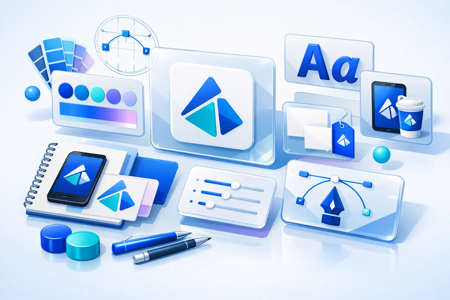
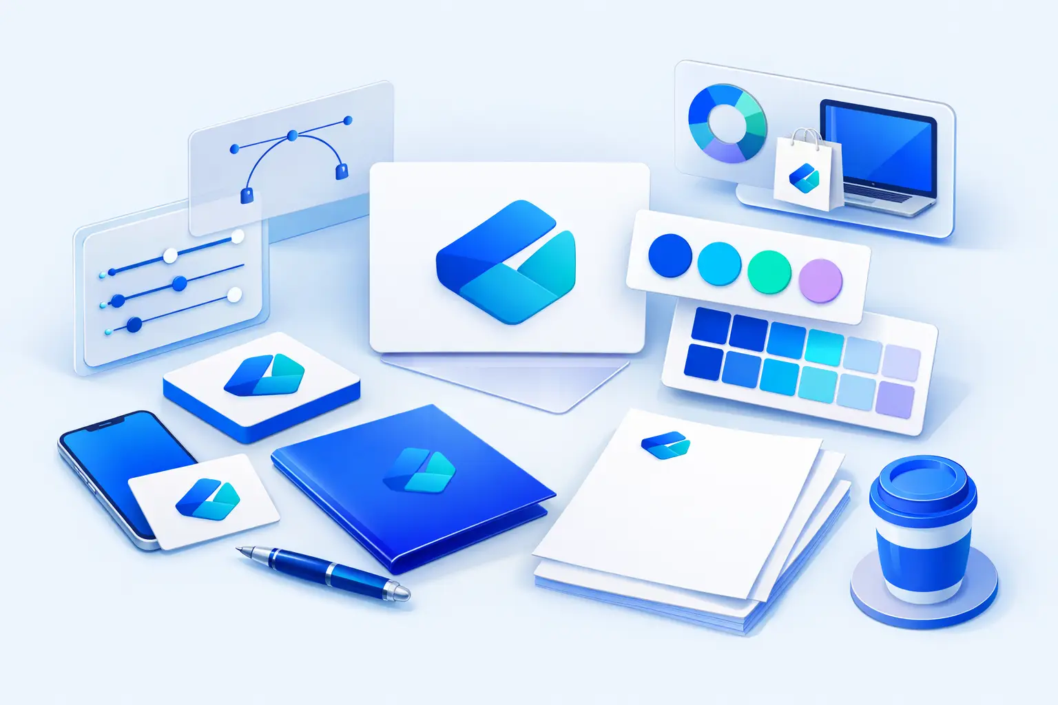
Color, fonts, and why the logo is only one piece
A logo on its own is not a complete brand identity. Even a simple business needs a coordinated color palette and font pairing if it wants to look consistent across different touchpoints. This is one reason AI branding tools can be helpful for non-designers. They can move beyond a single logo concept and support a more usable visual system.
Color choice depends on context more than universal rules. Blue may feel stable in one category and forgettable in another. Black can feel premium or severe depending on the typography and layout. Bright colors may help a playful brand, but they can also reduce flexibility if every application starts shouting for attention. Consider whether your colors still work in muted formats, grayscale, or print.
Font pairing matters for the same reason. A bold display font may suit a logo, but your website and documents also need readable supporting type. If the logo style and the brand fonts feel unrelated, the identity starts to look improvised.
When AI is a smart choice and when it is not
AI logo design is generally suitable when you need a professional starting point quickly, have a limited budget, and do not need deep brand strategy or custom illustration. That often fits solo founders, small teams, side projects, and service businesses that need to launch with a coherent identity instead of waiting months.
It may be less suitable when the brand requires extensive market research, a highly distinctive visual concept, packaging systems, or original illustration. It also may not be the right fit if multiple stakeholders need workshops, messaging alignment, and strategic positioning before any design work begins. In those cases, a freelancer, designer, or agency may be the better option.
There is no need to force this into an either-or argument. Some businesses start with AI to build a credible first version, then invest in custom design later. Others already know they need strategic depth from day one. The right choice depends on complexity, timeline, and how much ambiguity still exists in the business itself.
A practical workflow that saves time
If you want a fast process, keep it simple. Define your brand basics first, generate several logo routes, shortlist the most usable option, then build the supporting identity around it. Check how the logo looks on a website header, social image, document, and print preview before treating it as final.
If you use an AI-assisted branding platform such as Ficonica, the main advantage is not only speed in generating logo concepts. It is the ability to move from a name and business description toward a more coordinated brand system, including colors, typography, previews, guidelines, and downloadable assets. For many small businesses, that kind of structure is more useful than a logo file alone.
Common mistakes in AI logo design
The biggest mistake is choosing based on personal taste without checking business fit. Another is over-editing until the design loses clarity. It is also common to approve a logo before confirming what files and layouts are needed for real use.
A more subtle mistake is confusing visual branding with business strategy. A cleaner logo may help your business look more organized and credible, but it does not replace positioning, pricing, messaging, customer experience, or legal review. Branding supports those areas. It does not solve them by itself.
One final check is worth doing before you move on. Ask whether the logo still feels appropriate if your business grows slightly beyond its current offer. A very narrow visual idea can become limiting. A simpler, more flexible direction often lasts longer.
A good AI-designed logo is not the one with the most effects or the most unusual symbol. It is the one that helps your business show up clearly, consistently, and confidently from the first day you use it.