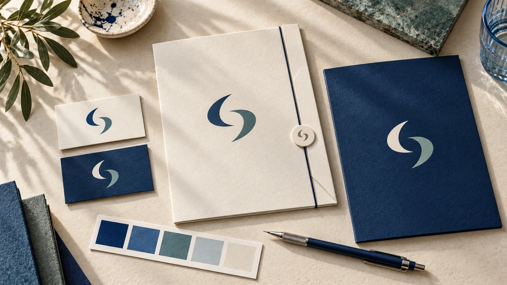
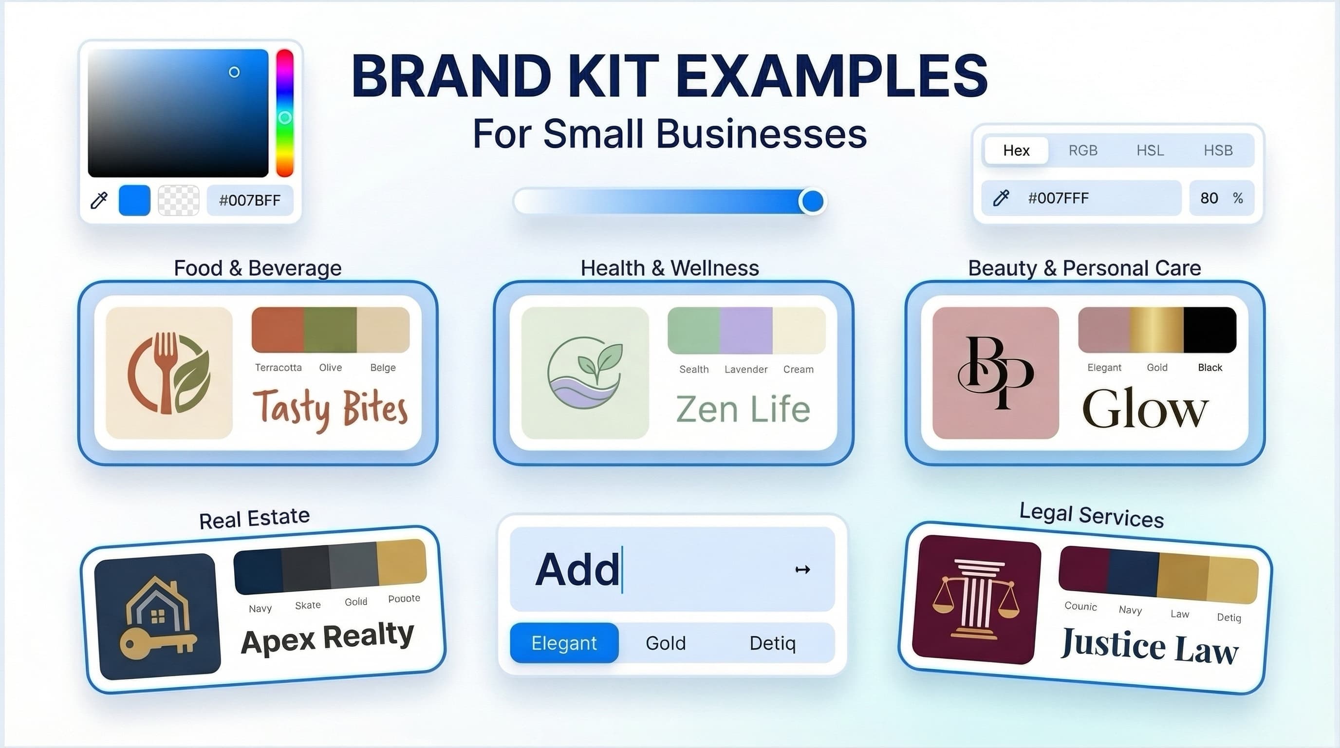
A brand toolkit is the practical set of visual assets and rules a business uses to look consistent everywhere it shows up. For most small businesses, that means more than a logo. It usually includes logo variations, colors, fonts, simple usage guidelines, and ready-to-use files for web, social media, email, and print.
If your business already has a name, a service, and a place to show up online, a brand toolkit helps turn that into a recognizable identity. It does not replace your business strategy, marketing plan, or legal work. What it does is make your brand easier to apply consistently, which is often the missing piece for founders who are building quickly and making design decisions on the fly.
Why a brand toolkit matters
The biggest problem a brand toolkit solves is inconsistency. Without one, a business tends to use different logo files, slightly different colors, mismatched fonts, and improvised graphics depending on who is creating the material. That may not seem urgent at first, but it creates friction fast. Your website looks one way, your Instagram posts look another, and your proposal PDF looks like it came from a different company.
A toolkit gives you a usable system. Instead of asking, "Which logo should I use here?" or "What blue was that again?" you have a defined answer. That saves time, reduces guesswork, and helps your materials look coordinated even if you are not a designer.
For a startup, freelancer, creator, or local service business, this is generally more useful than collecting random design files in a folder. A good toolkit organizes decisions so you can actually use them.
What should be in a brand toolkit?
The right toolkit depends on how your business operates, but a practical baseline is fairly consistent.
Logo files and logo variations
You usually need more than one version of your logo. A full logo may work well on your website header, while a simplified mark or horizontal version may fit social profile images, email signatures, or narrow spaces better. If you only have one file, you will end up stretching, cropping, or placing it awkwardly.
File type matters too. For digital use, PNG files are often helpful because they can support transparent backgrounds. For print or scalable use, vector files are generally preferred because they can be resized without losing quality. JPG files may be fine for certain everyday uses, but they are less flexible if you need transparency or clean scaling.
Color palette
Your brand colors should include primary colors and, in many cases, a few supporting colors. The goal is not to create the largest possible palette. It is to create a controlled set that works across your website, social graphics, documents, and printed materials.
For most small businesses, fewer colors is often better. A compact palette is easier to use consistently and less likely to become chaotic. The right set depends on your industry, audience, and how much visual contrast you need. A consultant may need a restrained palette that works in documents and presentations, while a creator brand may need more expressive accent colors.
Font pairing
A brand toolkit should define which fonts to use and where to use them. This usually means a primary font for headlines and a secondary font for body text or support content. Some brands use one versatile type family, which can also work well.
The practical question is not "Which font is most stylish?" It is "Can I use this consistently across my main channels?" A font may look great in a logo preview but become frustrating in presentations, social posts, or web pages if it is hard to read or difficult to access.
Basic brand guidelines
Brand guidelines do not need to be a 60-page document to be useful. For many early-stage businesses, a short guide is enough if it clearly shows logo usage, colors, fonts, spacing, and a few examples of correct and incorrect application.
This is where a toolkit becomes a system instead of a file pack. Guidelines help you make new materials later without reinventing the brand every time.
Ready-to-use business assets
This is where a toolkit becomes immediately useful. Depending on your business, that may include social media materials, business cards, stationery, letterheads, and email signatures. These assets matter because they reflect the places where a small business actually interacts with customers.
A business that sells mostly online may care more about social graphics and profile images than letterhead. A consultant or local service provider may care more about proposals, email signatures, and business cards. A toolkit should match your real use cases, not an imaginary full-scale corporate brand rollout.
What a brand toolkit is not
This part matters because the term can get stretched too far.
A brand toolkit is not your marketing strategy. It will not tell you what channels to advertise on, how to write your sales funnel, or which offer to launch first. It is also not the same as a full brand strategy process, which may include audience research, market positioning, messaging architecture, naming exploration, and deeper competitive analysis.
It is also separate from legal protection. Choosing a visual identity and generating assets is not the same as confirming trademark availability or ownership rights in a legal sense. If those questions are central to your decision, consider getting qualified legal guidance.
Who needs a simple toolkit and who needs more?
A simple brand toolkit is generally suitable for businesses that need to launch quickly, look organized, and maintain consistency across a manageable number of channels. That includes many solo founders, service providers, online shops, creators, and early-stage startups.
If your needs are more complex, a lightweight toolkit may not be enough. For example, if you need custom packaging systems, original illustration, extensive strategic research, or a highly distinctive art direction, a freelance designer or agency may be the better fit. The more your brand depends on unique visual storytelling or large-scale rollout, the more valuable human-led creative direction usually becomes.
That does not make one option universally better. It depends on budget, timeline, complexity, and how much customization your business truly needs right now.
How to evaluate a brand toolkit before you use it
Start with usability. Can you quickly identify which assets are for web, print, and social media? Are the logo versions clear? Are the colors and fonts documented in a way that a non-designer can actually follow?
Then look at coverage. Think about the next 90 days of business activity. Will you need a website logo, social profile image, email signature, business card, or presentation template? Your toolkit does not need to cover every possible brand application on day one, but it should support your most common tasks.
Finally, look at flexibility. A toolkit should help you stay consistent without boxing you into one rigid format. If every asset only works in one layout or one background color, you may run into limits quickly.
AI-assisted tools vs hiring a designer
If you are comparing options, the right question is not whether AI is better than a designer. It is whether an AI-assisted workflow matches the scope of your current needs.
For many small businesses, AI-assisted branding can be a practical starting point when speed, cost control, and ease of use matter most. Platforms like Ficonica are designed to help non-designers move from a business idea to a coordinated visual identity with logo concepts, customization, color and font choices, brand previews, guidelines, and downloadable assets.
That can be enough for an early-stage business that needs a clean, usable system without starting with a traditional agency process. But if your project requires deeper strategy, highly original visual language, or extensive customization, a professional designer may still be the stronger choice.
Build for where your brand will actually appear
A useful brand toolkit is not the one with the most files. It is the one that helps you show up consistently in the places your business already operates. If you send proposals, make sure your documents look aligned. If you sell through social channels, prioritize profile images and post-ready assets. If you rely on email outreach, your signature and logo files should be easy to use.
That mindset keeps branding practical. You are not building a museum piece. You are creating a working set of tools that support everyday business activity.
The most helpful next step is simple: list the five places your brand appears most often, then check whether your current toolkit supports each one clearly. If it does not, that is where to improve first.