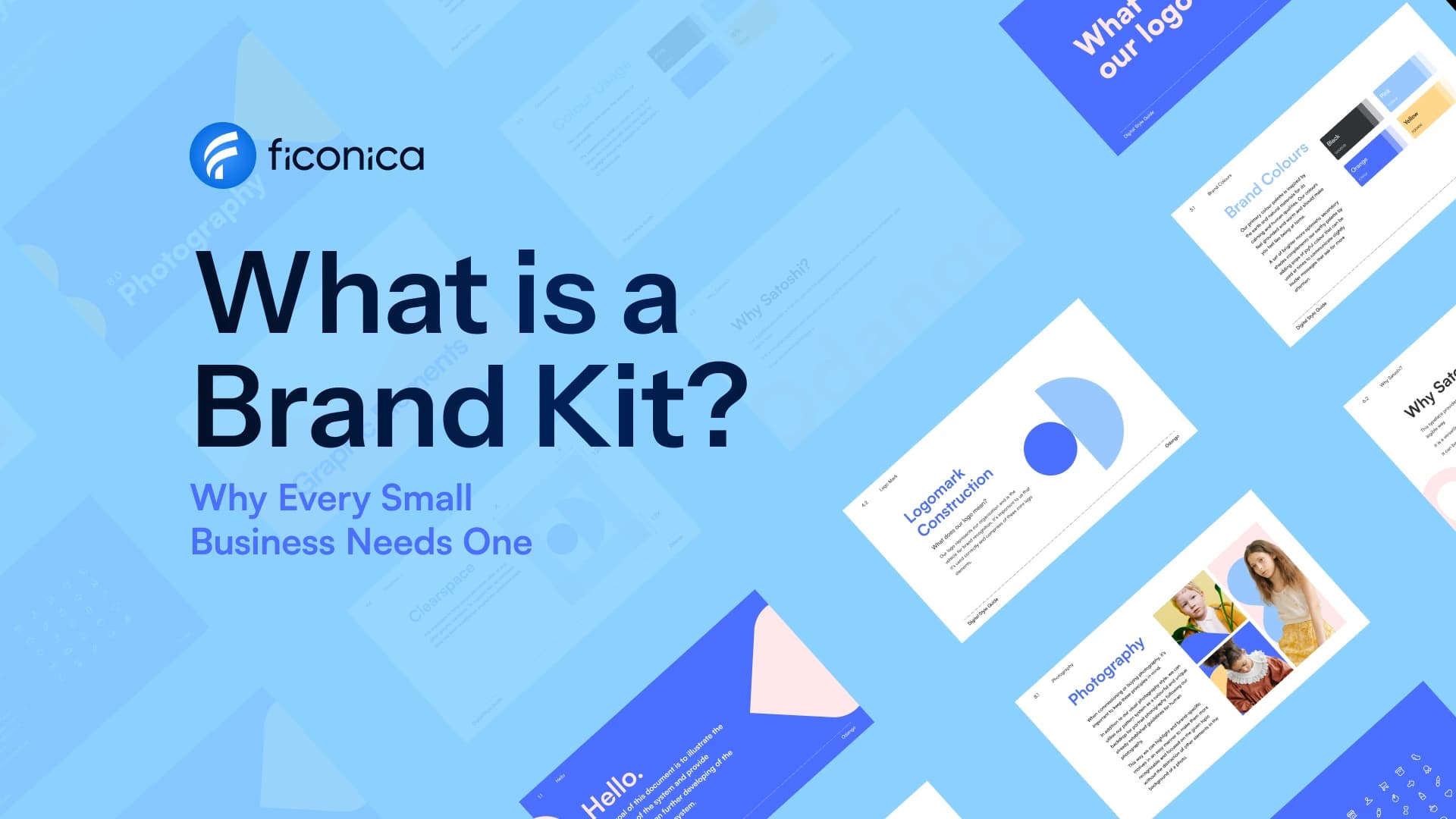
A brand kit is a practical set of visual rules and files that tells you how your business should look wherever customers find it. To create a brand kit, start with the essentials: a usable logo system, a limited color palette, a font pairing, and clear guidance for applying them. The goal is not to make every piece of content identical. It is to make your website, social posts, invoices, and printed materials recognizable as part of the same business.
For a new business, this is often more useful than collecting design ideas without a plan. A brand kit gives you decisions you can reuse, so you spend less time guessing whether a new graphic, proposal, or profile image fits your business.
What a brand kit should include
A complete brand kit does not need to be large. It needs to cover the places where your business actually appears. A consultant who mainly sells services online may need a different set of assets than a café, retail shop, or product-based business that uses packaging and printed materials.
At a minimum, your kit should include a primary logo, alternate logo versions, brand colors, and fonts. It should also include the actual files needed to use those elements. A logo shown only in a preview is not enough when you need to place it in a presentation, add it to an email signature, or send it to a printer.
Consider including these core components:
- A primary logo for your main website header, business documents, and prominent uses
- A simplified logo or icon for small spaces such as social profile images and browser icons
- A color palette with primary colors and supporting neutral or accent colors
- Heading and body fonts, plus notes on where each should be used
- Social media graphics or templates if social content is a regular marketing channel
- Business card, letterhead, email signature, or other stationery assets when they match your operating needs
- A short brand guide that shows correct logo spacing, color values, and font use
The right scope depends on your business. Do not create packaging layouts if you do not sell physical products. On the other hand, do not overlook a social profile image if referrals and customer discovery happen through social platforms.
Start with the business, not the logo
A logo is a visible part of a brand kit, but it cannot make basic positioning decisions for you. Before choosing shapes, colors, or typefaces, write a short working description of your business. Include what you offer, who it is for, the category you operate in, and three to five words that describe the impression you want to create.
For example, an accountant serving independent contractors may want to appear clear, organized, and approachable. A handmade skincare business may lean toward calm, thoughtful, and tactile. Those are not fixed design formulas. They are filters that help you reject choices that send the wrong signal.
Also consider where people will see your brand first. A local service company may rely on vehicle graphics, estimate documents, and Google Business Profile images. A creator may need a strong profile image, video thumbnails, and a simple media kit. Your first-use cases should shape the kit.
This exercise is visual branding, not a full business strategy. It will not determine pricing, validate demand, or guarantee marketing performance. It does help make the presentation of your existing business more consistent.
Build a logo system that works at different sizes
Many small businesses begin with one logo and try to force it into every format. That usually creates problems when the logo is too detailed for a small profile photo or too wide for a narrow website header.
A more useful approach is to prepare a small logo system. Your primary logo may include a symbol and business name. A stacked or horizontal alternative can suit different layouts. A symbol-only mark, if it remains identifiable, may be useful for small digital spaces.
Test each version before finalizing it. View it at a small size on a phone. Place it on a light background and a dark background. Check whether fine lines, small text, or subtle color differences disappear. If a logo only works in one large, carefully designed mockup, it is not yet practical enough for everyday use.
You should also organize logo files by purpose. Vector files are generally useful for print and scaling because they can be enlarged without becoming blurry. Raster files, such as PNG or JPG, are common for digital use. A PNG with a transparent background can be helpful when placing a logo over a colored website section or graphic. Confirm the requirements of your printer, web platform, or vendor before sending files.
Choose colors for flexibility, not just first impressions
Brand colors need to work across screens, documents, and print. Rather than selecting five equally dominant colors, choose one or two primary colors, then add neutrals and one optional accent. This gives you enough variety without making every social post look unrelated.
Think about contrast early. Text must remain readable against the backgrounds you plan to use. A pale accent color may look attractive in a palette but be hard to read when used for small text. Dark text on a light background is often a reliable starting point, while color can carry emphasis through buttons, labels, dividers, or graphic details.
Record the color values in your guide. Hex codes are commonly used for websites and digital graphics. Print providers may ask for CMYK values or have their own specifications. Screen colors and printed colors do not always match exactly, so a test print can be worthwhile for important materials such as signage, stationery, or packaging.
Pick fonts that are easy to use consistently
Typography has a major effect on whether a brand feels organized, but the practical question is simple: can your team use these fonts reliably? A brand kit generally needs a heading font and a body font, although one well-chosen font family may be enough for some businesses.
Choose a body font that is comfortable to read in paragraphs, estimates, emails, and web pages. Save highly decorative type for limited uses, such as a short headline or graphic. If a font is difficult to access across the tools you use, it may create inconsistency every time someone prepares a document.
Your guide should state the basics: which font is used for headings, which is used for body copy, and what weights or styles are preferred. You do not need a complex typography manual to get value from this. Clear defaults are usually more helpful than many exceptions.
Put the rules into a usable brand guide
A brand kit becomes more valuable when another person can use it without repeatedly asking for direction. Your brand guide can be a concise document. It should show the approved logo versions, the color codes, font choices, and examples of what to avoid.
Include a few simple rules. Specify whether the logo can be placed on photographs, whether it needs clear empty space around it, and which logo version to use on dark backgrounds. Note that the logo should not be stretched, recolored without a reason, or recreated with substitute fonts.
Keep the guide aligned with real work. If you send proposals every week, add a proposal cover example. If you publish social posts, show a sample post layout. A guide that reflects everyday materials is more likely to be followed than one filled with rules for assets you never use.
Choose the right way to create your brand kit
The best workflow depends on your budget, timeline, and the complexity of the work. An AI-assisted platform such as Ficonica may be suitable when you need to move from a business idea to coordinated logo concepts, colors, fonts, brand previews, guidelines, and downloadable assets without starting with a traditional agency process.
A freelance designer may be a better fit when you want closer collaboration and a tailored visual direction. A branding agency is generally more appropriate for businesses that need extensive research, brand strategy, original illustration, complex packaging systems, or coordination across many customer touchpoints. These options are not interchangeable, and the most expensive route is not automatically necessary for an early-stage business.
Whichever route you choose, review the deliverables before committing. Ask what logo variations, file types, guidelines, and editable materials are included. If you intend to use a business name or logo in a way that raises trademark or ownership questions, consult a qualified legal professional rather than treating a brand kit as legal clearance.
Use the kit before adding more assets
Once your kit is ready, apply it to the first three to five materials your customers are most likely to encounter. That might be a website header, social profile, proposal template, email signature, and business card. This is where small gaps become visible: perhaps the icon is unclear at profile size, or the accent color is too light for text.
Treat your first use as a practical test, not a final judgment. A good brand kit should make routine decisions easier, while leaving room for your business to grow and add assets when they become genuinely necessary.