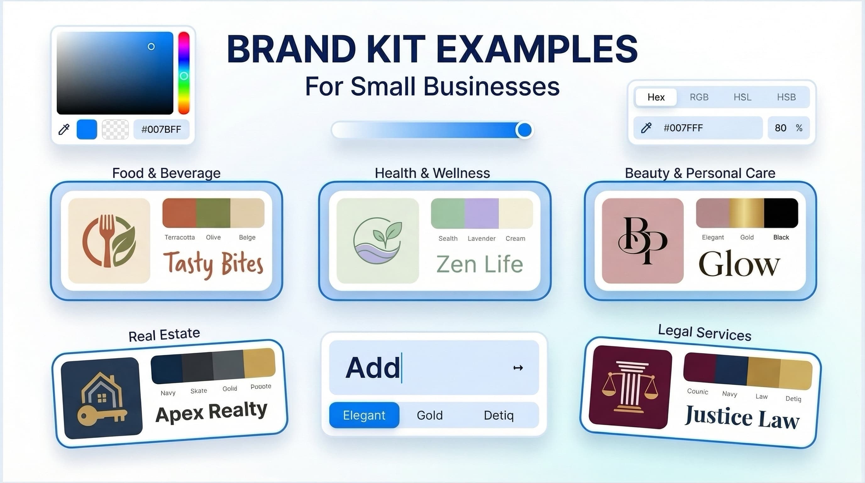
A brand kit creator is a practical way to turn a logo idea into a usable visual system: coordinated colors, fonts, logo versions, and ready-to-apply assets. It is generally suitable for founders and small teams that need to launch quickly without assembling every design decision from scratch. The value is not simply having more files. It is making sure the files work together wherever customers encounter your business.
A logo on its own leaves many questions unanswered. Which background color should you use? What typeface belongs on your website? Does the logo still read clearly in a small social profile image? A brand kit gives you repeatable answers, so each new page, post, document, or printed item does not become a new design project.
What a brand kit creator actually does
A brand kit creator organizes the basic ingredients of a visual identity around a selected logo direction. Depending on the tool and product, it may help generate logo concepts, suggest color palettes and font pairings, show brand previews, and prepare downloadable assets for common business uses.
The useful outcome is a system rather than a single image. A coffee cart, for example, may need a main logo for signage, a compact mark for an Instagram profile, a warm neutral palette for menus, and type choices that remain readable on a mobile screen. A consultant may need the same foundation expressed through a presentation cover, email signature, and simple social graphics.
This process can reduce the friction of early branding, but it does not replace every part of brand building. A kit will not define your pricing, validate product demand, write your positioning, or create a marketing plan. It can help your business look coordinated while you make those decisions, not make the decisions for you.
What a complete brand kit should include
The exact contents depend on how and where you operate. An online creator who sells digital templates needs different materials than a local service business that sends proposals and prints appointment cards. Still, most usable brand kits start with the same core pieces:
- A primary logo for the most common use, plus alternate or simplified versions when available.
- A defined color palette with primary, supporting, and neutral colors.
- Font choices for headings and body copy, including guidance on when to use each.
- Basic logo-use rules, such as clear space, minimum size, and background options.
- Digital and print assets appropriate to your business, such as social media materials, business cards, stationery, letterheads, or email signatures.
The primary logo matters, but flexibility matters just as much. A wide logo can work well in a website header but poorly in a square profile image. A one-color version may be needed for a stamp, invoice, or low-cost print job. Before choosing a logo direction, consider the small, constrained places your identity must work - browser tabs, mobile screens, product labels, and email footers often expose weaknesses first.
Colors need roles, not just visual appeal
A palette should give each color a job. One color may be used for primary buttons and key accents, another for background areas, and dark or light neutrals for readable text. Choosing five colors you like is not the same as choosing a palette you can apply consistently.
Contrast is especially important. Light gray text on a pastel background may look polished in a mockup but can be difficult to read on a phone. If you are not sure whether a combination is usable, keep body text dark against a light background or light against a genuinely dark background. Reserve softer combinations for decoration rather than essential information.
Color choices can help create a recognizable look, but they do not guarantee customer trust or sales. Their practical purpose is to help people recognize a consistent presentation and navigate your materials clearly.
Font pairing should reduce choices
Most early-stage businesses do not need a large type system. One font for headlines and one for body copy is often enough, provided both are legible and fit the character of the business. A detailed display font may suit a short heading but become tiring in a long proposal or service page.
Use font guidance as an operating rule. If every team member selects a different typeface for every social post, the brand will look inconsistent even when the logo and colors stay the same. Keeping the number of options small makes everyday execution easier.
How to use a brand kit creator well
The quality of the result depends partly on the decisions you bring to the process. Start with a clear description of your business: what you offer, who it is for, and the general impression you want to make. Terms such as calm, precise, playful, established, or approachable can be helpful starting points, but connect them to a real business context.
If you are launching a bookkeeping service, for instance, you might prioritize clarity, restraint, and legibility. A children’s art studio may have more room for expressive color and illustration. Neither direction is automatically better. The right choice depends on the offer, audience expectations, and where the identity will appear.
Next, review concepts at realistic sizes. Do not choose only from a large screen preview. Check whether the business name is readable when reduced, whether fine lines disappear, and whether the mark remains distinct without special effects. A simpler concept is often more practical across digital and print applications, though simplicity should still fit the personality of the business.
Then establish a short set of rules before creating materials. Decide which logo is the default, which colors are used for calls to action, which font is used in documents, and which social image style you will repeat. Save those choices in one accessible location. This is where brand guidelines are useful: they make a visual identity easier to hand off, revisit, and apply consistently.
Ficonica is one option for businesses that want to move from a name and industry description toward logo concepts, color and font choices, brand previews, guidelines, and downloadable materials. As with any tool, review the specific product details before purchase to confirm the assets and options that match your planned uses.
Prepare for the places your brand will appear
A brand kit becomes more valuable when it reflects your actual workflow. List the first places your business will show up during the next few months. For many small businesses, that includes a website, social profiles, invoices or proposals, email, and a few printed items. An online shop might add packaging inserts or product labels. A service provider may prioritize a presentation template and business card instead.
This step prevents a common problem: buying or creating a beautiful identity, then discovering you only received a version of the logo that does not work for your first essential application. Ask practical questions. Do you need a transparent logo for a website? Will you print in full color or one color? Does your social avatar need an icon rather than a full wordmark? What will another person need to make a new slide or flyer without guessing?
For print, confirm specifications with your printer before sending final artwork. Print methods, paper choices, dimensions, and color requirements vary. A design that looks good on screen may need adjustments for a small label, textured stock, or limited-color printing.
When a kit is enough and when to hire help
A brand kit creator is generally a strong fit when you need a clear, usable visual starting point, have a limited timeline, and can work within a guided set of choices. It may also suit a business that needs to replace inconsistent DIY materials with a more coordinated system.
A freelance designer can be a better fit when you need close collaboration, specialized design skills, or a distinctive visual direction beyond a guided platform. An agency may be more appropriate for complex brand strategy, extensive audience research, packaging systems, original illustration, naming work, or a large rollout across many touchpoints.
These options are not interchangeable because they solve different problems. A faster, guided workflow usually involves more structured choices. A custom engagement can offer deeper exploration, but generally requires more time, budget, and active participation from your team.
It is also wise to separate visual branding from legal questions. Creating a logo or business name is not the same as confirming trademark availability, registering a trademark, or determining ownership and usage rights. For decisions with legal consequences, review the relevant terms and consult a qualified professional.
Make the kit part of your daily work
A finished kit only helps if you use it. Keep your approved logo files, colors, fonts, and guidelines together. Create a few repeatable templates for the materials you produce most often, then resist redesigning them every week. Consistency does not mean every item must look identical. It means each one should clearly belong to the same business.
Start with the next asset your customers will actually see, whether that is your homepage, proposal cover, profile image, or business card. Applying the system in one real place is usually more useful than waiting for a perfect brand rollout.