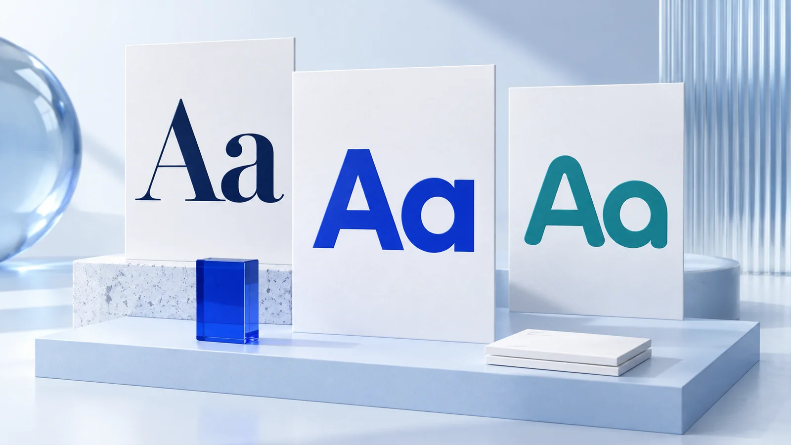
Brand typography is the set of font choices and usage rules that make your business recognizable wherever people encounter it. It is not just about finding a typeface you like. A useful typography system helps your website, social posts, proposals, packaging, and printed materials feel like they belong to the same business.
For a new or small business, the goal is usually simple: choose fonts that fit your positioning, remain easy to read, and can be applied consistently without a designer on every project. That does not mean typography alone creates trust or drives sales. It supports clarity and gives your visual identity a more organized, intentional appearance.
What brand typography includes
A brand typography system typically defines more than one font. It explains what each font is for and how it should appear. At a basic level, this includes a primary typeface for headings, a supporting typeface for body copy, and rules for size, weight, capitalization, spacing, and hierarchy.
Think of a consultant's website. The large headline, service descriptions, email signature, and presentation deck should not each use unrelated type styles. They can vary by format, but the visual language should stay connected. Typography creates that connection more quietly than a logo, but it appears far more often.
A practical system also accounts for real-world use. A stylish display font may work well in a logo or a short campaign headline but become difficult to read in a long service page. Likewise, a body font that looks clean on a laptop screen may need adjustment in a small printed brochure. The right decision depends on where your business communicates most often.
How to choose fonts for your brand typography
Start with the impression your business needs to communicate, then test whether the font works in everyday materials. A modern accounting firm might prefer a restrained sans serif that feels clear and structured. A handmade stationery shop may have room for a more expressive serif or script accent. Neither direction is automatically better. The relevant question is whether it fits the business and remains usable.
Choose readability before personality
Personality matters, but readability is the working requirement. Customers should be able to scan a headline, read a price, understand a call to action, and find key details without effort.
For body text, look for clear letterforms, comfortable spacing, and readable shapes at small sizes. Pay attention to characters that can be confused, such as uppercase I, lowercase l, and the number 1. This is especially useful for businesses that share booking links, product codes, email addresses, or technical information.
Display fonts can carry more character because they are usually used at a larger size and in shorter bursts. Use them carefully. If a font is hard to read in a social graphic or on a mobile screen, its distinctive style may work against the message.
Match the font to your audience and offer
Typography signals tone, although the signal is contextual rather than fixed. Serif fonts are often used when a brand wants an editorial, established, or crafted feel. Sans serif fonts are commonly chosen for a clean, direct, contemporary look. Monospaced, handwritten, or highly decorative fonts can be useful in specific contexts, but they require more restraint.
Avoid treating these associations as rules. A serif can look fresh and modern. A sans serif can feel warm. What matters is the complete system: the font’s proportions, weight, color, layout, imagery, and the words around it.
If you are unsure, write three sample lines that reflect your real business: a homepage headline, a short service description, and a customer-facing call to action. Compare potential fonts using those words rather than a generic alphabet preview. You will see much faster whether a font supports your actual message.
Keep the number of fonts small
Most early-stage brands can work well with two typefaces: one for headlines and one for body copy. In some cases, one versatile font family with several weights is enough. This can be easier to manage across a website, social templates, invoices, and documents.
Adding a third font may make sense for limited accents, such as a campaign label or occasional quote. Beyond that, consistency becomes harder to maintain. More choices can create more variation, particularly when different people make content for the business.
Pairing fonts without creating visual noise
A font pair works when the typefaces have enough contrast to serve different roles but enough common ground to feel related. Pairing a bold, characterful headline font with a neutral body font is a common and generally suitable approach.
Contrast can come from serif versus sans serif, wide versus narrow proportions, or a distinctive headline weight against a simple reading style. Do not stack contrast in every direction. For example, pairing an ornate script with an equally decorative body font often creates competition rather than hierarchy.
Test the pair in a simple layout. Place a heading, a paragraph, a button label, and a small caption on the same page. Then check the result on a phone. If the heading overwhelms the message or the body text feels cramped, revise the sizes, weights, or pair itself.
Build rules people can actually follow
Choosing fonts is only the first step. Your brand becomes consistent when the choices are documented in simple rules.
A useful set of typography guidelines may specify the primary heading font, body font, available weights, default text colors, and preferred type scale. It can also show whether headings use sentence case, title case, or all caps. Small decisions like these prevent a business from looking different every time it publishes a post or creates a PDF.
Keep the rules proportional to your needs. A solo freelancer may need a one-page reference with a few examples. A growing team with a website, newsletter, social channels, and sales materials may benefit from clearer templates and usage notes. Extensive brand books are valuable for some organizations, but they are not required to create a usable first system.
For entrepreneurs building a visual identity from scratch, Ficonica can help bring logo concepts, color choices, font pairings, previews, and brand guidelines into one coordinated starting point. That approach may be suitable when speed and practical consistency are the priority. A designer or agency may be more appropriate when you need original custom lettering, a detailed packaging system, extensive research, or highly tailored creative direction.
Apply typography across the places customers see
The same font does not need to appear at the same size everywhere. A business card has different space constraints from a website banner. Consistency comes from preserving the relationships: the same core fonts, similar hierarchy, and a recognizable tone.
Begin with the materials you use most. For many small businesses, that means the website, social media templates, email signature, proposals, invoices, and presentation slides. Set up a few repeatable patterns, such as one headline style, one subheading style, one paragraph style, and one caption style. This reduces decision-making each time you create content.
For print, review proofs at the intended size before ordering in volume. Thin font weights and tiny text can be less legible on paper than on a bright screen. For digital use, check contrast between text and background colors, especially on mobile devices. These are practical quality checks, not purely aesthetic preferences.
Common typography mistakes to avoid
The most common mistake is treating each new marketing material as a fresh design project. A different font for every promotion can make a business feel scattered, even when each individual piece looks acceptable.
Another issue is relying too heavily on all caps, ultra-light weights, or very tight letter spacing. These choices can work for short accents, but they may reduce readability in longer messages. Decorative fonts used in paragraphs create a similar problem.
Finally, do not assume a font preview tells you how it will behave everywhere. Test it with your business name, service names, real customer-facing language, small text, large text, and the backgrounds you plan to use. A font that looks impressive in isolation may not be the right operational choice.
Typography becomes more useful when it removes choices instead of adding them. Choose a system your business can use confidently next week, not just one that looks good in a single mockup.