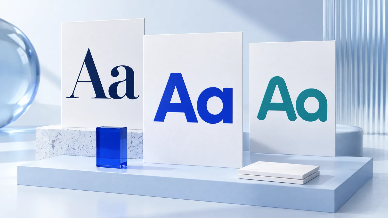
How to pick logo fonts starts with a simple rule: choose type that reflects your business personality and remains clear wherever people encounter it. A font may look striking in a large logo preview but become hard to read on a phone screen, storefront sign, social profile, or invoice. The right choice needs to work as part of a complete visual identity, not just as an isolated design detail.
For most new businesses, the goal is not to find the most unusual font. It is to choose one that makes the name recognizable, feels appropriate for the audience, and can be used consistently over time.
Start With the Brand Personality You Want to Show
Fonts communicate before someone reads the words. A geometric sans serif can feel clean and modern. A classic serif may suggest heritage, editorial quality, or considered expertise. A handwritten style can feel personal and expressive, while a condensed display font may feel energetic and bold.
These are tendencies, not fixed rules. A serif font is not automatically formal, and a sans serif is not automatically modern. Letter shape, weight, spacing, color, and the surrounding logo elements all affect the final impression. Still, identifying a few traits before reviewing fonts gives you a useful filter.
Write down three to five words that describe your brand. A neighborhood bakery might choose warm, handcrafted, and cheerful. A bookkeeping consultant may lean toward clear, calm, and dependable. A streetwear label may want confident, direct, and expressive. Then look for typefaces that support those qualities without relying on decorative effects.
This step also prevents a common problem: choosing a font because it is currently popular, even though it does not fit the business. Trends can be useful references, but a logo normally needs a longer working life than a social media post.
Choose a Font Category Before Choosing a Specific Font
You do not need deep typography knowledge to narrow the field. Start by deciding which broad category is generally suitable for the business.
Sans serif fonts
Sans serif fonts do not have the small finishing strokes, called serifs, at the ends of letters. They are often a practical choice for technology businesses, consultants, wellness brands, ecommerce shops, and services that need a clean digital presence. Many sans serifs stay readable at small sizes, though very thin or highly stylized versions may not.
Serif fonts
Serif fonts include those finishing strokes. They can work well for law firms, hospitality businesses, publishers, premium goods, creative studios, and brands that want a more established or editorial feel. Some serifs are highly traditional, while others have sharper, more contemporary forms. The details matter.
Script and handwritten fonts
Script fonts can add personality to a logo for a florist, beauty professional, café, artist, or personal brand. They are usually strongest when used sparingly. Long business names, thin strokes, tight letter connections, and small applications can make a script logo difficult to read.
Display fonts
Display fonts are made to create impact at larger sizes. They can suit entertainment, fashion, food, events, and brands with a distinct point of view. Their trade-off is flexibility. A highly stylized font may work in a primary logo but not in a small social avatar, email signature, or narrow website header.
A simple category choice reduces decision fatigue. Once you know you are looking for a friendly serif or a structured sans serif, it becomes easier to compare options on meaningful criteria.
Test the Business Name, Not a Sample Word
Font libraries often show appealing sample words such as “Modern,” “Coffee,” or “Studio.” Those previews are useful, but your own business name is the real test. Different letter combinations create different problems.
Look closely at repeated letters, tall letters, rounded forms, and characters that may blur together. For example, a name with “rn” can sometimes look like an “m.” An “I,” lowercase “l,” and number “1” may be confusing in certain typefaces. If your name contains several words, check whether their lengths feel balanced.
Also consider the way people will spell and search for your name. If a font makes a familiar word look ambiguous, a clearer option is usually the better choice. Distinctiveness matters, but recognition comes first.
Check Readability at Real-World Sizes
A logo font should be evaluated in context. View it large, then shrink it. Test it in black and white, on a light background, and on a dark background. Place it in the square space of a social profile and in a horizontal website header.
Pay particular attention to thin lines, tight spacing, and elaborate letterforms. These elements can disappear or crowd together when a logo is reduced. A small-business owner may use a logo on profile images, presentation slides, email signatures, packaging labels, and printed documents. One version does not need to solve every layout, but the typography should support flexible logo variations.
If the font only looks good at one size or in one color, it may be better suited to a campaign graphic than a core logo.
Pay Attention to Spacing and Weight
The font itself is only part of the decision. Letter spacing, also called tracking, changes how a wordmark feels. Slightly wider spacing can make a refined or minimal logo feel more open. Tight spacing can feel compact and energetic, but it can also reduce readability.
Font weight matters too. A light weight may appear elegant but can fade against a busy image or when printed small. A heavy weight can be clear and confident but may feel crowded in a long name. Medium and semibold weights are often versatile starting points, especially for brands that need to work across both screens and print.
Avoid stretching, squashing, or adding artificial outlines and shadows to force a font into a logo. These treatments often make type less legible and can date quickly. If a typeface needs major repair to work, consider another option.
Pair Logo Fonts Carefully
Many logos use one font for the business name and another for a descriptor, tagline, or category line. Pairing can add hierarchy, but it is easy to overcomplicate.
A practical approach is to combine contrast with compatibility. A bold sans serif business name may pair well with a restrained serif descriptor. A classic serif name may work with a simple sans serif underneath. The fonts should differ enough to create a clear hierarchy but share a similar level of polish and personality.
Avoid pairing two highly decorative fonts. They tend to compete for attention. Also avoid using a tagline simply because it fills empty space. If the business name is clear on its own, a simpler logo may be more flexible.
For a small team creating a broader identity, it helps to separate logo type from everyday brand fonts. The font in a logo can be distinctive, while the font used for website headings, social graphics, and documents should be easy to read in longer text. Ficonica’s font pairing tools can be useful at this stage because they let users review coordinated type choices as part of a wider brand system rather than making each decision separately.
Match the Font to Your Operating Reality
The most appropriate font depends on where your business appears. A mobile-first app, a local service business with vehicle signage, and a handmade product shop may need different solutions even if they share similar aesthetics.
Consider four practical questions before finalizing your choice:
- Can customers read the name quickly on a phone?
- Does the type remain clear in a one-color version?
- Does it fit the space where you use the logo most often?
- Can your team apply it consistently in future materials?
A complex monogram or expressive script may be appropriate for a boutique brand with short packaging labels and a visual audience. A service business that relies on fast recognition in search results, directories, and email may benefit from simpler typography. Neither approach is universally better. The best fit depends on the name, audience, brand personality, and applications.
Know When a Custom Typography Approach Is Worth It
For many early-stage businesses, a well-chosen existing font is enough to create a professional, consistent wordmark. It is faster to implement and easier to extend into a broader visual system.
A designer or branding agency may be a better fit when the logo needs custom lettering, original illustration, an extensive packaging system, or a detailed strategy based on audience research. Those projects benefit from deeper exploration and hands-on creative direction. An AI-assisted branding platform can be a practical option when you need to explore coordinated concepts and make decisions quickly, but it does not replace every level of custom design work.
Make the Final Choice With a Shortlist
Do not compare dozens of fonts until they all look alike. Select two or three candidates that fit your brand traits, then test each one with your actual name in the places that matter most. Ask a few people who resemble your customers whether they can read it quickly, but do not treat every preference as a design requirement.
Choose the font that is clear, appropriate, and flexible enough to support the business you are building. A logo font does not need to say everything about your brand. It simply needs to give the right first signal and keep working as your business shows up in more places.