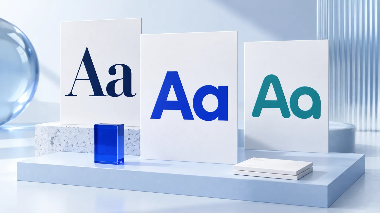
The best fonts for readability are usually simple typefaces with clear letter shapes, comfortable spacing, and enough weight to hold up at the size people will actually read. For most small businesses, a practical starting point is a clean sans serif such as Inter, Source Sans 3, or Arial for digital body text, or a readable serif such as Georgia or Merriweather for longer print-style reading. The right choice still depends on where the font appears, who needs to read it, and what role it plays in your brand.
A font can look polished in a logo preview and become frustrating in a checkout page, service menu, email signature, or product label. Readability is not about picking a universally perfect font. It is about making routine reading feel easy across the places your business shows up.
What Makes a Font Easy to Read?
Readable fonts make individual characters easy to distinguish without asking the reader to slow down. Look for an open, uncomplicated structure. Letters such as `a`, `e`, `c`, and `s` should have clear internal spaces, while similar characters such as uppercase `I`, lowercase `l`, and the number `1` should not be easily confused.
Several details matter more than many new business owners expect. A generous x-height, meaning relatively tall lowercase letters, often helps text remain legible at small sizes. Open apertures, or the openings in letters like `e` and `c`, reduce visual crowding. Moderate width and spacing also make paragraphs easier to scan.
Weight matters too. Very thin fonts can disappear on lower-quality screens, at small sizes, or when printed on textured materials. Extremely bold text can become dense and tiring in long paragraphs. Regular, book, or medium weights are generally suitable for body copy, while bold weights work better for headings and emphasis.
Readability also depends on the full design system. A clear font set too small, in pale gray, or placed over a busy image will not solve the problem. Type size, line height, color contrast, line length, and background all affect whether people can comfortably read your content.
Best Fonts for Readability by Use Case
Rather than using one font everywhere, choose based on the job the text needs to do.
Websites, apps, and digital content
For websites and digital interfaces, sans serif fonts are often a dependable choice because their forms stay clean on screens. Inter is widely used for interface-style text because it includes a broad range of weights and clear character shapes. Source Sans 3 is another practical option for websites, guides, and service pages. Arial remains useful when you want a familiar, widely available system font with minimal technical complexity.
Other commonly considered options include Open Sans, Lato, and Noto Sans. Each can work well for a small business site when configured carefully. The difference is often less important than using an appropriate size, usually avoiding tiny body text, and leaving enough space between lines.
If your website relies heavily on short headings and calls to action, a more distinctive sans serif can support personality. Keep the body font calmer. A highly stylized typeface may work in a headline but can become hard work in a paragraph describing your pricing, process, or return policy.
Long-form articles, proposals, and print materials
Serif fonts can be very comfortable for long reading, particularly in documents designed for print or editorial-style layouts. Georgia was designed with screen reading in mind and remains a sensible option for articles, proposals, and resource materials. Merriweather has a substantial, readable presence that can work well in longer digital and print text.
For printed brochures, menus, letterheads, or booklets, test the actual production size. Fine serif details that look attractive on a large monitor may fill in or soften when printed small. Paper stock, ink coverage, and print method can change the result, so a sample print is more useful than judging only from a mockup.
Emails, presentations, and documents
For email and presentation materials, familiar fonts can be the least risky decision. Arial, Georgia, Verdana, and Trebuchet MS are generally easy to read and broadly supported. Custom web fonts may not display consistently in every email inbox, so choosing a reliable fallback is part of good brand execution.
In presentations, readability is driven by distance. A font that works in a document may fail from the back of a room or on a small video-call screen. Use fewer words, larger type, and strong contrast. This is one case where a plain font often performs better than a more characterful one.
Labels, packaging, and small-format text
Small-format applications need extra caution. Ingredient lists, directions, contact details, and labels often force text into limited space. Condensed fonts, thin weights, and tight letter spacing may save room but can reduce clarity quickly.
Choose a font with sturdy shapes and test it at the final physical size. If a line can only fit by making it too small, the layout likely needs revision. Shorten the copy, increase the label size, or move secondary information elsewhere when possible.
Font Choices That Need More Testing
Some font categories are not inherently bad, but they require a specific use case and closer review. Script fonts can add warmth or personality to a logo, invitation, or short accent phrase. They are rarely a strong choice for body copy, navigation, or important instructions because letterforms can blur together at speed.
Display fonts, ultra-light styles, all-caps text, and condensed families have similar limits. They can create a visual mood in a headline, but they should not carry the main reading load. All caps in particular can make longer text harder to scan because readers lose the familiar outline created by lowercase letters.
There is also a brand trade-off. A neutral sans serif may be highly functional but can feel generic when used without distinctive color, imagery, layout, or typography hierarchy. The answer is not to force an unusual font into every application. It is to use a practical text font alongside a more expressive but controlled display font when your brand needs a stronger visual voice.
How to Choose Fonts for a Consistent Brand
Start by identifying your most common reading situations. A consultant may prioritize a website, proposals, and slides. An online seller may need product pages, social graphics, packing inserts, and labels. A local service business may need a website, estimates, invoices, vehicle graphics, and business cards. The font system should work across these real materials, not only in a logo.
Then choose one primary text font and test it in a few everyday samples: a paragraph on a mobile screen, a short email, a printed card, and a social post. Check whether the type still feels clear at normal viewing distance. Ask someone unfamiliar with the business to read a few lines quickly. If they hesitate over words or numbers, adjust the font, size, spacing, or contrast.
Next, set simple rules. Define which font is used for body text, headings, captions, and occasional accents. Limit the system to two font families in most cases. More fonts can make a young brand feel inconsistent and create extra decisions every time you prepare a new asset.
A font pairing tool can help you preview combinations, but it should support judgment rather than replace it. Ficonica, for example, includes font pairing as part of its coordinated brand-building workflow. That can be useful when you need a starting system for logos, colors, and brand materials, though a designer may be the better fit if you need highly customized typography, original lettering, or a complex packaging system.
A Quick Readability Check Before You Publish
Before approving a font choice, review it under normal conditions rather than at 200% zoom. Read body copy on a phone. Print a page if the design will be printed. Look at the smallest required text, including captions, URLs, dates, and contact details. Make sure text color clearly separates from its background.
Also review numbers and punctuation. These small elements matter in prices, phone numbers, appointment times, product sizes, and web addresses. A font can look attractive in a sample headline yet create avoidable confusion in the details customers need.
Finally, do not treat readability as a one-time branding task. As your website, product range, and materials expand, new applications may expose weaknesses in the original choice. A simple, well-documented font system gives you room to adapt without making every new piece feel disconnected.
Choose the font that lets people focus on your message, not the effort of decoding it. That is usually the most useful kind of brand consistency.