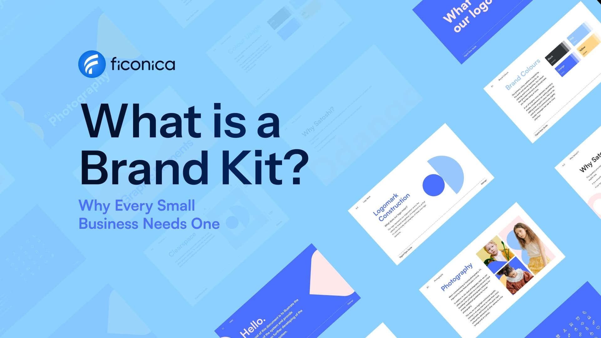
A social media brand kit is a small, practical set of visual rules and ready-to-use assets that helps every post look like it came from the same business. It should make publishing faster, not create another complicated document your team avoids opening.
For a new business, the goal is usually not to design dozens of post styles. It is to make a few repeatable decisions about your logo, colors, typography, imagery, and layouts so you can create a promotion on Monday, a product post on Wednesday, and an announcement next month without starting from scratch each time.
What belongs in a social media brand kit?
A useful kit contains the visual pieces you need regularly, plus simple rules for using them. The exact contents depend on your business and the platforms you use, but most small businesses benefit from a logo package, a defined color palette, font choices, image direction, and a set of social templates.
Think of it as a working version of your broader brand identity. A full identity may also cover print materials, website design, stationery, packaging, and other applications. A social kit focuses on the formats and decisions required for day-to-day online publishing.
Your logo variations
Your kit should include more than one way to display your logo. A horizontal logo may work well in a header or wide graphic, while a stacked version can fit more comfortably in square layouts. A simple icon, monogram, or symbol can be useful for profile images where a full business name would be difficult to read.
Set clear rules for when each version should be used. For example, use the icon for an account avatar, the full logo on a cover image, and a logo-free layout when the post already contains a prominent brand name or product label. Repeating a large logo in every corner of every graphic can make posts feel crowded.
Keep enough empty space around the logo and avoid stretching, recoloring, outlining, or placing it over a busy background without contrast. These are small details, but they prevent a recognizable mark from becoming inconsistent across posts.
A limited color system
Choose a primary color, one or two supporting colors, and neutral shades for backgrounds and text. You do not need to use every brand color in every post. In fact, using fewer colors per design generally makes a feed easier to scan.
Your social media kit should explain which colors have specific jobs. A primary color might appear in headers, buttons, or graphic accents. A light neutral can provide a consistent background. A dark neutral may be reserved for body text. If you use a bright accent color, consider saving it for calls to action, dates, prices, or key numbers.
Color choices affect readability as much as appearance. Light text on a pale background, for example, may look polished in a design file but become hard to read on a phone screen. Check contrast before treating a color pairing as a standard.
Font rules that work on mobile
Most small businesses only need two typefaces: one for headings and another for supporting text. If your logo uses a distinctive display font, that does not mean it should be used for every caption graphic. Decorative fonts can lose clarity at small sizes.
Specify which font is used for headings, subheadings, and short supporting text. Also define a simple hierarchy: a large headline, a smaller detail line, and optional small print. Consistent hierarchy helps people recognize your content before they read every word.
If a selected font is not available in the tool your team uses to create posts, choose an accessible substitute and document it. A practical system that can be used consistently is generally more valuable than a perfect font choice that only one person can access.
Build templates around real post types
Templates are the part of a social media brand kit that turns visual decisions into a repeatable workflow. Start with the posts you actually publish, not a generic list of social media graphics.
A consultant may need a tip graphic, a client availability announcement, and a quote layout. An online seller may need a product feature, a new arrival post, a sale announcement, and a customer review format. A local service business may need educational posts, seasonal reminders, and team introductions.
Create templates for four to six recurring needs before adding more. Each template should establish the logo placement, font hierarchy, color use, image area, and safe space for text. The content can change, but the underlying structure should stay recognizable.
Design for the platform, not just the feed
A square post can be a helpful starting point, but it will not fit every placement equally well. Stories, short-form video covers, profile headers, and vertical posts each have different dimensions and on-screen behaviors. Build separate layouts when a format is central to your content plan.
Leave margins around text and important visual elements. Platform interfaces can cover parts of an image with captions, buttons, account names, or cropping. A template that looks balanced in an editing tool may need more breathing room when viewed in an app.
Avoid squeezing a full paragraph into a single graphic. Social posts work better when the visual communicates one clear idea, while the caption carries the context, details, and next step.
Add image and illustration direction
Visual consistency is not limited to colors and logos. The photos, icons, and illustrations you choose shape the overall impression of the account.
Write a few specific guidelines. For example, a personal finance educator may use clean desk scenes, natural light, and close-up working moments. A bakery might use warm product photography with simple backgrounds and minimal text overlays. A software consultant may use focused screenshots, abstract technical details, and restrained graphic elements.
Also decide what does not fit. If your brand uses calm, editorial photography, heavily filtered stock images and neon clip art may create an inconsistent result. This is not about following a universal style rule. It is about choosing imagery that supports the character you want people to recognize.
If you use icons, select one style: outlined, filled, rounded, geometric, or hand-drawn. Mixing several icon styles in the same post often looks accidental.
Include a one-page usage guide
A social kit becomes much more useful when another person can follow it without asking you questions. Put the essential rules into a short guide that covers the approved logo versions, color values, fonts, template examples, and image direction.
Use plain instructions such as: “Use the dark logo on light backgrounds,” “Keep headlines to two lines when possible,” or “Use the accent color only for key details.” These rules are easier to apply than broad directions like “make it feel premium” or “keep it on brand.”
You can also note the practical decisions behind the system. For instance, state that the business uses product photography for sales posts, staff photos for community updates, and simple typography for educational content. This gives a freelancer, virtual assistant, or future team member enough context to make sensible choices.
Keep branding separate from marketing performance
A consistent visual identity may make your content easier to recognize, but it does not guarantee reach, engagement, leads, or sales. Those outcomes also depend on the offer, audience, message, timing, platform, and how useful the content is.
Treat the kit as a production tool, not a replacement for a content strategy. Review your posts periodically to see whether the layouts still suit what you publish. If a template makes every message look too similar, revise it. Consistency should create recognition, not monotony.
Choose the right way to create your kit
A DIY kit is generally suitable when you have a clear business direction, limited needs, and the willingness to make a few focused visual choices. An AI-assisted branding platform such as Ficonica may help founders create coordinated logo concepts, color palettes, font pairings, brand previews, and downloadable assets without beginning with a traditional agency engagement.
A freelance designer may be a better fit when you need closer creative collaboration or a more individual visual approach. An agency can be appropriate for businesses that require extensive research, complex brand strategy, packaging systems, original illustration, or a large number of applications. The right choice depends on the complexity of the work, your budget, and how much direction you can provide.
Before publishing your next post, choose one recurring content type and turn it into a template with approved colors, type, and image space. A social media brand kit becomes valuable the moment it helps you make a clear post faster while keeping your business recognizable.