If you need a startup branding guide, start here: build a simple visual identity system you can actually use, not a giant brand project you will ignore after launch. For most early-stage businesses, that means choosing a clear logo direction, a small color palette, one or two fonts, and the core files and templates needed for your website, social profiles, presentations, and basic print materials.
That approach is enough to help a new business look organized and credible. It is not the same as full brand strategy, market positioning, naming, trademark work, or marketing performance. Those areas matter too, but they solve different problems.
What a startup branding guide should help you do
A good brand for a startup is not just something that looks polished in a logo preview. It should be usable across the places where your business actually appears. If your logo only works on a white background, your fonts are hard to read, or your colors shift from one platform to another, the brand will create friction instead of clarity.
For most founders, the real goal is consistency. You want your site, social graphics, email signature, pitch deck, and basic documents to look like they belong to the same business. That is usually more valuable than chasing originality in every detail during the first stage.
This is where many startups overcomplicate the process. They spend weeks debating abstract brand personality terms when what they need right now is a usable system. A strong first version should be simple enough to apply quickly and flexible enough to refine later.
The core pieces of startup branding
Logo system
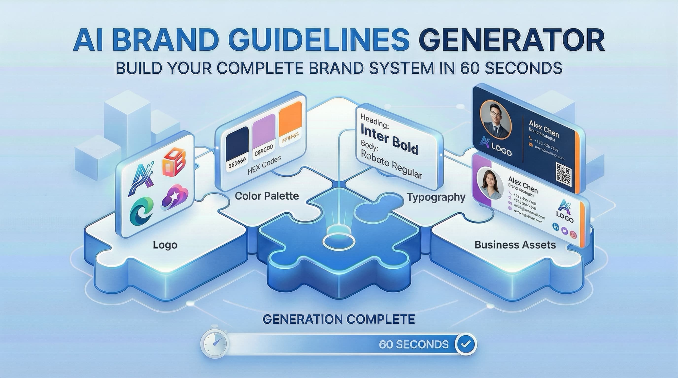
You do not just need one logo file. You generally need a small logo system. That often includes a primary logo, a simplified version for small spaces, and a mark or icon that can work in places like a profile image or favicon.
The main question is not whether the logo is impressive in isolation. It is whether it stays legible at different sizes and works across digital and print use. A detailed logo may look good in a large mockup but fail in an Instagram profile image or email signature.
Color palette
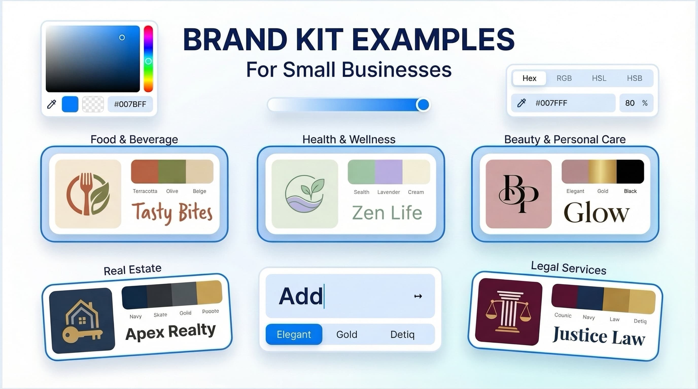
Most startups need fewer colors than they think. A practical palette often includes one primary brand color, one or two supporting colors, and a set of neutral tones. That is usually enough for a website, social media graphics, presentations, and basic printed materials.
Color choices depend on context. A bold palette may help a creator brand feel energetic, while a consultant or B2B software startup may need something more restrained. There is no universal right answer. The better test is whether the colors remain usable, readable, and consistent across screens and documents.
Typography
Fonts shape how your business feels, but readability should come first. Most early-stage businesses can work well with one headline font and one body font. That combination gives enough variety without becoming difficult to manage.
Stylized type can be useful, but only if it still works in everyday use. If your chosen font makes website text harder to read or limits what your team can create, it may be too specialized for this stage.
Brand rules
A startup does not need a hundred-page brand manual. It does need a short set of rules. Define which logo versions to use, which colors are approved, which fonts are standard, and how much spacing to keep around the logo.
These simple guidelines save time and reduce inconsistency. They are especially helpful when you start creating assets quickly or working with contractors.
Startup branding guide: what to create first
The best order depends on your launch timeline, but most founders should start with business basics rather than edge cases. Focus first on the assets that customers, partners, and investors are most likely to see.
Your first priority is usually a logo set, brand colors, font pairings, and a basic style guide. After that, consider the materials tied directly to your launch channel. If you are selling online, that may mean social graphics and website visuals. If you are service-based, it may mean presentation templates, proposals, letterheads, or an email signature. If you meet clients in person, business cards may still be useful.
This is where product choice matters. Some founders only need a clean visual identity and a few ready-to-use files. Others need deeper strategic work, original illustration, packaging systems, or extensive design research. Those are different scopes, and they should be treated that way.
How to choose the right branding route
There is no single correct way to build a startup brand. The right option depends on budget, timeline, complexity, and how customized the result needs to be.
An AI-assisted branding platform is generally suitable when you need a fast, practical visual identity without starting a full agency engagement. That can make sense for first-time founders, freelancers, creators, consultants, and small teams that need coordinated assets and clear brand rules quickly.
A freelancer or designer may be a better fit if you want more tailored exploration, closer collaboration, or a brand identity built around a distinct concept. An agency may be worth considering when the project includes research, positioning, messaging systems, packaging, naming, or a larger rollout across many touchpoints.
One practical option in the AI-assisted category is Ficonica, which helps users move from a business name and industry description to a coordinated visual identity system. That may be useful if your priority is speed, simplicity, and getting a usable brand kit without a traditional custom process. If your needs are more strategic or highly customized, a designer or agency may be the better route.
Common mistakes this startup branding guide can help you avoid
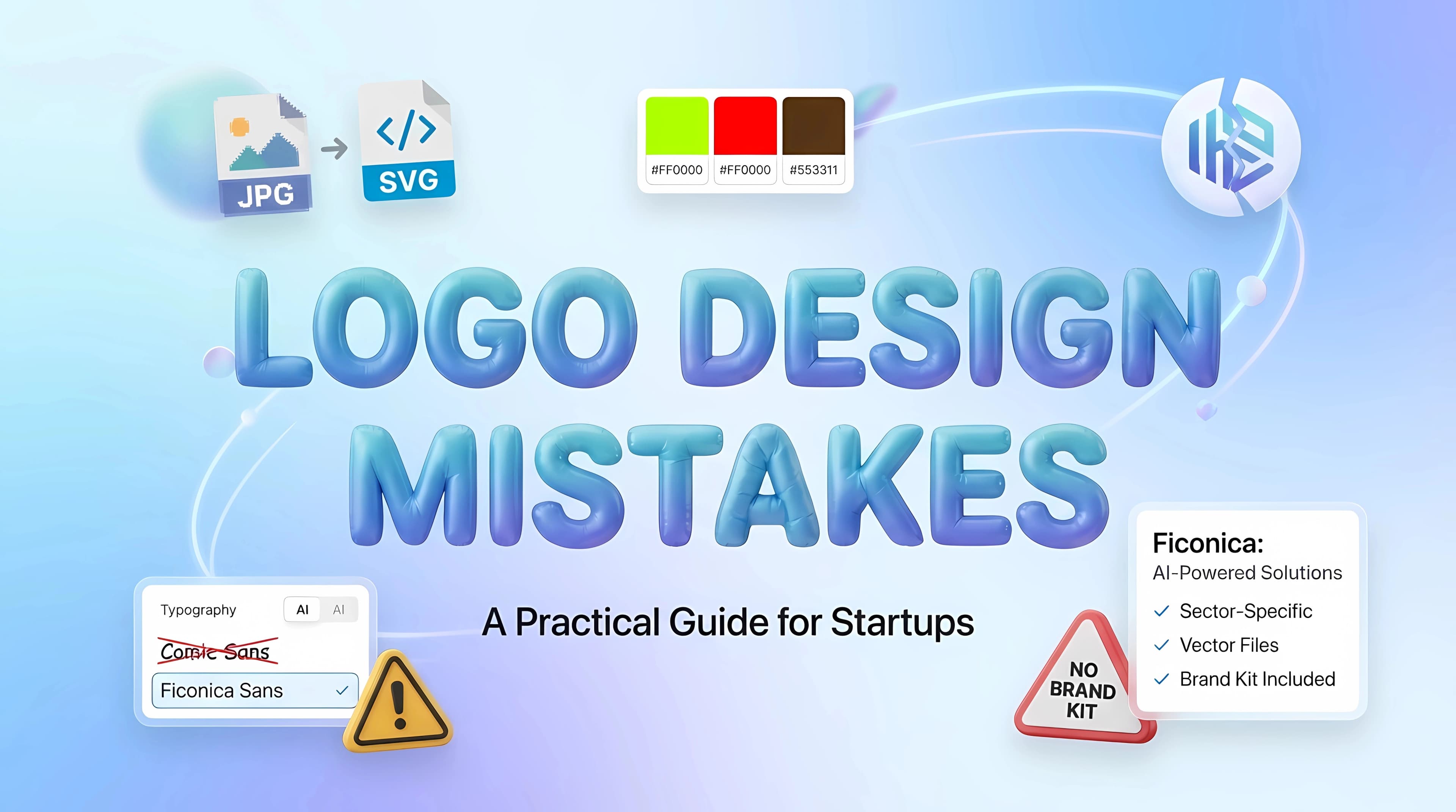
The first mistake is treating branding like a logo-only decision. A nice logo does not solve inconsistency on its own. If your colors, fonts, and everyday templates are undefined, the brand will still feel fragmented.
The second mistake is building too much too early. Many startups request packaging systems, detailed merchandise concepts, or highly specific sub-brand structures before they have validated the core business. Sometimes that investment is justified. Often, it is premature.
The third mistake is confusing visual branding with business outcomes it cannot directly guarantee. A stronger identity may help your business look more organized and recognizable. It does not automatically create demand, improve the product, fix pricing, or replace marketing strategy.
The fourth mistake is ignoring file usability. Founders often approve a design without asking how it will be used later. You should consider whether you have the formats needed for web use, social use, presentations, and print before you finalize anything.
What a practical brand kit should include
A useful brand kit should help you apply your identity immediately. In most startup cases, that means logo variations, color specifications, font guidance, and files prepared for common digital and print situations.
Depending on the business, it may also include social media materials, business cards, stationery, letterheads, or an email signature. The right set depends on where your business shows up. A local service business and a digital creator may need very different assets, even if both need consistent branding.
It also helps to think one step ahead. If you know you will be pitching investors, attending events, or shipping printed materials, consider those use cases early so the identity supports them from the start.
How to know when your startup brand is good enough
Good enough does not mean perfect. It means your identity is clear, consistent, readable, and usable across your main channels. If customers see your business in three different places and the experience feels connected, that is a strong early sign.
You also want a brand that your team can maintain without constant redesign. If every social post requires custom decisions about color, typography, and layout, your system is probably too loose. If the identity gives enough structure to move quickly, it is doing its job.
Over time, your brand may evolve. That is normal. Startups often refine their visual identity after they learn more about their market, products, and audience. A first version does not need to predict the next five years. It needs to support the business you are building now.
If you are deciding where to begin, aim for a brand system that is simple, consistent, and easy to apply. The fastest progress usually comes from making practical choices you can use this week, not from waiting for a perfect brand you may never launch.