An AI logo tool for entrepreneurs is generally a good fit when you need a credible starting point for a new business, have a clear idea of your audience, and need to apply your identity quickly across digital and print materials. It is less suitable when the job requires deep brand strategy, a highly original illustration style, or a complex visual system developed through extensive research.
The useful question is not whether AI can replace every designer. It is whether the tool can help you make sound, usable branding decisions for the stage your business is in. For many founders, the first goal is straightforward: create a logo, colors, type choices, and basic assets that look coordinated wherever customers encounter the business.
What an AI logo tool can help you create
A logo is only one part of a visual identity. It may be the most recognizable element, but it has to work with the colors, fonts, images, layouts, and materials your business uses day to day. A standalone logo file can leave you back at the same problem when you need a website header, social profile image, invoice, presentation, or printed card.
An AI-assisted branding platform typically begins with basic inputs such as your business name, industry, and preferences. From there, it can generate logo directions and give you a starting point for customization. The practical value is speed: you can compare multiple approaches without having to translate every visual preference into professional design language.
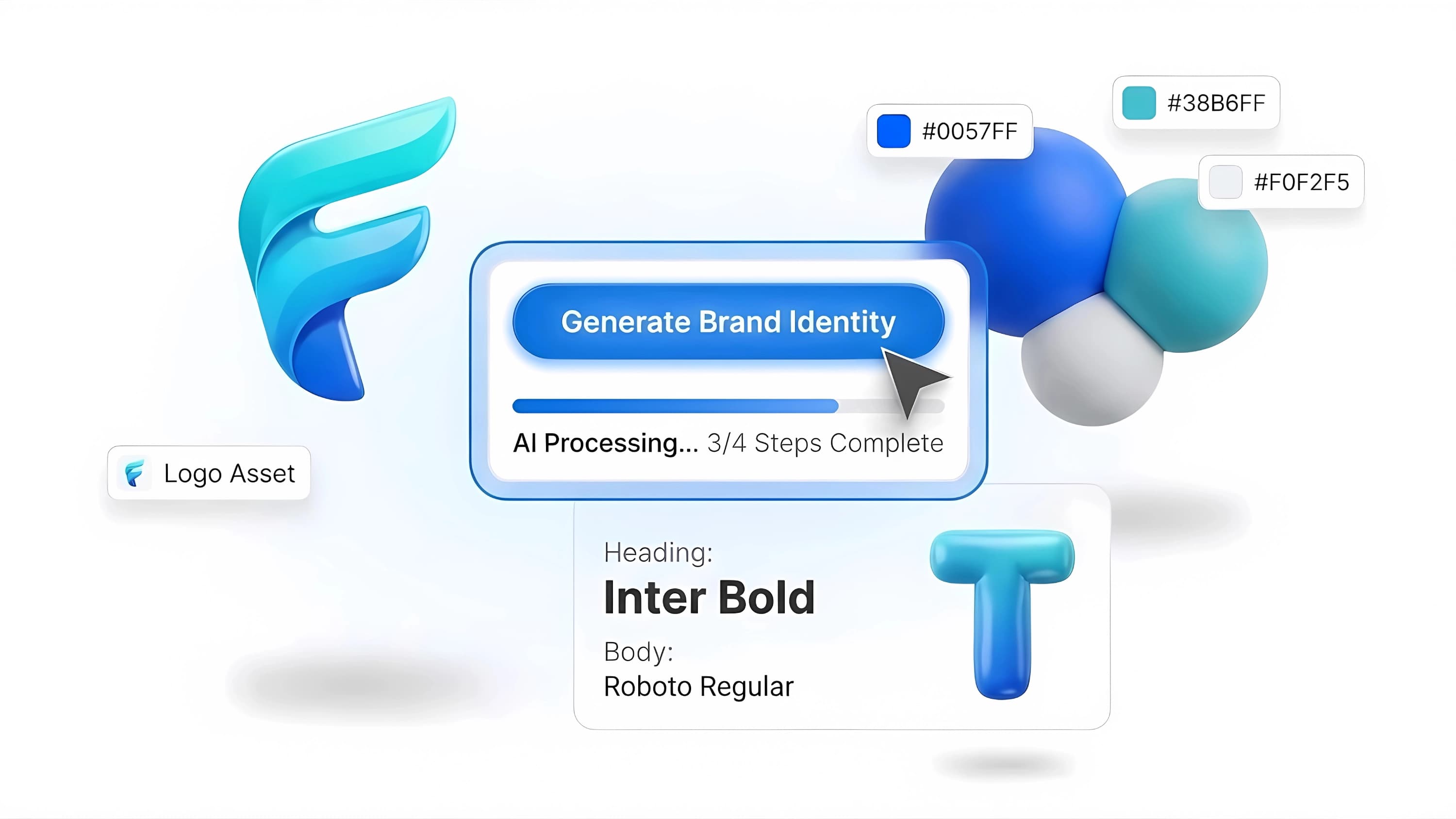
A coordinated system may include a logo concept, a color palette, font pairings, brand previews, guidelines, and downloadable files for different uses. The exact assets vary by platform and product, so review what is included before committing to a workflow. If you expect to print packaging, signage, or stationery, confirm that the available files and materials fit those needs.
Ficonica is one option built around this broader process, helping users move from a name and business description toward a coordinated brand system rather than stopping at a logo concept alone.
When an AI logo tool for entrepreneurs is a practical choice
AI tools are generally suitable for businesses with a defined offer and a modest set of immediate branding needs. A consultant launching a practice, a freelance photographer refreshing an inconsistent identity, or an online seller setting up a storefront may benefit from having usable visual basics in place quickly.
They can also help if you are still learning what you like. Seeing several logo directions can make preferences more concrete. You may realize that a detailed emblem becomes unreadable at small sizes, that your preferred color combination feels too muted on a screen, or that a decorative font is difficult to use in a presentation. Those are useful discoveries before you invest more time and money.
The approach depends on your willingness to make choices. AI can offer options, but it cannot fully determine the personality your business should project or which direction will feel right to the people you serve. Give the tool thoughtful input, then edit with a real use case in mind.
Start with a short business brief
Before generating anything, write two or three sentences that describe what you sell, who it is for, and how you want to be perceived. Avoid vague phrases such as “modern and professional” on their own. They are common preferences, but they do not create much direction.
A stronger brief might say: “I provide bookkeeping for independent creative studios. The identity should feel organized, calm, and approachable, not corporate or playful.” This gives you criteria for evaluating the results. You are not choosing a logo because it looks impressive in isolation. You are choosing one because it supports the business context.
Choose for everyday use, not the preview
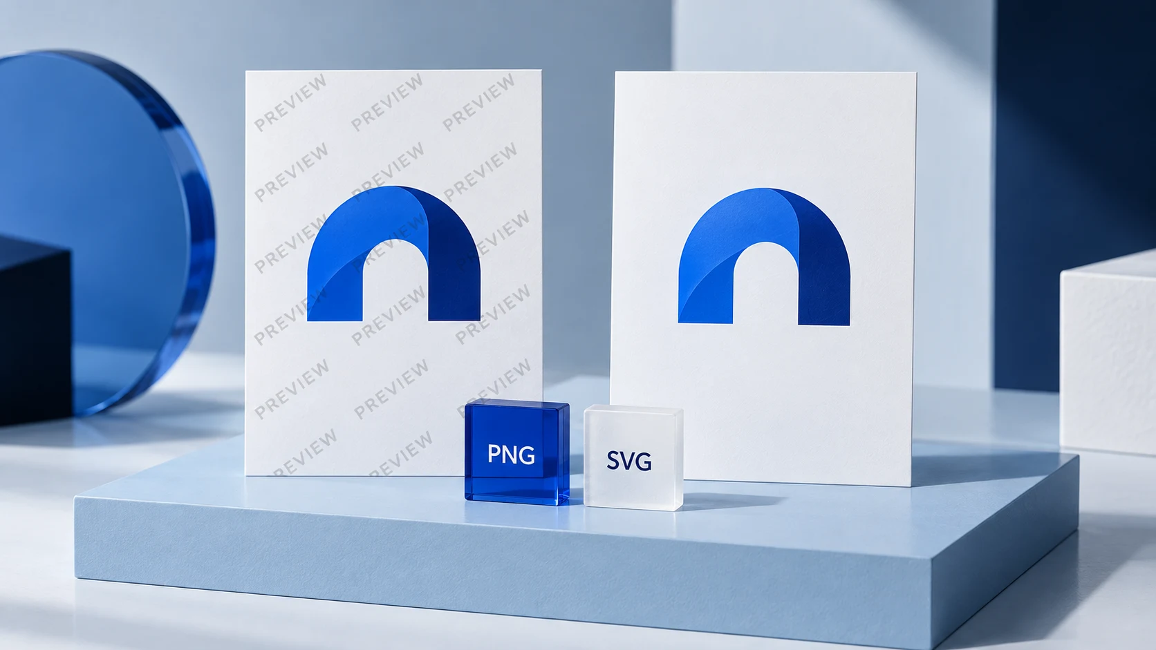
A polished preview can be helpful, but your logo will spend more time in less glamorous places: browser tabs, social avatars, email signatures, receipts, slide decks, and mobile screens. Check whether the mark remains recognizable when it is small and whether the business name is easy to read.
Also consider the one-color version. A logo that only works in a full-color mockup may create limitations later. You may need a simple black version for documents, a reversed version for dark backgrounds, and a compact variation where space is limited.
How to evaluate the results
The first set of concepts is not a final answer. Treat it as a working selection. Narrow the options by asking whether each direction is clear, flexible, and consistent with your offer.
Clarity matters because prospective customers need to recognize your business name and understand the general tone quickly. Flexibility matters because the identity needs to work beyond a homepage. Consistency matters because repeated choices in color, type, and layout make your materials feel related.
Use a few realistic tests before finalizing a direction:
- View the logo at a small size, including an icon-sized version.
- Place it on light and dark backgrounds.
- Try the selected fonts in a short headline and a longer paragraph.
- Apply the palette to a simple social post or presentation slide.
- Review how the design looks in black and white.
These tests do not prove that a brand will perform better in the market. They simply expose practical design issues while they are easier to fix.
Keep customization focused
The ability to edit a logo is useful, but too many changes can weaken a coherent starting concept. Adjust the parts that affect usability most: spacing, legibility, color contrast, font readability, and the relationship between an icon and the business name.
Consider your category without copying it. A local bakery may reasonably use warmer colors and friendlier type than a cybersecurity consultant, but category conventions are not rules. The right choice depends on the audience, price point, business personality, and how you want to differentiate yourself.
What AI branding tools do not solve
An AI-generated visual identity is not a business strategy. It cannot validate a business name, define your positioning, identify an audience, write your messaging, or determine whether customers will choose you. It can support the visual expression of decisions you have already made.
It also does not settle legal questions. If you plan to use a name or logo commercially, consider getting appropriate professional guidance on availability, registration, ownership, and any other legal requirements relevant to your business. Do not assume that a generated concept is automatically clear to use in every market or category.
Finally, AI is not the right tool for every creative brief. If your brand needs custom illustration, distinctive lettering, an extensive packaging system, a detailed research process, or a visual direction that must be unlike anything else in your field, a professional designer or agency may be a better fit. Their value often comes from strategic exploration, judgment, and iterative collaboration, not simply from producing files.
AI logo maker vs. freelancer vs. agency
The right route depends on the complexity of the work and the level of collaboration you need. An AI platform is usually the fastest route to a structured starting identity when budget and time are limited. It works best for founders who can make decisions independently and need practical assets for an initial launch.
A freelance designer may be appropriate when you want a more tailored concept, direct feedback, and a person who can refine details around a clear brief. Quality, process, scope, and pricing can vary substantially, so review the designer’s work and confirm deliverables before starting.
An agency is generally more appropriate when branding needs to connect to broader research, positioning, naming, messaging, packaging, campaign development, or a large set of touchpoints. That level of work can be valuable for a more complex launch, but it may be more than an early-stage business needs.
There is room for a staged approach. You might begin with a practical AI-assisted identity, use it consistently while you validate the business, and later engage a designer when the brand requires deeper differentiation. Starting small does not prevent a more customized brand project later.
Turn your new identity into a usable system
Once you have chosen a direction, document the decisions. Keep the primary logo, alternate versions, color values, font names, and simple usage rules in one place. This prevents each new asset from becoming a fresh design decision.
Use the same basics across your website, social profiles, email signature, proposals, invoices, and printed materials. Consistency does not mean every item must look identical. It means the elements should feel like they come from the same business.
Your first identity does not have to express every future ambition of the company. It needs to be clear, usable, and appropriate for the customers you are trying to reach now. Build something you can apply with confidence, then let real business needs guide what you improve next.