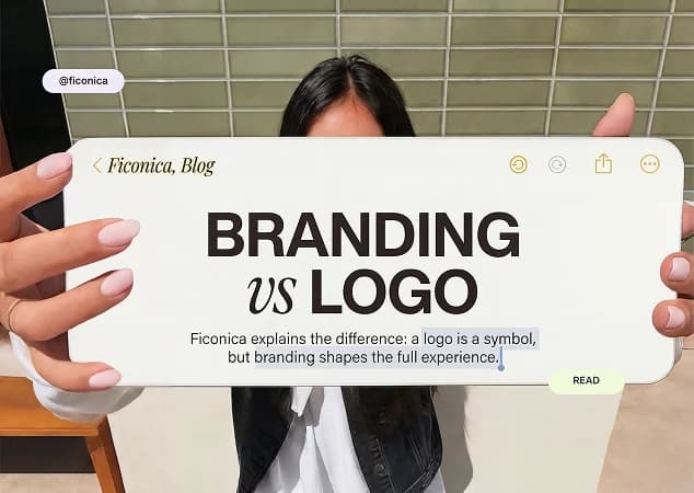
A brand identity is the visual system people use to recognize your business. It includes more than a logo: your colors, fonts, image style, layouts, and the files and rules that keep those choices consistent across your website, social profiles, email, print materials, and more.
For a new or small business, the goal is not to create an enormous brand book. It is to make a set of clear visual decisions you can use repeatedly without reinventing your look every time you post, send a proposal, or order business cards.
What a Brand Identity Includes
A practical brand identity gives your business a coordinated appearance. When the same visual choices show up in the places customers encounter you, the business is easier to recognize and generally looks more organized.
The logo is usually the starting point, but it is only one part of the system. A complete identity typically includes a primary logo, alternate logo layouts, a simple icon or mark when appropriate, a color palette, font selections, and basic usage guidance. It may also include ready-made assets for social media, email signatures, stationery, presentations, or print.
The right scope depends on how and where you operate. A freelance consultant who mainly works through referrals may need a polished logo, website styling, proposal template, and email signature. An online shop may also need product labels, packaging considerations, social templates, and image guidelines. A local service business may prioritize vehicle graphics, uniforms, signs, and printed estimates.
Your Logo System
A single logo file is rarely enough. A horizontal logo may fit a website header, while a stacked version can work better on a square social profile or a narrow printed item. A simplified icon can be useful at very small sizes, such as a browser tab or profile image.
The important point is flexibility, not quantity. Every variation should still look like the same business. Avoid creating several unrelated logo styles simply because each looks good on its own.
You also need files that suit the places where you will use them. Digital graphics and print production often require different file types and color settings. Before paying for printing or signage, ask the printer which file format and specifications they require. This small step can prevent blurry artwork, unexpected color shifts, or a logo that is too small to reproduce clearly.
Color and Typography
Colors help create a recognizable visual environment, but they should be chosen for usability as well as appearance. Your palette needs enough contrast for readable text, particularly on websites, presentations, and social graphics. It should also work in a limited one-color application, such as a basic stamp, invoice, or low-cost print item.
A useful starting palette often has a main color, a supporting color, one or two neutrals, and an accent used sparingly. More colors are not necessarily more distinctive. Too many competing shades can make templates harder to use consistently.
Typography works the same way. Choose fonts that suit your business personality and remain readable in the formats you use most. A creative studio may have room for a more expressive display font. A financial consultant, contractor, or wellness practice may benefit from simpler type choices that remain clear at small sizes.
In most cases, one font for headings and one for body text is enough. If you cannot explain when each font should be used, the system may be more complicated than your team needs.
Reusable Brand Assets
Brand assets turn design choices into everyday working tools. They can include social post templates, business card layouts, letterheads, email signatures, presentation covers, and image treatments. These are especially helpful when more than one person creates customer-facing materials.
A template is not a substitute for judgment. It gives you a reliable starting structure, but you still need to consider the message, audience, and context. A promotion graphic, for example, should not use the same amount of text or visual emphasis as a hiring announcement or a customer testimonial.
Brand Identity vs. Brand Strategy and Marketing
Visual identity is closely connected to brand strategy, but it is not the same thing. Strategy addresses questions such as who you serve, what you offer, how you position your business, and why customers might choose you. Your identity expresses some of those decisions visually.
Marketing is also separate. A consistent logo and color palette can make campaigns look coordinated, but they do not determine pricing, product quality, customer service, media spend, or campaign performance. Design can support communication; it cannot guarantee sales, trust, or growth.
This distinction matters when you are deciding how much help to seek. If you already have a clear business name, audience, and offer, a focused visual identity process may be appropriate. If you are still deciding what your company stands for, entering a crowded category, or managing multiple products and audiences, strategic research and deeper creative direction may be needed before visual design begins.
How to Build a Brand Identity Without Overcomplicating It
Start with a short written brief. Describe what you sell, who it is for, the feeling you want your business to convey, and where customers will see your brand most often. Specific language helps. “Friendly accounting support for independent contractors” gives more direction than “modern professional services.”
Next, identify your essential applications. For many businesses, that means a website, social profile images, email, invoices or proposals, and a few social graphics. Do not build a large package of materials you will not use in the next year. You can expand the system when your needs become clearer.
Then choose a visual direction that fits the brief and test it in realistic situations. View the logo at small sizes. Put a sample headline in the selected font. Place the colors behind readable text. Mock up a social post and a simple document header. A design that looks appealing in isolation may be difficult to use in the real places your business operates.
Finally, document the decisions. Even a concise set of guidelines should show the approved logo versions, color codes, font names, spacing preferences, and examples of common uses. This reduces guesswork when you or a collaborator create new materials later.
An AI-assisted platform such as Ficonica may help entrepreneurs move from a business description to coordinated logo concepts, color palettes, font pairings, brand previews, guidelines, and downloadable assets. It is generally suitable when speed, a clear workflow, and practical visual consistency are the priority. Review the available outputs carefully to confirm they match your intended uses.
When to Use a Designer or Agency Instead
An AI branding platform is not the right answer for every project. A freelance designer may be a strong fit when you want direct collaboration, a more tailored visual approach, or help translating a clear brief into custom deliverables. The experience and portfolio of the individual designer matter more than the job title alone.
An agency may be more appropriate for businesses that need audience research, positioning work, naming exploration, a detailed packaging system, original illustration, extensive campaign creative, or coordination across a larger team. Those projects usually involve more stakeholders and more complex decisions than a basic visual identity setup.
Consider your actual constraints rather than assuming that one route is universally better. A small business with a straightforward offer may benefit from getting a clean, usable system in place quickly. A company preparing for a major launch or complex rebrand may need a deeper process.
Keep the System Consistent After Launch
The most useful brand identity is one you can maintain. Store approved logo files in one place, keep your color and font choices visible to anyone creating materials, and retire old versions instead of letting them circulate. When you create something new, compare it with your guidelines before publishing.
Consistency does not mean making every item identical. It means using the same visual foundation while adapting the layout and message to the job at hand. Start with the materials your customers see most, use them regularly, and let the system grow only when your business gives you a real reason to add more.