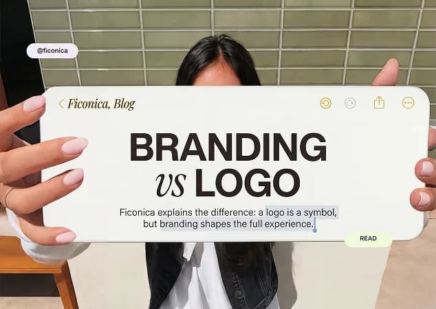
A complete brand identity is the set of visual choices and practical files that help people recognize your business wherever they encounter it. For a small business, that usually means more than a logo: you need a usable logo system, a defined color palette, font choices, image direction, templates or layouts for common materials, and clear rules for applying them consistently.
The goal is not to make every post, document, and package look identical. It is to make them clearly belong to the same business. A customer should be able to move from your website to an invoice, social profile, or business card without wondering whether they are dealing with the same company.
What a complete brand identity includes
A brand identity is the visual expression of your business. It supports recognition and helps your materials look organized, but it is not the same as your business strategy, marketing plan, reputation, or legal trademark status. A polished identity cannot fix an unclear offer or guarantee sales. It can, however, give your business a more coherent foundation for communicating what you do.
For most early-stage businesses, a practical identity has six connected parts.
1. A logo system, not one logo file
Your primary logo is the version you use most often, such as the mark in a website header or on a proposal cover. But one horizontal logo rarely works everywhere. A complete system commonly includes a stacked version for square spaces, a simplified icon or monogram for small profile images, and light and dark versions for different backgrounds.
The key test is size. If the logo becomes unreadable in a social profile circle or on a small label, it needs a simpler alternative. Avoid stretching, recoloring, outlining, or adding effects to make one version fit every context. Those workarounds usually make a brand look less controlled.
2. A focused color palette
Choose a primary color that carries most of the brand recognition, one or two supporting colors, and neutral colors for backgrounds and text. A palette with five intentional colors is generally easier to use than one with fifteen appealing swatches and no hierarchy.
Assign a job to each color. For example, a service business might use deep blue for headers and key brand elements, warm sand for backgrounds, charcoal for body text, and a brighter accent only for buttons or highlights. This gives non-designers a repeatable system instead of a collection of preferences.
Color also needs to work in real conditions. Check that text remains easy to read against its background, and consider how the palette appears on screens, in basic office printing, and in black and white. Screen colors and printed colors can differ, so businesses that rely heavily on packaging or signage may need professional print testing.
3. Typography with clear roles
Fonts shape the tone of a brand before a reader processes a single sentence. A financial consultant may favor a restrained, highly readable typeface, while a handmade candle studio may choose something softer or more expressive. Neither direction is automatically better. It depends on the audience, service, and intended personality.
Keep the system simple: select a heading font and a body font, then define where each belongs. If your heading typeface is decorative, body copy should usually be plain and comfortable to read at small sizes. Limit the number of weights and styles too. Using many fonts to create variety often creates inconsistency instead.
4. Supporting visual elements
These are the details that make an identity feel like a system rather than a logo pasted onto a page. They might include a pattern, icon style, photo treatment, shape language, illustration approach, or layout preference.
A brand does not need every one of these elements. A solo consultant may only need a logo, colors, typography, and a simple document layout. An ecommerce business with frequent product launches may benefit from a more developed photography and packaging direction. Build for the touchpoints you actually use.
5. Everyday brand assets
A complete identity becomes useful when it is prepared for the places where business happens. Common needs include website graphics, social profile images, post templates, presentation slides, proposal or invoice documents, email signatures, business cards, and letterheads.
Start with your highest-frequency materials. If you send proposals each week, a branded proposal template may be more valuable than a set of rarely used promotional graphics. If you sell in person, print-ready card and signage files deserve more attention. This order keeps the project practical and prevents asset overload.
6. Brand guidelines people will use
Guidelines do not need to be a 60-page design manual. For a small team, a concise document can be enough if it explains which logo version to use, approved colors with their values, fonts and sizing, spacing around the logo, and a few examples of correct and incorrect use.
The value is consistency when someone else creates a slide, edits a social post, or sends a document. Without basic rules, small variations accumulate: the logo is slightly different, the blue shifts, and three unrelated fonts appear in customer-facing materials.
How to build a complete brand identity without overbuilding it
Begin with the business decisions that should guide the visuals. Write a short description of who you serve, what you offer, what makes your approach distinct, and the three to five qualities you want people to associate with your business. Specific language helps. “Approachable bookkeeping for independent creatives” gives a clearer visual direction than “modern financial solutions.”
Next, list every place a customer is likely to see your brand in the next six to twelve months. This might include a landing page, LinkedIn profile, appointment reminders, product labels, email proposals, or marketplace listings. The list tells you what assets and logo variations you need now.
Then create the core visual system before producing collateral. Finalize the logo options, colors, fonts, and basic style direction first. Making business cards before resolving the logo system often creates rework later.
Finally, document the choices and apply them to your priority materials. Review the set together. Does the profile image use the correct logo? Is the website heading font the one in your guidelines? Is body text readable? These simple checks matter more than adding another decorative element.
File formats you should ask for
File formats are a practical part of a complete brand identity guide because the wrong file can make a good logo look blurry or unusable. Raster files, such as PNG and JPG, are made of pixels. They are useful for digital placements, but enlarging them can reduce quality. PNG files can support transparent backgrounds, which makes them useful for web and social media use.
Vector files, commonly SVG, PDF, or EPS, are built from scalable paths. They are generally better for large-format printing, signage, and situations where a printer or designer needs to resize the logo. The specific format a vendor requests can vary, so keep an organized master folder rather than sending the same image file to everyone.
It also helps to name files clearly. A folder containing “logo-final-new2.png” is difficult to manage six months later. Use names that identify the variation and format, such as “business-name-primary-dark.svg” or “business-name-icon-white.png.”
Choosing the right way to create your identity
An AI-assisted branding platform is generally suitable when you need a coordinated starting system quickly, have a relatively straightforward visual brief, and are comfortable selecting and refining options yourself. Ficonica, for example, is designed to help users move from a business description to logo concepts, color and font choices, brand previews, guidelines, and downloadable assets.
A freelancer or independent designer may be a better fit when you want closer creative collaboration, original illustration, or a more tailored process. An agency is often more appropriate for businesses that need extensive audience research, positioning work, naming, packaging systems, a large campaign rollout, or complex brand architecture. The right choice depends on the scope, budget, timeline, and the level of strategic and creative support required.
Whichever route you choose, review what is actually included before committing. Confirm the asset types, editable or export options you need, intended use cases, and any commercial-use terms directly with the provider. If you need advice on trademark availability, registration, or ownership, consult a qualified legal professional rather than treating a logo creation process as legal clearance.
Common mistakes that make an identity feel incomplete
The most common issue is treating the logo as the whole brand. A logo without font, color, and application rules leaves every new document open to improvisation. The opposite problem is overdesigning too early: too many colors, multiple logo styles with no purpose, and elaborate assets that do not appear in daily work.
Another mistake is copying visual trends too closely. Trends can provide references, but your identity needs to suit your own audience and offer. A business that wants a calm, established feel may not benefit from the same high-contrast type and loud gradients used by a trend-driven creator brand.
A useful identity should make the next piece of communication easier to create. If you can open a template, choose the right logo, apply the approved colors, and publish without second-guessing every design choice, the system is doing its job.