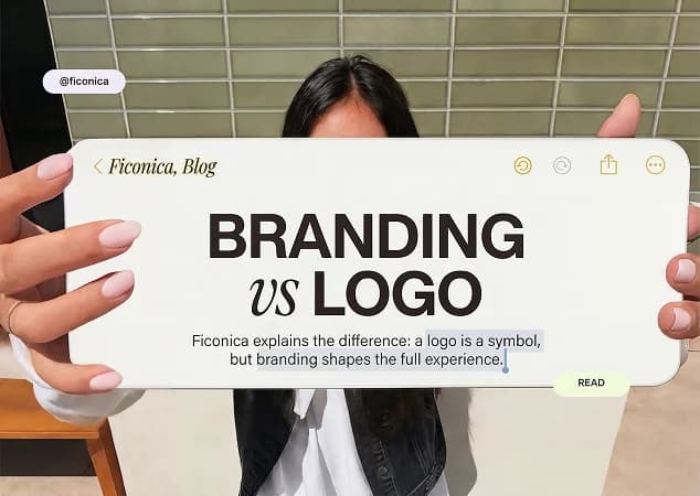
To build a brand identity, start by deciding how your business should look and sound wherever people encounter it. Then turn those decisions into a small, repeatable system: a logo, colors, fonts, imagery, and simple rules for using them. The goal is not to make every piece of content identical. It is to make your business recognizable whether someone sees your website, invoice, social profile, packaging, or presentation.
For a new business, this work can feel larger than it needs to be. You do not need a 100-page brand book before you launch. You need a clear foundation that works in the places your customers actually see first.
What a Brand Identity Includes
A brand identity is the visible and verbal expression of your business. It is different from your business strategy, marketing plan, or product quality, though all of those should inform it. A strong visual identity can make your materials feel more organized and credible. It cannot, by itself, guarantee sales, trust, or customer loyalty.
Most small businesses need five connected elements: a logo system, a color palette, typography, image direction, and usage guidelines. Your business name, messaging, and tone of voice also shape how the identity is perceived, but they are not replacements for a visual system.
The key word is system. A logo on its own is an asset. A logo paired with colors, type choices, and consistent layouts gives you a practical way to create new materials without starting from scratch each time.
Start With the Business You Are Actually Building
Before choosing a color or browsing logo styles, write a short working brief. This does not need design language. It should answer practical questions: What do you sell? Who is it for? What should customers understand quickly? Where will they first encounter the brand? What should your business feel like compared with alternatives?
For example, a bookkeeping consultant serving independent contractors may need to communicate clarity, calm, and professionalism. A handmade candle shop may prioritize warmth, sensory detail, and a more expressive visual style. Neither approach is universally better. The right direction depends on the offer, audience expectations, price point, and channel.
Also identify the first three to five places your identity must work. For many early-stage businesses, that is a website header, social media profile, email signature, proposal or invoice, and a simple printed item. This keeps decisions grounded in use rather than personal preference alone.
Build a Brand Identity From a Clear Visual Core
Choose a logo system, not just one logo
Your primary logo is the main version of your business name or symbol. But it may not fit every space. A wide logo can work well in a website header and poorly in a square social profile. A detailed mark may lose clarity at a small size.
Plan for a few useful versions: a primary logo, a compact or stacked version, and a simple icon or mark where appropriate. You should also have light and dark versions so the logo remains readable on different backgrounds. Avoid squeezing, stretching, outlining, or recoloring the logo arbitrarily once you have chosen its approved forms.
Keep the design appropriate to the business. A playful illustrated mark may suit a children’s activity brand, while a specialized B2B service may benefit from a simpler wordmark. This is a judgment call, not a fixed rule. Distinctiveness matters, but so does usability at small sizes and across everyday materials.
Limit your color palette
A practical palette usually includes one or two primary colors, a supporting accent, and neutral colors for text and backgrounds. The neutral colors do a significant amount of work. They help create breathing room, support readable text, and prevent every asset from competing for attention.
Choose colors based on how they function together, not on color associations alone. Blue does not automatically make a company trustworthy, and green does not automatically make it sustainable. What matters is whether the palette suits the brand context, creates enough contrast, and can be applied consistently.
Test your colors on real items. Look at a website button, a social post, a document heading, and a light or dark background. If text is hard to read, revise the combination. Accessibility and clarity should take priority over a shade that only works in a mood board.
Select fonts for everyday reading
Typography gives a brand much of its personality, but it must also make information easy to scan. A small business generally needs a heading font and a body font, or one versatile font family that covers both roles. Use decorative type carefully. It can add character in a logo or short headline, but may become tiring in paragraphs, pricing tables, or presentations.
Define the basics early: which font is used for headlines, which for body text, what weights are approved, and the usual size relationship between headings and paragraphs. These decisions prevent a common problem: every new document looking as though it came from a different business.
Consider where the fonts will be used. A typeface that looks good in a logo preview may be impractical if your team cannot use it consistently in the tools they rely on. Simple, accessible choices are often easier to maintain.
Set an image and layout direction
Your visual identity also appears in photography, illustrations, icons, spacing, and composition. Decide whether images should feel candid or polished, bright or muted, product-focused or people-focused. You do not need to prescribe every future photo, but a few boundaries help.
The same applies to layouts. Repeated elements such as generous white space, a consistent corner style, a particular headline treatment, or a recognizable color block can make templates feel connected. Use these elements with restraint. Too many visual devices can make basic communication harder to read.
Turn Decisions Into Rules People Can Use
A brand identity only saves time when the rules are easy to find and follow. Create a concise brand guide that shows the approved logo versions, minimum clear space, color values, fonts, and a few examples of correct and incorrect use. Include guidance for social profile images, documents, and any printed pieces you plan to produce.
The guide should answer ordinary questions quickly: Which logo goes on a dark background? Which colors are for text? What is the default headline font? Can the icon appear without the business name? If a rule does not help someone make a real decision, it may not need to be in the first version.
Save files in an organized folder structure and name them clearly. Keep final logo files separate from editable source files and old drafts. For print, confirm the supplier’s requirements before ordering materials. Print preparation can involve different color settings, dimensions, and file requirements than digital use.
Choose the Right Way to Create It
The best process depends on the complexity of your needs. An AI-assisted branding platform can be a practical fit when you need a coordinated starting point quickly, have a straightforward offer, and are comfortable guiding the outcome with your own preferences. Ficonica, for example, helps users move from a business name and industry description toward logo concepts, palettes, font pairings, brand previews, guidelines, and selected downloadable assets.
A freelance designer may be a better fit when you want close collaboration and a more tailored creative process. A branding agency is generally more suitable when the work requires deep customer research, positioning, naming, original illustration, complex packaging, a large product architecture, or extensive rollout support. These options involve different levels of time, budget, and strategic depth.
Whichever route you choose, review the final identity in the contexts where it will live. A beautiful logo that does not read on a mobile screen or fit an email signature still needs adjustment.
Keep the Identity Consistent After Launch
Consistency is not about policing every creative decision. It is about making the common decisions easy. Create a few reusable templates for social posts, proposals, slides, and documents. Use the approved logo files rather than copying an image from a web page. Keep colors and typography stable long enough for the system to become familiar.
At the same time, allow the brand to develop as the business learns more about its audience. You may refine photography, simplify a palette, or add a layout template after launch. Frequent wholesale redesigns usually create confusion, but thoughtful adjustments are normal.
Your next practical step is simple: list the first places customers will see your business, then make sure each one uses the same visual core. That is where a brand identity stops being a design project and starts becoming a useful business tool.