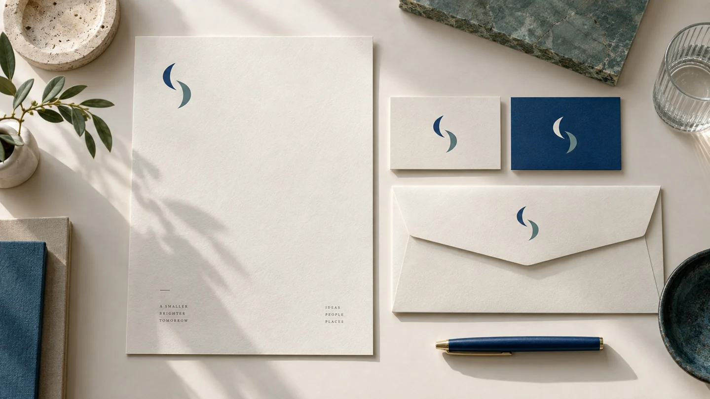
Cover: AI-generated editorial concept, not a customer project or a product screenshot.
A worked brief: Morrow Studio’s first stationery set
Morrow Studio is a fictional example for this article. The following is an editorial brief you can adapt, not a customer project or a report of a completed print run. Imagine a small creative studio that meets prospects, sends proposals and occasionally mails signed documents. It needs three useful pieces before it needs folders or merchandise.
| Piece and recipient task | Content and design decision | Check before ordering |
|---|---|---|
| Business card: find the portfolio and contact the studio | Front: the approved symbol and Morrow Studio name. Reverse: person’s name, role, email and portfolio URL. Use a light information side and reserve the accent color for a small detail. | View and print at the supplier’s trim size. Read every contact detail without zooming. If a QR code is added, test it on that actual-size proof and retain a written contact route. |
| Letterhead: read and respond to a proposal | Use a restrained header and contact footer. Keep the main text area clear. Prepare a low-ink everyday version if the document will often be printed in an office. | Insert a long, realistic proposal and check its second page. Confirm that text stays inside the intended area and does not collide with the footer. |
| Envelope: deliver the document and identify the sender | Use a compact logo and return address. Keep decoration separate from the delivery address. | Ask the printer for its envelope template and check the chosen postal service’s addressing rules. Verify window position if using a window envelope. |
The same identity does not require the same composition. A card helps someone act quickly; a letterhead makes space for a message. Repeating an oversized card logo on a letterhead would spend valuable reading space without helping that task.
Make omissions explicit
For this example, leave a long service list off the card: the portfolio can explain the work. Leave a decorative full-page background off the everyday letterhead: it adds ink coverage without helping the proposal. Delay presentation folders until there is a recurring reason to hand them out. These are choices for this fictional brief, not universal rules for every business.
A concrete bleed calculation
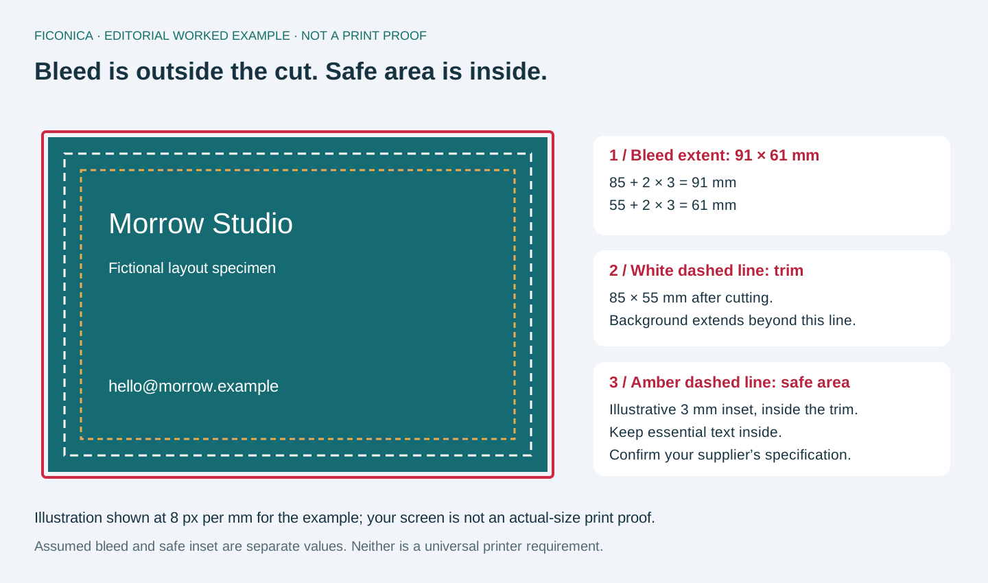
Suppose your printer specifies an 85 × 55 mm trimmed card and 3 mm bleed on every side. The artwork’s bleed extent is then 91 × 61 mm: add twice the bleed to each trimmed dimension. This is an example, not a universal card specification. Extend edge-touching backgrounds into the bleed, and keep essential text inside the printer’s safe area. Bleed and safe area solve different problems; adding bleed does not protect text placed on the cut line.
Adobe’s bleed guidance also advises checking the print provider’s requirements. Ask whether the supplier wants crop marks before including them.
Three approvals, three different questions
- Layout approval: Is the information correct and easy to find at actual size?
- File approval: Does the exported file satisfy this printer’s dimensions, bleed, font, image and color requirements? Adobe’s preflight documentation identifies checks such as missing fonts, overset text and low-resolution images. Passing those checks does not correct a wrong phone number.
- Production approval: Is the agreed proof sufficient for the paper, color and finishing decisions? An office print can help check scale; it cannot demonstrate the final supplier’s color or finish.
Keep an editable master, the printer’s specification, the approved export and the approval date together. Use an explicit filename such as morrow-business-card-front-v01-approved.pdf only after approval. If a phone number changes, update the master and produce a new export rather than leaving two files both called “final.”
Business stationery should make every routine interaction look intentional, from handing over a card to sending a formal proposal. Learning how to design business stationery starts with one principle: each piece should use the same visual system, while doing its own practical job well.
A business card needs fast, scannable contact information. A letterhead needs room for readable correspondence. An envelope needs to identify the sender without competing with the recipient address. Treating them as copies of the same design usually creates clutter. Treating them as unrelated documents creates a fragmented brand.
Start with a small, usable stationery system
For most new and small businesses, the core set includes business cards, letterhead, and envelopes. Depending on how you work, you might also need invoice templates, compliment slips, presentation folders, appointment cards, or mailing labels. Do not order every possible item simply because it is available. Start with the pieces you will actually use in the next few months.
A consultant who works primarily online may need a digital letterhead and business card first. A local service business may get more value from durable cards and branded invoices. A retail business that ships orders might prioritize packing inserts or thank-you cards. The right set depends on your customer touchpoints, not on a fixed checklist.
Before opening a design tool, gather the elements that must remain consistent:
- Your primary logo and any approved compact or one-color versions
- Brand colors, including print-friendly alternatives
- Chosen typefaces and their hierarchy
- Business name, contact details, website, and social handles where relevant
- A short tagline only if it clarifies what you do
This is the foundation of a brand system. Stationery is an application of that system, not a separate branding project.
Set the visual hierarchy before decorating
A common mistake is to begin with a background pattern, oversized logo, or decorative color block. Start instead with what the recipient needs to find.
On a business card, the person’s name and the best contact method are generally the highest-priority details. Your company name and logo establish who the card represents. A job title can help when it explains the person’s role, but it may be unnecessary for a solo business owner whose services are already clear.
On a letterhead, the body copy needs priority. A logo in the upper corner or a restrained header can identify the sender without taking space from the message. If the letterhead will be used for contracts, proposals, and invoices, reserve generous margins and avoid visual elements that reduce readability.
For envelopes, practical postal requirements come first. Keep the recipient area clear and place the return address where it will not be confused with the delivery address. A small logo, a brand color lining, or a simple return-address treatment can be enough to create recognition.
Use one idea across every format
Consistency does not mean placing the logo in the same exact spot on every piece. It means repeating recognizable choices: the same logo version, a related color balance, the same type family, and a similar level of visual energy.
For example, a calm financial consulting brand may use a dark navy wordmark, ample white space, and a small muted accent color across all pieces. A children’s activity studio may use brighter colors and friendlier type, but should still limit the palette and repeat a few recognizable elements. The goal is cohesion, not identical layouts.
Choose typography and color for print, not just screens
Type and color can look different after printing. Thin type may lose clarity at small sizes, especially on uncoated stock. Very pale text can be difficult to read. A font that looks expressive in a large logo may not work for phone numbers, addresses, or paragraph text.
Use a simple hierarchy. Your name or company name can be slightly more prominent, while contact details should remain comfortably legible. In most cases, one typeface family with a few weights, or a carefully chosen display and body pairing, is enough. Adding several unrelated fonts makes small formats feel busy quickly.
Color also needs restraint. A full-bleed color card can feel distinctive, but it may make fine text harder to read and can affect print cost. White or light backgrounds are generally practical for information-heavy pieces. Darker colors may work well as accents, on one side of a card, or on envelopes where text contrast is carefully checked.
If your brand palette was created for digital use, ask your printer or designer for appropriate print color values. Screen colors use RGB light, while commercial printing commonly uses CMYK ink values. Exact appearance depends on the printer, paper, ink, and finishing method, so request a proof when color accuracy matters.
Design each stationery item for its real-world use
Business cards
A business card has limited space. Include only information that helps someone contact or identify you: name, business name, role if useful, phone number, email address, website, and possibly a physical address. If you use a QR code, make sure it leads somewhere current and useful, such as a portfolio, booking page, or contact card. It should not replace all printed contact information.
Avoid shrinking text to fit extra services, social profiles, and slogans. A clean card that answers who you are and how to reach you is usually more useful than a miniature brochure.
Letterheads
Letterheads should support communication, not turn every page into an advertisement. Keep the header and footer modest, create a clear text area, and test a full page of sample copy before finalizing the template.
Consider both printed and digital use. A letterhead that looks good on premium paper may be impractical if it uses heavy full-page color for everyday home or office printing. You may need one version for professionally printed documents and another lighter version for routine PDFs or internal printing.
Envelopes and supporting pieces
Envelopes are often the first physical item a recipient sees, so they should look aligned with the rest of the set. However, printing limitations and mail handling matter. Keep critical information away from edges, folds, and seal areas. For a small business, a simple return address and logo are often sufficient.
Supporting pieces should earn their place. A thank-you card can add a thoughtful touch to shipped orders. A compliment slip can be useful for short notes or document packages. If neither fits how you serve customers, skip them and focus your budget on better paper or a stronger core set.
Check the delivered file, not just the preview card
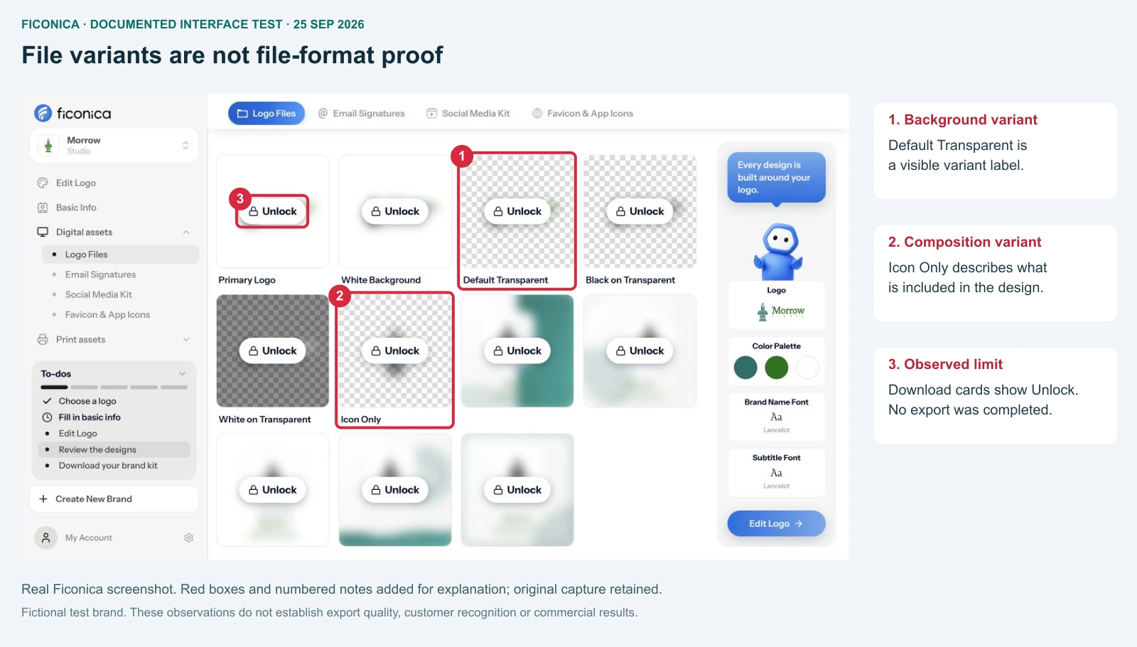
The following is a real Ficonica screen from our documented Morrow Studio test on 25 September 2026, reused here to explain the handoff boundary. Ficonica is our own product. The cards show logo variants and an Unlock state; we did not download or inspect a paid export in that test. This is not the stationery editor and does not demonstrate print-ready stationery.
Prepare files correctly before printing
A polished layout can still fail at the print stage. Printers have specifications for trim size, bleed, safe areas, resolution, color mode, and file type. Follow the requirements of the printer you plan to use rather than relying on a generic export setting.
Bleed is extra image or color area that extends beyond the final trimmed edge. It helps prevent thin white lines if the paper shifts slightly during cutting. A safe area keeps text and important logo details away from the trim edge. These small technical details matter most on business cards, where even a minor shift is noticeable.
Check every detail at actual size before approving a file. Read phone numbers aloud. Confirm email addresses, website spelling, suite numbers, and social handles. Look for inconsistent punctuation and spacing. Print a test on a standard office printer if possible, not to judge final color, but to judge scale, margins, and legibility.
Paper choice is part of the experience, but it is a trade-off. Thick uncoated stock can feel approachable and makes writing easier. Coated stock can make colors appear sharper and may suit image-led designs. Specialty finishes can add contrast, but may not fit a restrained professional brand or a tight budget. Choose materials that support how the item will be handled.
Build the system efficiently
If you already have an established logo, color palette, and font pairing, create your stationery from those approved assets. Keep editable source files organized, and name final exports clearly so team members do not accidentally use an outdated card or letterhead.
If you are still creating your visual identity, an AI-assisted platform such as Ficonica may help you develop coordinated logo concepts, colors, fonts, and brand previews before applying them to stationery. It can be a practical fit for straightforward early-stage needs. For a complex identity, custom illustration, unusual print production, or extensive strategic direction, a freelance designer or branding agency may be a better fit.
Once the first version is ready, use it for a short period and notice what is missing. You may find that customers ask for a booking link more often than a phone number, or that a digital letterhead serves you better than printed sheets. Update the system based on actual use, while keeping the core visual rules stable.
Good stationery does not need to be elaborate. It needs to be clear, consistent, and prepared for the moments when someone decides whether to keep your details, reply to your letter, or recognize your business again.
- How to create logo variations — choose layouts for different spaces.
- Raster versus vector graphics — understand file behavior before handoff.
- Guide to logo customization — refine the identity before applying it.