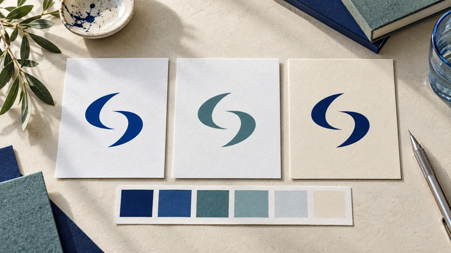
A guide to logo customization should start with one practical goal: make your logo recognizable, readable, and usable wherever your business appears. That means refining more than the icon. You need to consider typography, color, spacing, layout, and the versions required for a website, social profile, invoice, presentation, or printed item.
A logo does not need to communicate every part of your business. Its job is to create a clear visual signature that can be repeated consistently. For a new business, thoughtful customization is often what turns a generic starting concept into an identity that feels considered and appropriate for the audience you want to serve.
Start With the Context, Not the Decoration
Before changing fonts, colors, or symbols, define where the logo will be used most often. A local service business may need a mark that remains clear on a vehicle decal, uniform, and invoice. An online consultant may prioritize a clean website header, profile image, and presentation cover. A product business may need to test the logo at small sizes on labels or packaging.
This context affects nearly every customization choice. Fine details can look attractive on a large screen but disappear in a small social media avatar. A wide horizontal logo may work well in a website navigation bar but be awkward on a square profile image. The right direction depends on your actual applications, not just on how the design looks in an editor.
Write down your three most important uses before you begin. This creates a simple filter for decisions: if a change makes the logo less useful in those places, it may not be the right change.
Customize the Logo in the Right Order
Changing everything at once makes it hard to tell which decision improved the design and which one created a problem. Work from the structural choices to the finishing details.
1. Choose a suitable logo structure
Most small businesses benefit from having more than one arrangement of the same core logo. A horizontal version usually places the symbol beside the business name and is generally suitable for website headers, email signatures, and documents. A stacked version places elements above and below each other, which may fit square spaces better. A symbol-only version can be useful at very small sizes once people already recognize the brand.
Do not treat these as separate logos. They should use the same symbol, type style, and visual character. The purpose is flexibility, not variety for its own sake.
If your business name is long, a horizontal lockup may become too narrow or too small in common placements. Consider a stacked layout before shrinking the type to an unreadable size. If the name is short, you may have more room to use a stronger horizontal composition.
2. Refine the icon for clarity
An icon can be literal, such as a simplified leaf for a plant shop, or more abstract, such as a geometric form that suggests movement or connection. Either approach can work. What matters most is whether the shape remains distinct at the sizes where customers will encounter it.
Look for details that create visual noise: very thin lines, tiny interior gaps, too many separate elements, or effects that rely on subtle shading. Simplifying an icon does not mean making it plain. It means preserving the feature people will remember while removing elements that do not hold up at small sizes.
Test the icon in one color. If it only works with multiple colors, gradients, or shadows, it may be less adaptable for stamps, single-color printing, or simple digital uses. A full-color version can still be part of your system, but a one-color option is a practical safeguard.
3. Select typography for readability and fit
Your logo font should match the business personality without making the name difficult to read. A modern sans serif may suit a software consultant, creative studio, or personal brand. A serif can feel more established or editorial. A script may fit certain handmade or event-focused businesses, but it needs especially careful testing because scripts can become hard to read at small sizes.
Avoid choosing a font only because it looks distinctive in a large preview. Put the logo at the size of a website header, a business card, and a mobile screen. Can someone read the business name quickly? Are letters running together? Does the type feel too light compared with the icon?
Letter spacing also matters. Tight spacing can make a compact wordmark, while slightly wider spacing may create a calmer, more premium feel. There is no universal setting. The useful test is whether the letters look intentional and stay legible rather than cramped or disconnected.
4. Build a restrained color system
Color customization should give you a useful set of options, not a collection of unrelated shades. Start with a primary brand color, then choose supporting neutrals and, if needed, one accent color. Your logo may use only one or two of these colors while the wider palette supports your website, social graphics, and documents.
Consider contrast before personal preference. A pale yellow logo on white may be difficult to see. Dark text on a light background is often easier to use in practical settings. You should also prepare a black version, a white reverse version for dark backgrounds, and a full-color version where appropriate.
Colors can influence how a brand feels, but they do not guarantee trust, sales, or customer loyalty. The more useful question is whether your chosen colors suit your category, audience, and typical use cases. A bold palette may help a creator stand out, while a financial consultant may prefer a more restrained system. Both approaches depend on positioning and execution.
Check Spacing, Alignment, and Balance
Spacing is one of the least glamorous parts of logo customization, yet it often determines whether a logo looks polished. Give the icon and business name enough room to breathe. If the elements are too close, the logo can feel crowded. If they are too far apart, they can look unrelated.
Check alignment in each layout. In a horizontal logo, the icon should feel visually connected to the wordmark rather than merely placed beside it. In a stacked logo, center alignment is common, but it is not mandatory. The best arrangement depends on the icon shape and the width of the business name.
Also define clear space around the completed logo. This is the minimum empty area that should remain around it when used with text, borders, photos, or other graphics. Clear space helps the logo remain visible and avoids the common problem of a mark being squeezed into a crowded design.
Test the Versions You Will Actually Use
A logo that looks good in a large artboard has not finished its job. Test it in realistic situations before you finalize the design. This is where many customization decisions become clearer.
Review your logo in at least these settings:
- A website header and mobile screen
- A square social media profile image
- A document or invoice heading
- A light background and a dark background
- A small printed item, such as a business card or label
Pay attention to what fails first. If the tagline disappears at a small size, remove it from the small version rather than forcing it to remain. If the icon becomes unrecognizable in a profile image, use a simplified symbol-only variation. If the full-color logo lacks contrast over photography, use a one-color alternative.
These are not signs that the main logo is weak. They are normal adaptations for different formats. A complete visual identity gives you clear rules for using the right version in the right place.
Prepare Practical Logo Files
Logo customization is only useful when you can export and apply the result. For digital use, you will generally want a transparent-background image file for websites, presentations, and social graphics. For print, a scalable vector file is often preferred because it can be enlarged without becoming blurry. A PDF may also be requested by print providers, depending on the job.
Keep files organized by version and color. Clear names such as “businessname-horizontal-color” or “businessname-icon-white” reduce confusion when you return to the files months later or share them with a printer, web developer, or collaborator.
If you use an AI-assisted branding platform such as Ficonica, review the available customization controls and downloadable assets before committing to a final direction. The practical value is not just generating a logo concept. It is being able to create coordinated variations, colors, typography, and brand materials that you can use consistently. For highly specialized illustration, extensive brand research, complex packaging, or custom creative direction, a freelance designer or branding agency may be a better fit.
Create Simple Rules for Consistent Use
Once the logo is finalized, document a few straightforward rules. Specify which logo is the primary version, which version to use on dark backgrounds, the approved colors, the typefaces used across the brand, and the minimum size for readable reproduction. You do not need a lengthy design manual to begin. A one-page reference can prevent mismatched colors, stretched logos, and inconsistent fonts.
Avoid common shortcuts such as changing logo colors for every campaign, placing the mark over busy images without contrast, adding unapproved effects, or stretching the proportions to fill a space. Consistency is what allows a simple logo to build recognition over time.
The strongest next step is to place your customized logo into one real business asset today, whether that is a website header, proposal template, social profile, or business card. Seeing it in use will tell you more than another hour of adjusting it in isolation.