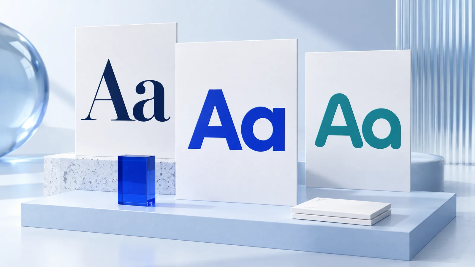
To pair fonts for brands, choose one typeface for attention and one for support, then test them in the places customers will actually see them. Most small businesses need two fonts, not a large collection: a display font for headlines and a highly readable text font for body copy, buttons, captions, and documents.
A font pairing is not about finding two typefaces that look impressive next to each other in a specimen. It is about creating a repeatable system. Your headline, website, social graphics, email signature, invoice, and printed card should feel like they belong to the same business without making every message hard to read.
Start With Roles, Not Personal Favorites
The simplest way to choose fonts is to assign each one a job. Your primary font carries the brand's stronger personality. It may appear in the logo, headings, large promotional messages, and selected social media graphics. Your secondary font handles the everyday work: paragraphs, product details, navigation, forms, and long captions.
This distinction matters because the most expressive font is rarely the easiest one to read at small sizes. A condensed sans serif may create a confident headline, for example, but it can feel cramped in a paragraph. A classic serif can add warmth and authority to a title, while a neutral sans serif keeps web copy clear.
Before looking at font names, write down three to five words that describe the visual direction you want. A bookkeeping consultant might choose clear, calm, and established. A handmade candle shop might choose warm, considered, and tactile. These are design cues, not promises about customer behavior, but they make subjective choices easier to evaluate.
How to Pair Fonts for Brands With Useful Contrast
Good pairings have contrast, but not conflict. If two fonts are nearly identical, the combination can look accidental. If they are dramatically different in too many ways, the brand can feel disjointed. The goal is a visible distinction with enough shared structure to look intentional.
A practical starting point is to pair fonts from different broad categories. A serif and sans serif combination is common because the contrast is obvious and flexible. For example, a refined serif headline can work with a straightforward sans serif for text. A modern sans serif headline can also work with a readable serif if the business needs a more editorial tone.
You can also combine two sans serif fonts, but give them clearly different roles. One might be wide and geometric for headings, while the other is more neutral for body copy. This can suit technology services, fitness businesses, and contemporary product brands. It requires more care because similar sans serifs can compete rather than complement each other.
Script, handwritten, and decorative fonts are usually best treated as accents. They can add character to a short phrase, a packaging label, or a social post, but they are generally unsuitable for paragraphs, navigation, or essential business information. If your primary display font is highly decorative, keep the supporting font especially plain.
Check the details that affect readability
Do not judge the pairing from a single word. Test a real headline, a 50-word paragraph, a call-to-action button, a price, an email address, and a social graphic. These small tests expose problems quickly.
Look closely at letterforms that tend to cause confusion, such as lowercase l, uppercase I, and the number 1. Check whether punctuation, dollar signs, ampersands, and numerals look clear. If you sell products or schedule appointments, readable prices, dates, and contact details matter more than a distinctive headline.
Also test weight and spacing. A thin font may look polished on a large monitor but disappear on a phone screen or in light print. Tight letter spacing can make a short logo treatment feel compact, yet it may reduce readability in an all-caps heading. The right choice depends on where and how often the font will be used.
Choose a Pairing That Fits Your Actual Brand Materials
Typography should reflect the practical needs of your business. A local service business with detailed website pages needs an excellent body font. A creator whose brand appears mainly in short video covers and social templates may place more emphasis on a distinctive headline font. An online store needs both: attractive product presentation and clear descriptions, pricing, and checkout information.
Consider the formats you expect to use during the next year. If you need proposal templates, brochures, labels, presentation slides, and a website, choose fonts that remain legible across digital and print applications. Very fine details, extreme contrast between thick and thin strokes, and delicate scripts may not reproduce consistently at small sizes.
Font availability also deserves attention. A pairing is only useful if the people creating your materials can access and use it consistently. Confirm the font files, styles, and permitted uses before building templates around them. This is a practical workflow check rather than legal guidance, and the relevant terms vary by font provider.
Three Pairing Directions to Consider
There is no universally correct font combination. Still, these directions are generally suitable starting points for early-stage brands.
Editorial serif plus neutral sans serif
Use a serif for major headlines and a neutral sans serif for text. This direction can feel thoughtful, established, or premium without requiring ornamental design. It may suit consultants, boutique retailers, photographers, wellness brands, and businesses that rely on longer-form content.
The trade-off is that some traditional serifs can feel overly formal. Choose a serif with simple shapes if you want the system to remain modern and approachable.
Geometric sans serif plus humanist sans serif
A geometric sans serif has orderly, constructed forms. A humanist sans serif tends to have more open, text-friendly shapes. Together, they can create a clean system with enough difference between heading and body roles. This is often a sensible option for digital products, professional services, and startups.
The risk is subtle contrast. Set the heading font at a noticeably different size or weight, and avoid using both typefaces for the same kind of message.
Expressive display font plus simple workhorse font
This approach uses a distinctive display face sparingly, paired with a versatile sans serif or serif for all functional copy. It may work for food brands, personal brands, events, beauty businesses, and creative shops where a recognizable visual mood matters.
Restraint is essential. Use the display face for short headlines or selected emphasis, not every piece of text. When the accent font becomes the default, consistency can turn into clutter.
Build a Small Typography System Around the Pair
Once you choose two fonts, define a few rules before creating more assets. Decide which font is used for H1 and H2 headings, body copy, buttons, captions, and pull quotes. Establish a limited set of weights, such as regular and bold for text, plus one semibold or bold treatment for headings.
Avoid solving every new design problem by adding another font. Extra typefaces create more decisions for anyone making a presentation, post, or flyer. A three-font system can work when the third font has a specific purpose, such as a data-heavy mono font or a controlled accent face. For most new businesses, two fonts are easier to apply well.
Set a hierarchy, too. On a website, the largest heading should be visibly larger than subheadings, which should be visibly different from body text. On social templates, keep this same relationship even when the overall scale changes. Consistent hierarchy often makes a brand look more organized than a more unusual font choice would.
Test Before You Commit
Create a simple one-page test using your real business content. Include a homepage-style headline, an about paragraph, a product or service price, a button label, a social post, and a business card-sized contact block. View it on a phone and desktop, then print it at home if printed materials matter to your business.
Ask practical questions: Can someone scan the key information quickly? Does the display font remain recognizable without overpowering the page? Are the two roles obvious? Does the system still work in black and white? If the answer is no, adjust size, weight, spacing, or the pairing itself.
An AI-assisted branding platform such as Ficonica can be useful when you want to explore coordinated font, color, and logo directions quickly. It is generally a good fit for straightforward early-stage identity needs. A designer or agency may be a better choice when the project requires extensive research, original illustration, complex packaging, or highly customized art direction.
Your final pairing does not need to impress every designer on the internet. It needs to help your business communicate clearly and look consistent wherever people encounter it. Choose the combination you can use confidently, document the rules, and give it enough time to become familiar.