The logo trends worth paying attention to are the ones that make a brand easier to recognize, use, and remember across real business touchpoints. For a small business, that usually means clear typography, flexible layouts, distinctive details, and designs that still work at a small size. A fashionable effect can be useful, but it should support your brand rather than become the whole identity.
A logo is not a marketing strategy, a guarantee of customer trust, or a substitute for a clear offer. It is a visual identifier. Its job is to help people recognize the business consistently on a website, social profile, invoice, package, presentation, or storefront sign.
Logo Trends: What Is Actually Useful?
Many current logo directions share one underlying idea: identities need to work in more places than they did before. A mark may appear as a tiny profile image, a website header, a social post, a shipping label, and a printed business card. That has pushed designers toward systems that are simple enough to scale yet distinctive enough to avoid looking generic.
The useful question is not, “Which logo trend is most popular?” It is, “Which visual direction fits how my business needs to be seen and used?” A playful bakery, a B2B consultant, and an indie app can all use contemporary design, but they should not necessarily use the same visual language.
1. Simplified marks with more personality
Minimal logos remain common, but plainness alone is no longer enough. The stronger examples use a restrained shape, symbol, or wordmark with one memorable detail: an unusual letterform, a purposeful cut in a shape, a softened corner, or a recognizable rhythm in the typography.
This approach is generally suitable for businesses that need a logo to remain clear at small sizes. It can work especially well for service businesses, digital products, consultants, and online stores. The trade-off is that a very simple logo needs careful execution. A generic circle, leaf, monogram, or abstract sparkle may look polished but can be difficult to distinguish from similar brands.
2. Custom-feeling typography
Wordmarks are receiving more attention because typography can carry a lot of personality without requiring a complicated icon. A wordmark might use a distinctive serif, a confident geometric sans serif, a handwritten-inspired style, or customized letter spacing and ligatures.
For a new business, a wordmark can be a practical choice when the company name is short and reasonably easy to read. It puts the name in front of the audience from the beginning. It also avoids forcing a symbolic icon before the business has built enough recognition for that icon to stand alone.
The limitation is legibility. Decorative type can become hard to read in social profile images, mobile navigation, or small printed materials. Before choosing a stylized wordmark, test it at the smallest size you expect to use.
3. Flexible logo systems, not one fixed file
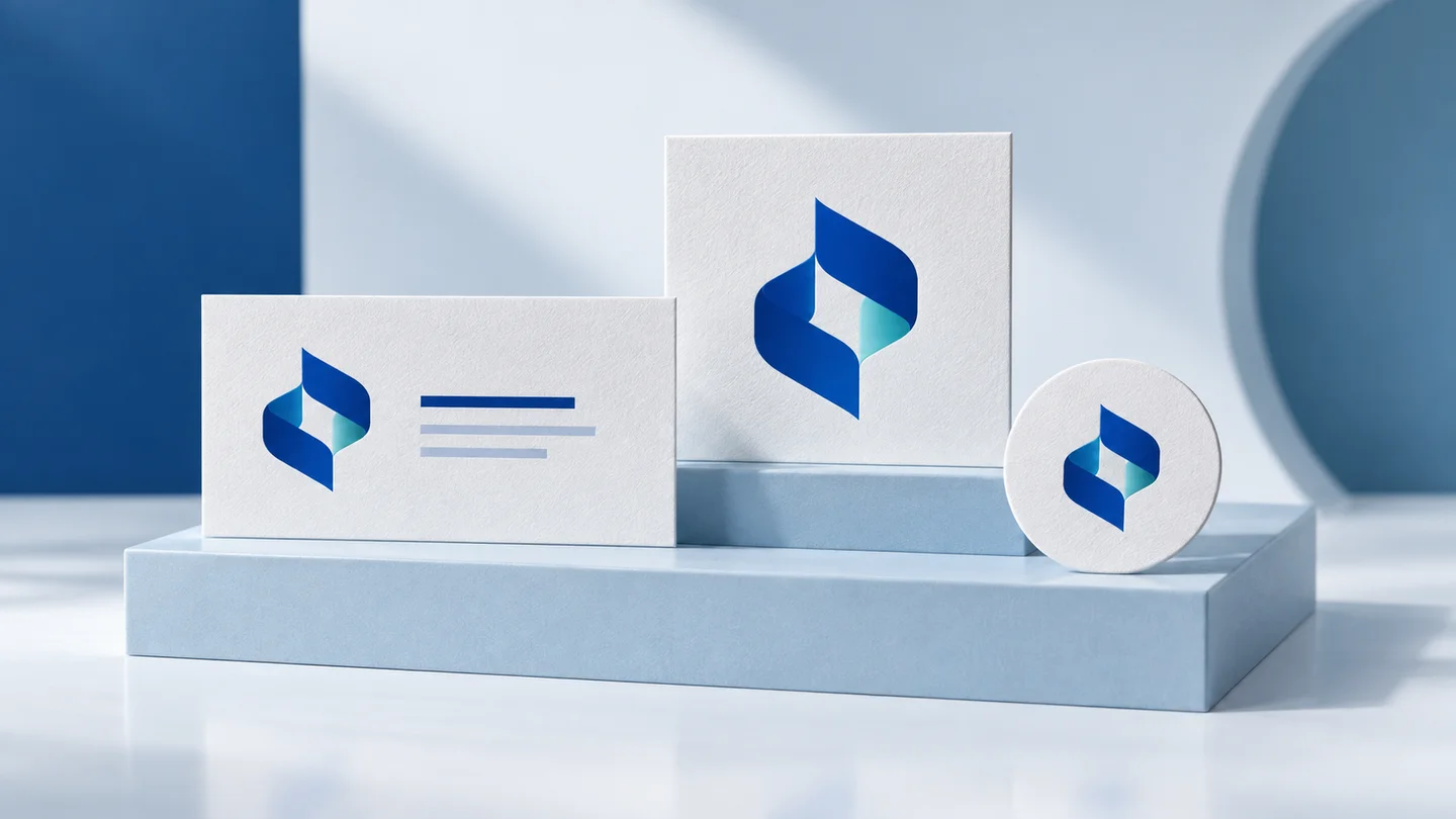
One of the most practical logo trends is not a visual style at all. It is the move from a single logo to a set of coordinated variations. A complete system may include a primary horizontal logo, a stacked version, a symbol or monogram for compact spaces, and a one-color version for limited printing.
This does not mean every business needs four separate-looking logos. The elements should feel related and follow the same type, color, and shape decisions. The goal is to avoid squeezing a wide logo into a square social avatar or using a detailed emblem where a clean one-color mark would be more appropriate.
For early-stage brands, this flexibility often has more practical value than adding visual effects. It helps the identity stay consistent as the business begins using more channels.
4. Bolder color with a disciplined palette
Many newer identities use brighter, more confident color choices. Saturated greens, vivid blues, warm reds, and unexpected pairings can help a brand feel energetic or contemporary. However, a bold palette is not automatically right for every category.
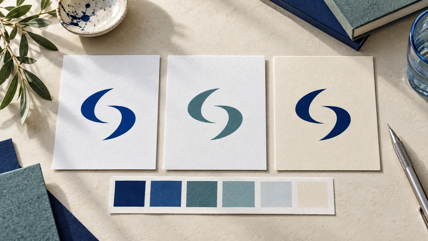
Color should reflect the tone you want to communicate and the settings where the brand will appear. A financial consultant may prefer a calm, limited palette. A children’s activity business may have more room for high-energy combinations. Both can be current if the colors are used consistently.
Consider accessibility and reproduction as well. Low-contrast color combinations can make text difficult to read, while subtle gradients may reproduce differently on screen and in print. Every palette should include practical neutral colors and a clear dark-light contrast option for everyday use.
5. Imperfect, human details
Hand-drawn lines, organic shapes, textured lettering, and intentionally irregular details are appearing more often in brands that want to feel personal, local, creative, or handmade. This direction can be a good fit for artists, food businesses, wellness brands, independent retailers, and community-focused services.
The appeal is understandable: not every business needs to look like a software company. Human details can add warmth when they are tied to the product or founder’s point of view.
Still, this style depends on the execution. Too much texture or too many small details can make a logo difficult to reproduce. A hand-drawn mark should remain recognizable in one color and at small sizes, even if supporting illustrations provide the richer visual texture elsewhere.
6. Depth, motion, and digital-first effects
Gradients, soft 3D forms, motion, and variable typography can create an expressive digital presence. These elements are often strongest in campaign graphics, website interactions, social content, and animated intros rather than in the core logo itself.
A static logo should not depend on animation to make sense. Likewise, a detailed gradient should have a solid-color alternative for documents, embroidery, stamps, and other practical applications. Think of motion and depth as optional layers of the identity, not requirements for the basic mark.
How to Decide Whether a Trend Fits Your Brand
Start with your business context before collecting visual references. Write down what you sell, who needs to recognize you, where the logo will appear most often, and three to five words that describe the intended brand personality. For example, “precise, calm, knowledgeable” points in a different direction than “playful, handmade, welcoming.”
Next, look at your direct competitors. The purpose is not to copy their style. It is to identify repeated visual conventions in the category. If every competitor uses a navy blue shield, another navy blue shield may blend in. On the other hand, moving too far from familiar category cues can confuse customers. The right level of difference depends on the audience and the type of business.
Then test a logo concept in everyday situations. View it in a website header, square social icon, email signature, black-and-white document, and a small printed format. If the business will use packaging or merchandise, test those applications too. A logo that looks impressive on a large presentation slide may fail when reduced to 32 pixels.
Finally, separate the core identity from short-lived campaigns. You can use a trendy type treatment, animated graphic, or seasonal color for a launch without rebuilding the logo every time visual tastes change. This approach gives the brand room to feel current while protecting recognition over time.
Build the System Around the Logo
A logo works better when it is supported by a few clear rules. Choose primary and secondary colors, one or two typefaces, image direction, spacing guidance, and versions for light and dark backgrounds. These decisions turn a logo into a usable visual identity rather than a file that sits in a folder.
An AI-assisted branding platform such as Ficonica may be useful when you need to explore logo concepts and assemble coordinated basics such as colors, fonts, brand previews, guidelines, and downloadable assets without starting with a traditional agency engagement. It may be less suitable when the project requires deep brand research, a highly original illustration style, a complex packaging system, or extensive custom creative direction. In those cases, a freelance designer or branding agency may be the better fit.
If you use an AI tool, treat its output as a starting point for evaluation, not an automatic final answer. Check that the name is spelled correctly, assess readability, compare variations, and confirm that the selected assets meet your intended digital and print needs. Questions about trademark availability, registration, ownership, or legal rights require appropriate professional guidance outside the visual design process.
Choose Recognition Over Novelty
The most useful trend is a logo that makes your business look intentional wherever customers encounter it. A contemporary detail can help, but clarity, consistency, and a good fit for your audience tend to last longer than a dramatic style choice. Choose a direction you can use confidently next month, next year, and in the small spaces where real brands spend most of their time.