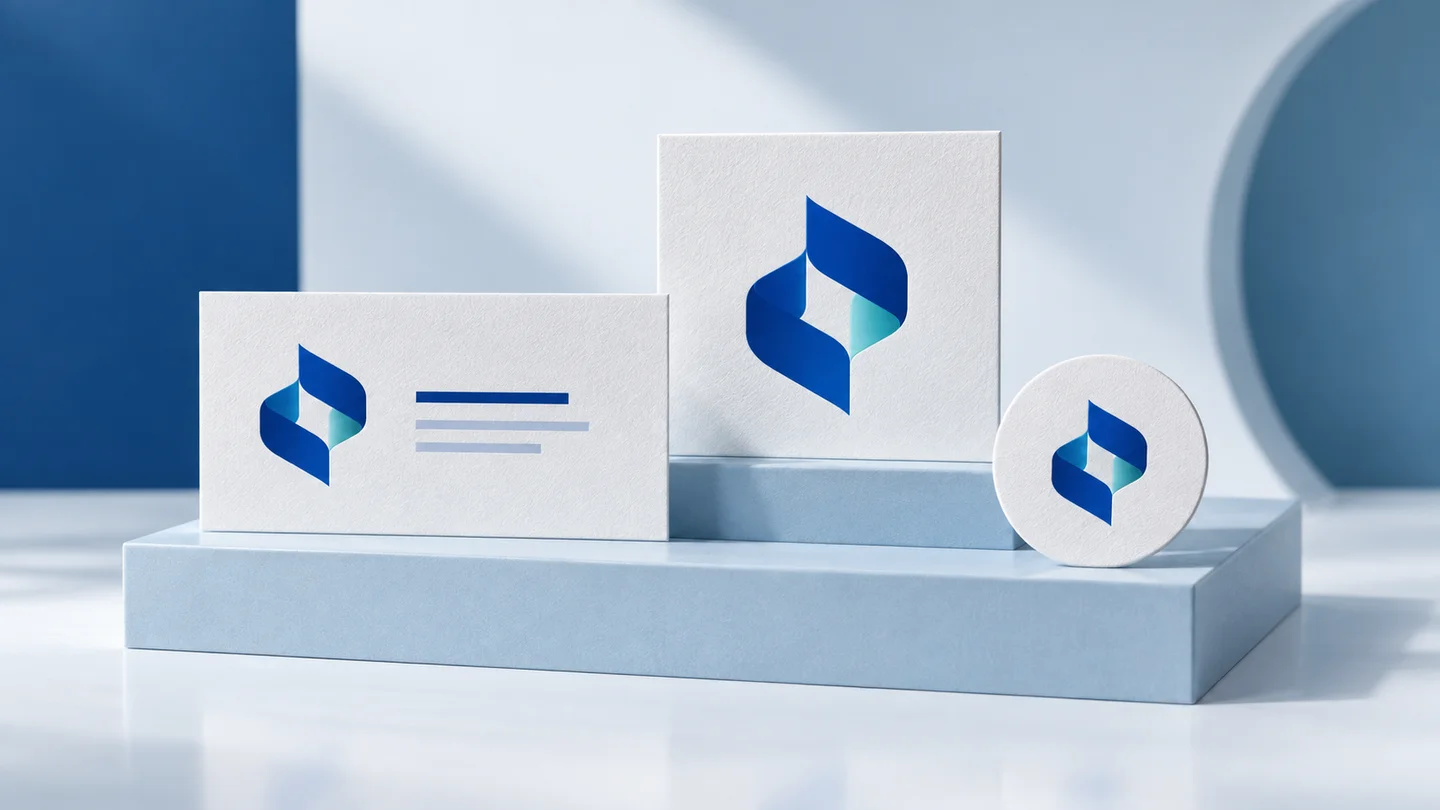
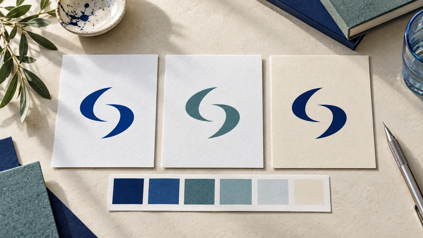
A generated logo concept is a starting point, not a finished identity. To edit generated logo concepts effectively, first decide what the logo needs to communicate, then refine only the elements that improve clarity, fit, and usability. The goal is not to add more detail. It is to make the chosen direction easier to recognize and easier to use everywhere your business appears.
Start by choosing one direction
Generated results often make it tempting to combine parts of several concepts: the icon from one, the type from another, and the color from a third. That can work, but it can also produce a logo with no clear visual logic. Choose the concept that best matches your business before you begin editing.
Ask a few practical questions. Does the concept suit the kind of business you are building? Would it still make sense if your services expand? Can a customer understand the business name without effort? Does it feel appropriate next to the brands your audience already sees in your category?
A local accounting firm, for example, may need a clear wordmark that works on invoices and email signatures. A handmade candle shop may have more room for an expressive symbol and softer typography. Neither approach is universally better. The right choice depends on the business, audience, and where the logo will be used.
Once you select a direction, save other promising concepts for reference but avoid reopening the decision with every small edit. Consistency usually comes from developing one idea with care.
Edit the business name before the icon
The business name is often the part people need to read, search for, and remember. If the name is hard to read, a polished icon will not solve the problem.
Check spelling, capitalization, spacing, and punctuation first. Then look at the typeface. Decorative lettering may be suitable for a short, personality-led name, but it can become difficult to read at small sizes or on busy backgrounds. A more straightforward font is generally suitable for businesses that need to appear across proposals, websites, social profiles, and printed materials.
Pay close attention to letter spacing. Too much space can make a short name look disconnected. Too little can cause letters to blur together, especially when the logo is reduced. Also consider how the name breaks across lines. A stacked layout may fit a square social profile image well, while a horizontal layout may be more useful in a website header.
If your concept includes a tagline, treat it as optional at smaller sizes. Taglines commonly become unreadable on profile images, browser tabs, labels, and promotional items. Your primary logo should still work when the tagline is removed.
Keep typography limited
A logo rarely needs several type styles. One typeface for the name and, if necessary, a complementary style for a tagline is usually enough. Adding extra fonts can make an early-stage brand look less organized rather than more distinctive.
When you choose a font pairing for the wider brand, make sure it supports the logo instead of competing with it. The font used in a website heading does not have to be identical to the logo lettering, but the two should feel intentionally related in weight, mood, and level of formality.
Simplify the symbol, not just its appearance
An icon may look appealing at large size yet become unclear when used as a small social avatar or favicon. Before adding shadows, textures, fine lines, or tiny details, test whether the basic shape is recognizable.
A strong small-business logo symbol generally has a clear silhouette. It should remain understandable in one color and at reduced size. If an icon relies on several thin interior lines, gradients, or small decorative marks, consider removing the least essential parts.
This does not mean every logo needs to be minimal. A more detailed mark can be appropriate for certain creative businesses, heritage-style brands, or packaging-led products. The trade-off is practical: detailed marks need more space and may require a simplified alternate version for smaller applications.
If the icon and wordmark are both competing for attention, reduce one. You might make the icon smaller, choose a quieter color, or simplify its shape. The logo should feel like one unit, not two separate design ideas placed beside each other.
Choose colors for flexibility
Color can give a generated concept more personality, but it also affects where and how the logo can be used. Start with a small palette rather than editing every element into a different shade.
Test the logo in full color, black, and white. If it only works with a specific gradient or pale background, it may create problems on documents, stamps, merchandise, and third-party platforms. A one-color version is not less professional. It is a practical version of the same identity.
Consider contrast as well. Light text on a light background and dark text on a dark background can look refined in a large preview but fail in actual use. Make sure the main logo remains legible on the backgrounds you expect to use most often.
Your brand colors should support the logo rather than overwhelm it. A vivid accent may be useful for buttons, highlights, or social graphics, while a neutral background color can give the system room to breathe. The exact balance depends on your industry and visual direction.
Adjust the layout for real placements
A single logo arrangement does not fit every space. Editing generated logo concepts often means creating a few related versions rather than forcing one layout everywhere.
At minimum, consider a primary logo for standard use, a compact version for square or narrow spaces, and a symbol-only version if the icon remains recognizable without the name. A horizontal logo may work best on a website or letterhead. A stacked version may be better for social profiles, presentation covers, and business cards.
Do not stretch, compress, or manually reshape the logo to fit a space. Instead, use the appropriate variation and leave enough clear space around it. Crowding a logo against a page edge, photo, or block of text makes even a well-designed mark feel less considered.
Previewing the logo in context is more useful than evaluating it on a blank canvas. Place it on a simple website header, a social profile image, a document, and a light and dark background. You are looking for practical issues: Is the name still readable? Does the icon disappear? Is the contrast sufficient? Does the layout need a compact alternative?
Check the logo at small sizes
Many first-time founders judge a logo at the large size shown in an editor. Customers will often encounter it much smaller. A logo that looks good only when enlarged is not yet ready for everyday use.
Reduce the design until it is roughly the size of a profile image, mobile header, or email signature mark. If the business name becomes difficult to read, try a simplified layout rather than shrinking the same design further. If fine icon details disappear, use a simplified symbol or a wordmark in that placement.
This is also the moment to check line thickness. Extremely thin strokes may vanish on lower-quality screens or basic print materials. Very heavy strokes can close up small internal spaces. There is no single correct weight, but the logo should remain clear at the sizes you actually need.
Keep edits aligned with the wider brand system
A logo is one part of visual branding. Its colors, typography, and general tone should help guide your website, social templates, documents, and printed materials.
After finalizing the logo, record the decisions you made: the approved colors, font choices, logo variations, preferred backgrounds, and examples of what not to do. This does not need to be a complex agency-style manual. Even a simple set of guidelines can prevent inconsistent use when you create new materials later.
Platforms such as Ficonica can be useful when you want to develop a logo concept alongside coordinated colors, fonts, previews, and brand assets. A freelancer, designer, or agency may be a better fit when your project requires extensive research, original illustration, packaging systems, or highly customized creative direction.
Make changes in rounds, then stop
Unlimited editing can weaken a concept. Set a short review process: first address readability and layout, then refine color and small visual details, then test the final versions in realistic placements. Avoid changing type, icon, color, and composition all at once, because you will not know which change improved or weakened the result.
Before export, check that the final files include the versions you expect to use and that the design is consistent across each one. A clear, adaptable logo is more valuable than a concept filled with effects you cannot reliably reproduce. Once it works in the places your business operates, give it room to become familiar.