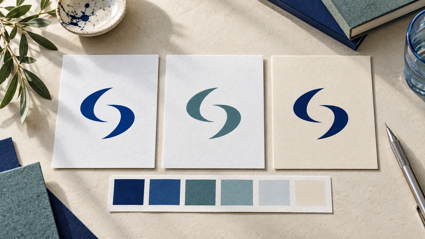
Logo clear space rules define the minimum empty area around your logo. They prevent text, images, page edges, and other design elements from crowding the mark, so it remains easy to recognize wherever your business appears.
For a new business, this is one of the simplest brand rules to create and one of the easiest to overlook. A polished logo can feel less professional when it is squeezed into a website header, placed too close to a sponsor logo, or surrounded by busy social graphics. Clear space gives the logo room to function without changing the logo itself.
What logo clear space rules actually mean
Clear space, sometimes called an exclusion zone, is the protected area around a logo. Nothing should enter that area except the background the logo sits on. That means no headlines, icons, photos, borders, patterns, or additional logos.
The rule is not about creating a large blank page. It establishes a minimum distance. Designers can use more room when a layout calls for it, but they should not use less.
Think of clear space as a boundary that travels with your logo. Whether the logo appears on a business card, a proposal cover, an Instagram post, or a partner page, the boundary helps maintain a consistent presentation.
Clear space is different from logo size
A minimum-size rule answers, “How small can the logo be before it becomes hard to read?” A clear-space rule answers, “How close can other elements get to it?” Both belong in practical brand guidelines, but they solve different problems.
For example, a small logo in a website footer may still be legible. If the copyright line or social icon sits directly against it, though, the logo can still look cramped. The correct size does not replace adequate spacing.
How to choose a clear-space measurement
Most small businesses do not need a complicated formula. The goal is a rule that is easy for anyone making materials to understand and apply.
A common approach is to choose a recognizable part of the logo as the measurement unit. This could be the height of a letter in the wordmark, the width of an icon detail, or a simple unit labeled “X.” Your guidelines then state that the logo needs at least 1X of clear space on every side.
If your logo includes a symbol and a business name, use a measurement that remains visible in the complete logo. Avoid basing the rule on a tiny detail that becomes difficult to measure at small sizes.
Three practical ways to define the space
For a simple wordmark, the height of a capital letter is generally suitable. If the logo is an icon paired with text, the width or height of a prominent part of the icon may be easier to use. For compact badges or monograms, defining clear space as a percentage of the logo’s total height can be more practical.
The exact amount depends on the logo and where it will be used. One unit of clear space is a sensible starting point for many applications. A more detailed or visually dense logo may benefit from additional room. A logo that appears beside a required partner mark may need a specific co-branding layout rather than a general spacing rule.
What matters most is consistency. A usable rule is better than a highly technical one that nobody outside a design team can apply.
Logo clear space rules for common materials
The same rule should guide every format, but real layouts create different pressures. A social profile image has limited room. A storefront sign may have plenty. A website navigation bar needs to balance logo visibility with useful navigation.
Websites and email signatures
In a website header, keep navigation links and buttons outside the logo’s clear space. Do not treat the edge of the header as a substitute for the rule either. The logo should have room from both nearby elements and the outer edges of the screen area.
Email signatures are often crowded because they combine a name, title, contact details, a logo, and sometimes promotional graphics. Use a smaller logo only if it stays readable, then maintain space between it and the text block. A compact signature usually looks more considered than one with a large logo pressed against several lines of information.
Social media and digital ads
Social templates can become cluttered quickly. When placing a logo over a photo or color block, reserve a quiet corner rather than dropping it into the remaining space at the end. The logo’s clear space should also be free from high-contrast visual details that make the mark harder to distinguish.
Platform interface elements can create another issue. Profile-picture crops, buttons, captions, and safe areas vary by platform and device. Leave extra room around the logo in posts and short-form video graphics when there is any chance a platform may crop the edges.
Print, packaging, and documents
For print, clear space matters near trim edges, folds, holes, and binding. Your logo may technically have enough room from a headline but still feel too close to the edge of a folded brochure. Consider both the exclusion zone and the physical constraints of the finished item.
Packaging and labels often have limited real estate. In these cases, the logo does not need to be the largest element, but it should not compete with required product information or decorative graphics. If space is genuinely tight, simplify the layout before reducing the clear space below your established minimum.
Use more space when the context is busy
Minimum clear space is a floor, not a target. Some situations call for more than the guideline states: a textured background, a crowded event banner, a promotional graphic with several offers, or a page that includes multiple brand marks.
Contrast also matters. Clear space cannot fix a logo that disappears into a similar-colored image or a busy pattern. Your brand guidelines should include approved logo color versions for light and dark backgrounds. When no approved version provides enough distinction, use a different background treatment rather than forcing the logo into the design.
There are exceptions. Small app icons, browser favicons, and some social profile images do not allow a visible exclusion zone around the logo because the platform itself crops the asset. For these formats, use a logo variation created for small spaces, if you have one. Do not simply shrink a detailed horizontal logo until it no longer works.
Common mistakes that make logos look crowded
The most common issue is treating a logo as decoration rather than a brand identifier. It gets placed wherever an empty gap appears, often after all other content has been arranged. That usually leads to inconsistent spacing from one piece of content to the next.
Other frequent mistakes include placing a tagline too close to the logo, putting a border through its exclusion zone, pairing it tightly with a partner logo, or adding it over the busiest part of a photograph. Another is measuring only the visible ink of the letters while ignoring a logo’s icon or overall lockup.
Avoid changing the rule arbitrarily for each template. If a layout regularly cannot accommodate the logo, the template needs revision. A clear-space rule is useful precisely because it gives non-designers a simple limit before the design starts to feel compressed.
Add the rule to your brand guidelines
Your guidelines should show the rule visually, not only describe it in words. A page with the logo centered inside a shaded boundary is usually enough. Label the measurement unit, show the required space on all four sides, and include one or two examples of incorrect use.
Keep the guidance close to the logo files and templates your team uses. A brand system built through Ficonica can help organize logo assets and brand guidelines in one place, but the same principle applies regardless of how your identity was created: people need a clear reference at the moment they are designing, posting, or printing.
For more complex brand systems, a designer may define different rules for horizontal, stacked, icon-only, and partnership versions of a logo. This is especially useful when your business uses signage, packaging, campaigns, or multiple sub-brands. For a straightforward startup identity, one clear rule for the primary logo and a few well-prepared templates may be enough.
A simple check before you publish
Before approving any asset, look at the logo at its actual size. Ask whether it can be identified quickly, whether anything appears to press against it, and whether the surrounding background gives it enough visual separation. Then check the version used: the full logo, icon, color treatment, and proportions should match your approved assets.
Clear space will not determine your business strategy or marketing results. It does, however, remove a common source of visual inconsistency. Give your logo the room it was designed to have, and every small touchpoint has a better chance of looking deliberate.