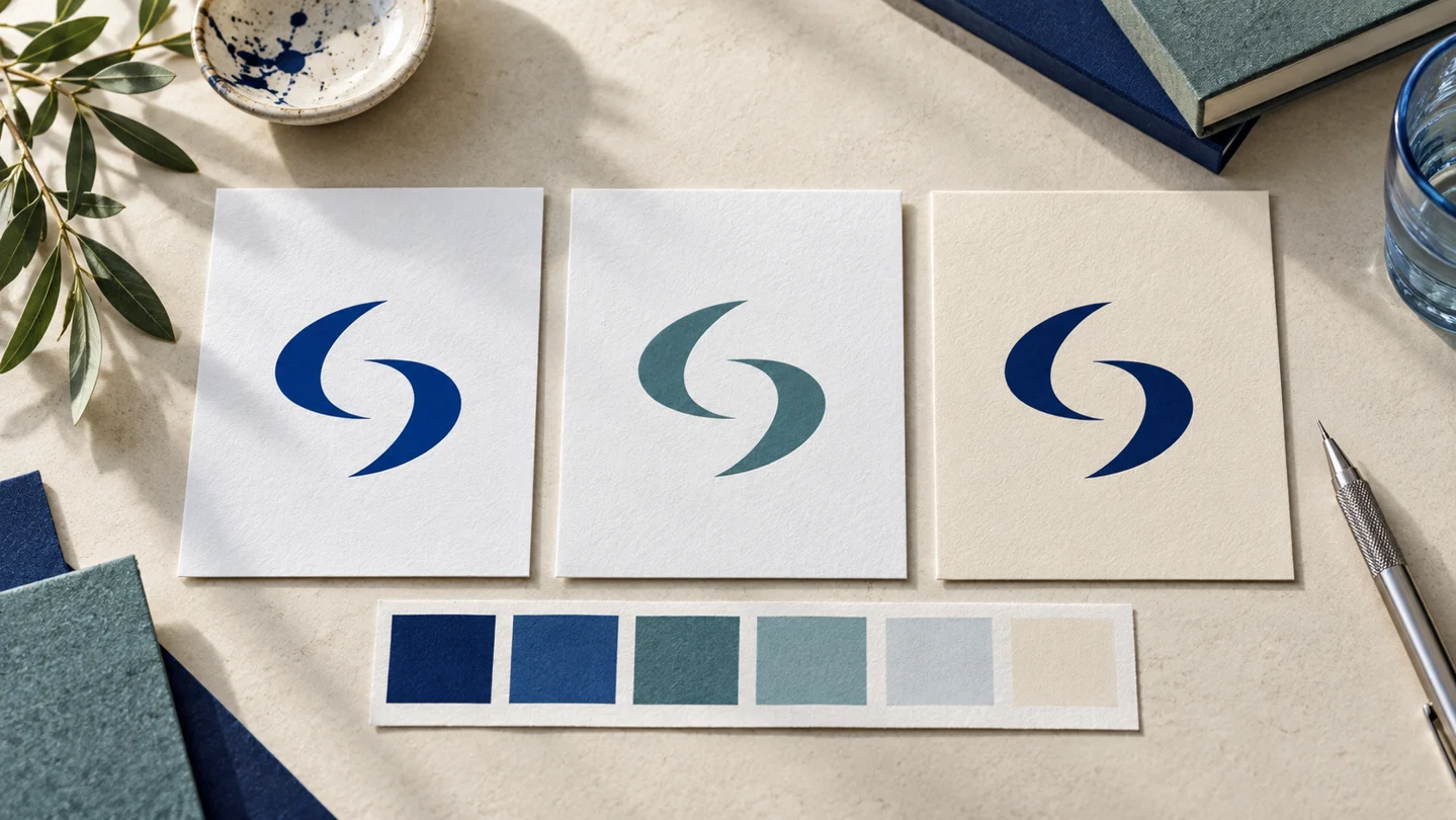
Logo editor software is generally a good fit when you need a usable logo quickly, want direct control over revisions, and do not need a fully custom identity system from day one. The right tool should help you create more than an attractive mark on a screen. It should make it easier to use that mark consistently on a website, social profile, email signature, presentation, and printed material.
For a new business, the decision is less about finding the most advanced design interface and more about choosing a workflow you can actually complete. A tool with hundreds of effects may be unnecessary if you only need to adjust a name, icon, colors, and layout. On the other hand, a simple logo generator may feel limiting if it cannot produce the variations and file types your business needs.
What logo editor software should help you do
At a basic level, logo editor software lets you change the parts of a logo concept: text, fonts, colors, symbols, spacing, size, and arrangement. That control matters because a logo rarely works equally well in every format. A horizontal version may suit a website header, while a stacked version may work better as a social media profile image.
The useful question is not simply, “Can I make a logo here?” Ask whether you can create a small, repeatable system around it. Most small businesses need a primary logo, a compact variation, a simple icon or mark where appropriate, and clear color and type choices. Those elements make everyday brand decisions faster and reduce the chance that every new post or document looks unrelated.
A practical editor should also let you preview your work at realistic sizes. A detailed icon can look fine while enlarged but become unreadable in a browser tab, profile image, or mobile header. Likewise, a thin font may appear polished in a design canvas yet disappear when printed small.
The features that matter most
Feature lists can make every platform look similar. Focus instead on the capabilities that affect whether you can use the finished design in real situations.
Customization without unnecessary complexity
Look for control over the business name, tagline, font, color, icon, and layout. You should be able to test options without rebuilding the design from scratch. For example, a consultant may want to compare a wordmark with a small symbol, while an online shop may need to see whether its name remains readable in a square profile image.
More controls are not automatically better. If you have limited design experience, an editor with too many manual settings can make basic decisions feel harder. Templates, guided suggestions, and restrained options may help you move forward, provided the result does not force your business into a generic or poorly fitted style.
Logo variations for different placements
A single logo file is rarely enough. Consider whether the software supports a horizontal layout, stacked layout, icon-only version, and one-color version. These are not decorative extras. They solve ordinary placement problems.
A wide logo can be difficult to read on a social profile. A full-color version may not reproduce well on a single-color stamp or certain print applications. You may not need every variation immediately, but planning for them avoids a rushed redesign when your business adds a new channel.
Files that match your intended use
Before choosing a tool, make a short list of where the logo will appear. Web use commonly calls for image files that work well online. Print work often benefits from scalable vector files, which can be enlarged without becoming blurry. A transparent-background version is useful when placing the logo over a colored background, photo, or document.
File needs depend on the project. A freelancer launching a simple portfolio site may only need web-ready assets at first. A retailer ordering signage, labels, or packaging should discuss the printer's requirements before finalizing anything. Do not assume every platform includes the same downloads or export options. Check the current product details before you commit.
Color and typography choices that travel with the logo
A logo editor can become more useful when it helps you define the colors and fonts used around the logo. The goal is not to find a universally “correct” blue, serif, or icon shape. It is to select choices that fit your business and remain practical across digital and print materials.
For example, a pale accent color may look appealing in a large graphic but have weak contrast against a white background. A display font may suit a logo but be difficult to read in body text on a website. Consider using a distinctive typeface for the logo or headlines and a clear, legible font for longer text.
Write down the color values and font names once you decide. Without that record, it becomes easy to use slightly different shades and substitutes across social posts, documents, and presentations.
How to evaluate logo editor software before you buy
Start with your actual launch tasks, not an abstract wish list. If you are opening a local service business, you may need a website logo, profile image, quote template, and business card. If you are building a digital product, your priority may be an app icon, landing-page logo, social graphics, and presentation cover.
Then test the editing experience with a real business name. Long names, short names, words with unusual letter shapes, and taglines can reveal layout problems quickly. A concept that looks balanced with a sample name may need more careful spacing when your own name is added.
Pay attention to these four practical checks:
- Can you change the core elements without starting over?
- Can you make versions for horizontal, square, and small-format use?
- Are the available file types suitable for your website, social media, and planned print work?
- Can you save the colors, fonts, and usage rules needed to keep future materials consistent?
Also review the platform's current terms and product information for the specific assets you plan to use. Questions around commercial use, ownership, name availability, and trademark registration can depend on the service and jurisdiction. A logo tool is not a substitute for legal guidance or a trademark search where those issues matter to your business.
AI-assisted tools, designers, and agencies: when each fits
AI-assisted logo editor software may suit founders who need a fast starting point, want to compare visual directions, and are comfortable making straightforward choices about layout, colors, and typography. It can be particularly practical when the goal is a coordinated starter identity rather than a long strategic engagement.
Ficonica is one option for this kind of workflow. It is designed to help users move from a business name and industry description toward logo concepts and a coordinated visual identity, including brand previews and guidelines. For a founder who needs to organize the basics in one place, that approach may be more useful than treating the logo as an isolated file.
A freelance designer may be a better fit when you want closer creative collaboration, a distinct visual concept, or a professional to refine details you cannot easily judge yourself. This can be valuable for businesses with unusual naming challenges, a specific creative point of view, or a need for original illustration.
A branding agency is generally more appropriate for organizations that need extensive research, positioning work, stakeholder alignment, packaging systems, large-scale rollout planning, or highly customized art direction. That process can bring depth, but it also usually requires more time, budget, and participation from the business.
The choice depends on the risk and scope of the project. A solo consultant validating a new offer has different needs from an established company changing a brand used across products, retail environments, and multiple teams.
Common mistakes after the logo is finished
The most common problem is treating the exported logo as the entire brand. Once the design is complete, create a simple reference document with your approved logo versions, colors, fonts, background choices, and a few examples of acceptable use. This does not need to be a long design manual. Even a short set of rules can help a small team stay aligned.
Avoid stretching the logo, placing it on low-contrast backgrounds, adding unapproved effects, or changing its colors for every campaign. These choices can make a business look inconsistent, even when the original logo is sound.
Finally, test the identity where customers will actually encounter it. Put the logo into a website header, a social profile, an invoice, and a basic print mockup. If it remains clear and recognizable across those everyday uses, you have built something more useful than a single polished image: a practical starting point for your brand.